The 30 Best-Looking Airlines Logos in The World
Skift Take
We would totally put any of these logos on a t-shirt! But seriously, airline branding is a serious multi-billion dollar matter, and smart airlines are using their distinctive logos to stand apart. Or should.
Iran Air logo. In our estimation the most striking looking logo in all of airline industry. The logo was designed by Edward Zohrabian in 1961, inspired by an image atop one of the columns at Persepolis. 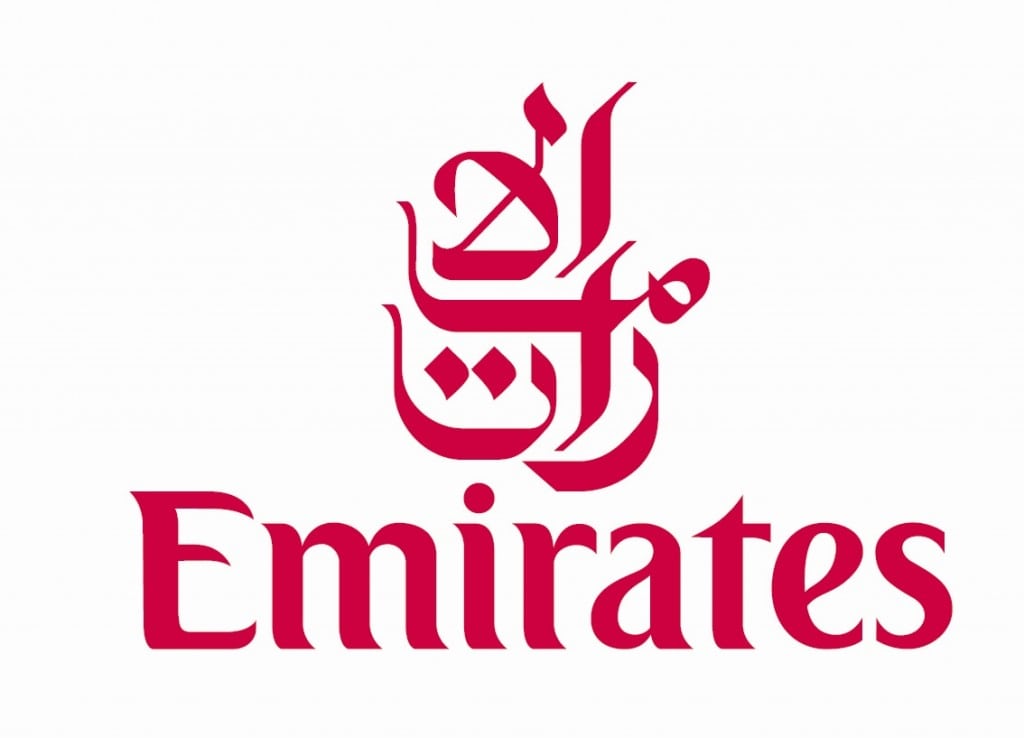
Emirates Airlines logo. Arabic calligraphy, done well, is hard to beat when it comes to great typography. With Emirates rise and its varied sponsorships in sports, this logo become one of the most recognized in the world. 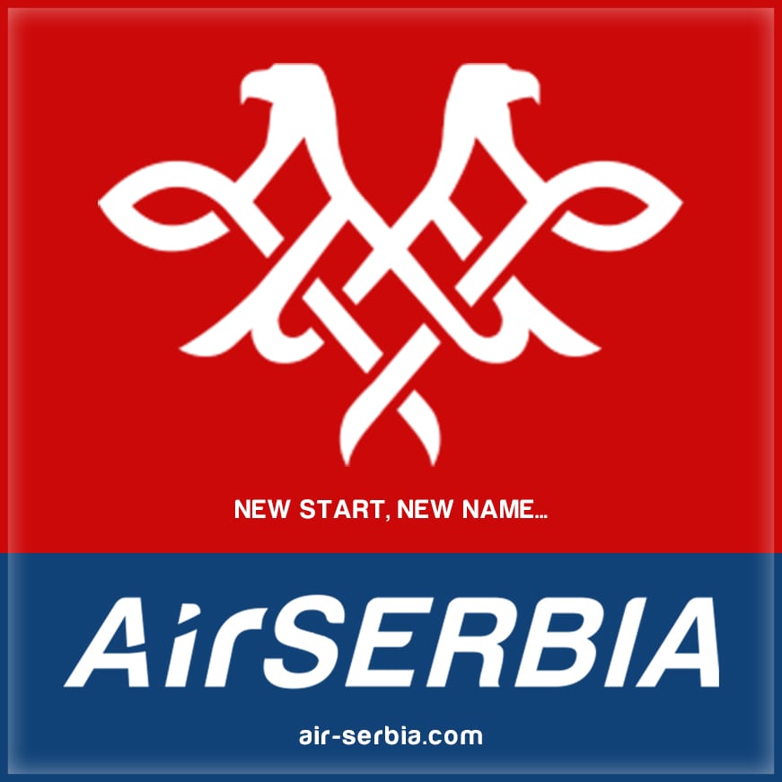
Air Serbia logo: Serbia's original national airline JAT was just rebranded with this logo. The red, white and blue comes from Serbia's national flag, as does the outline for the eagles. 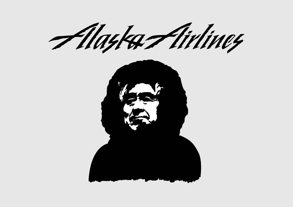
Alaska Airlines logo: The striking logo is the image of a smiling Alaskan eskimo, to represent where the airline originated from. The logo was changed in early 1970s and remains it main brand today. 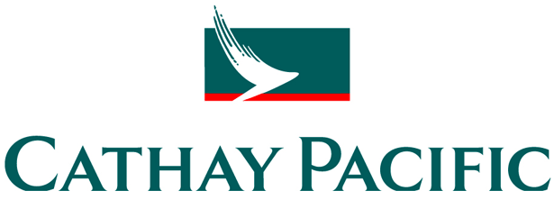
Cathay Pacific logo: This present logo was launched in 1994, when the airline launched a new identity created by branding agency Landor Associates. This "brushwing" symbol is a white calligraphy stroke against a green background, suggesting the wing of a bird. 
Air Canada logo. In October 2004, Air Canada launched a rebrand, and with this the new logo came into being. 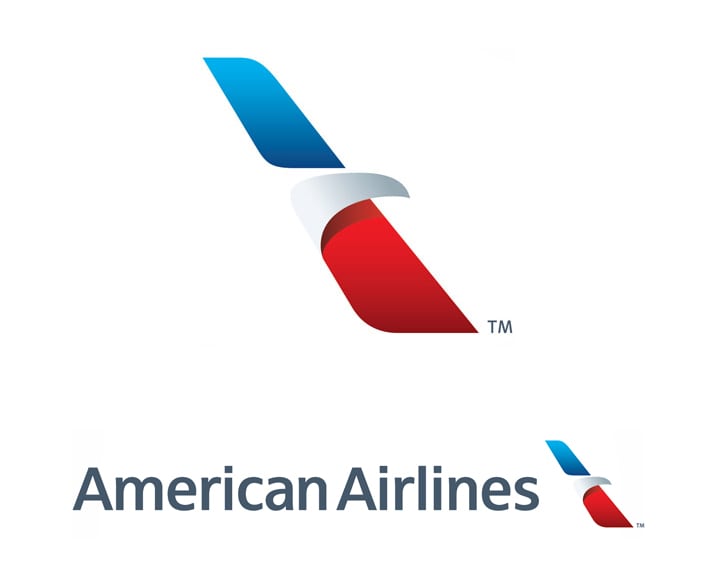
American Airlines logo: This new logo and redesign of AA was launched early this year, replacing its iconic Massimo Vignelli logo of yore. The new AA tail may be horrendous, but this new logo itself is smart and modern. 
Lufthansa logo: One of the best known logos in airline industry, the encircled-stylized-crane-inflight logo was designed by German architect and graphic designer Otto Firle in 1918. It was part of the livery of the first German airline, Deutsche Luft-Reederei (abbreviated DLR), which began air service on February 5, 1919. In 1926, Deutsche Luft Hansa adopted this symbol, and in 1954, Lufthansa expressed continuity by adopting it, too. 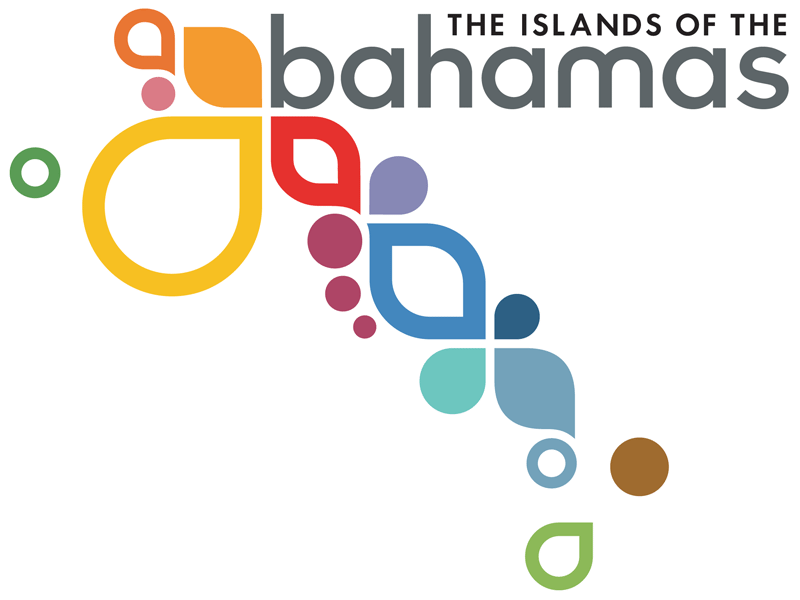
Bahamas Air logo: This is the national airline of Bahamas, and its logo, changed in 2004, is a replica of the current logo of the country's tourism brand. 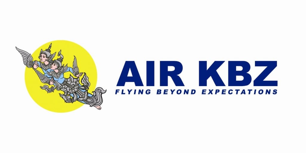
Air KBZ: One of the fast growing new local airlines in Myanmar, with a funky logo of two mythical fairies flying, inspired in part of Hindu-Buddhist iconography. 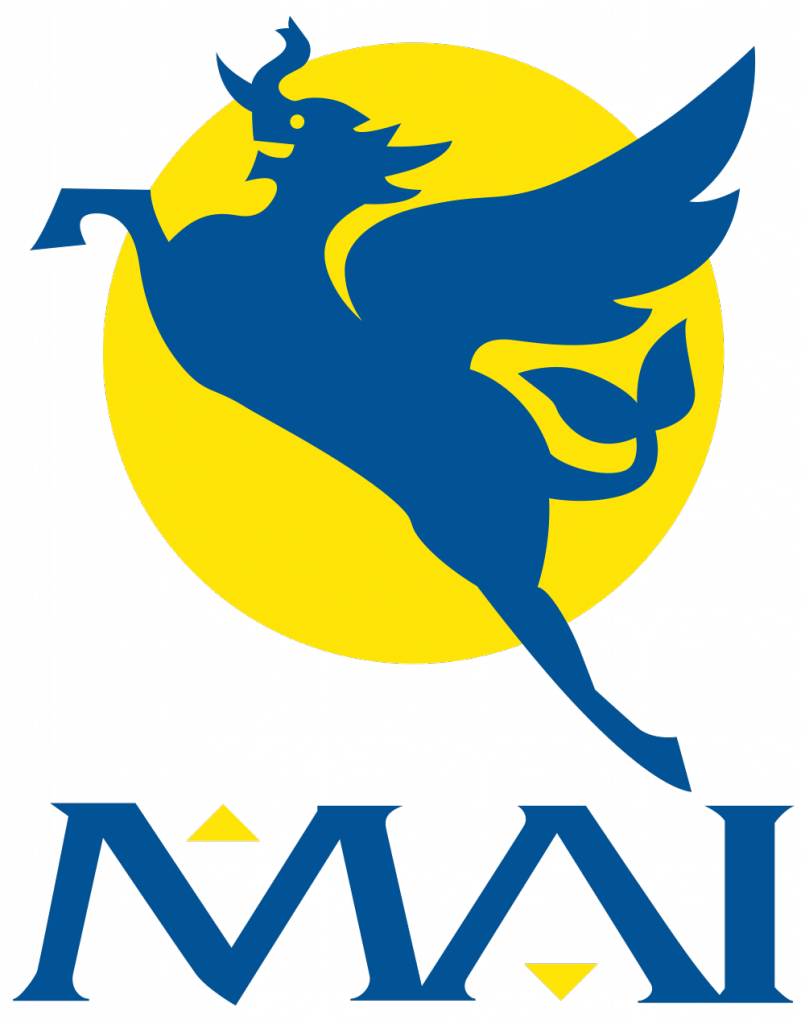
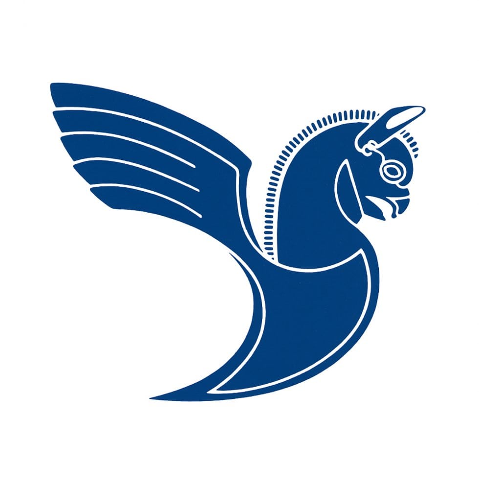
Myanmar Airways International logo: The international flag carrier of Myanmar, MAI was founded in 1946 as Union of Burma Airways. The new logo of a stylized flying horse-elephant came in 2001, as part of a rebrand. 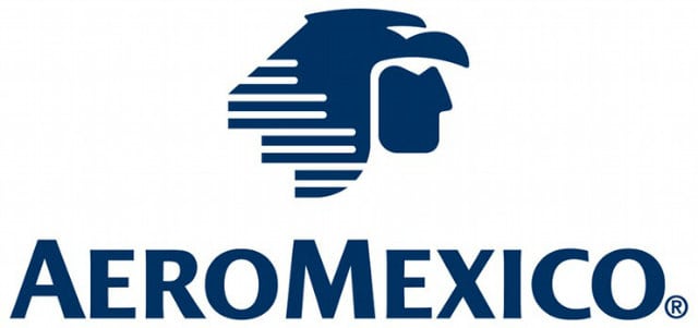
AeroMexico logo: The flag carrier of Mexico, the logo shows the head of an Aztec eagle warrior, and was adopted in its current form in 1994. 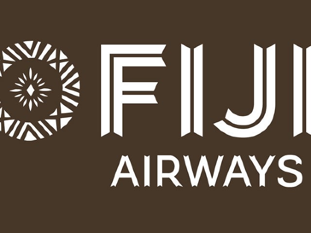
Fiji Airways logo: Recently rebranded from Air Pacific, the new logo is a "Masi symbol that epitomizes Fiji and enhances the new name of Fiji’s national carrier." 
Drukair logo: Drukair is the national airline of Bhutan. The logo is based on Druk, the Thunder Dragon of Bhutanese mythology, a very common motif in the Himalayan Kingdom. Druk is also the national symbol of the country. 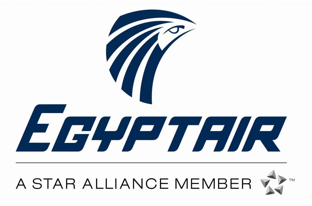
Egyptair logo: Egyptair is the flag carrier of Egypt, and the logo is Horus, the logo is the sky deity in ancient Egyptian mythology, chosen because of its ancient symbolism as a "winged god of the sun", and usually depicted as a falcon or a man with the head of a falcon. 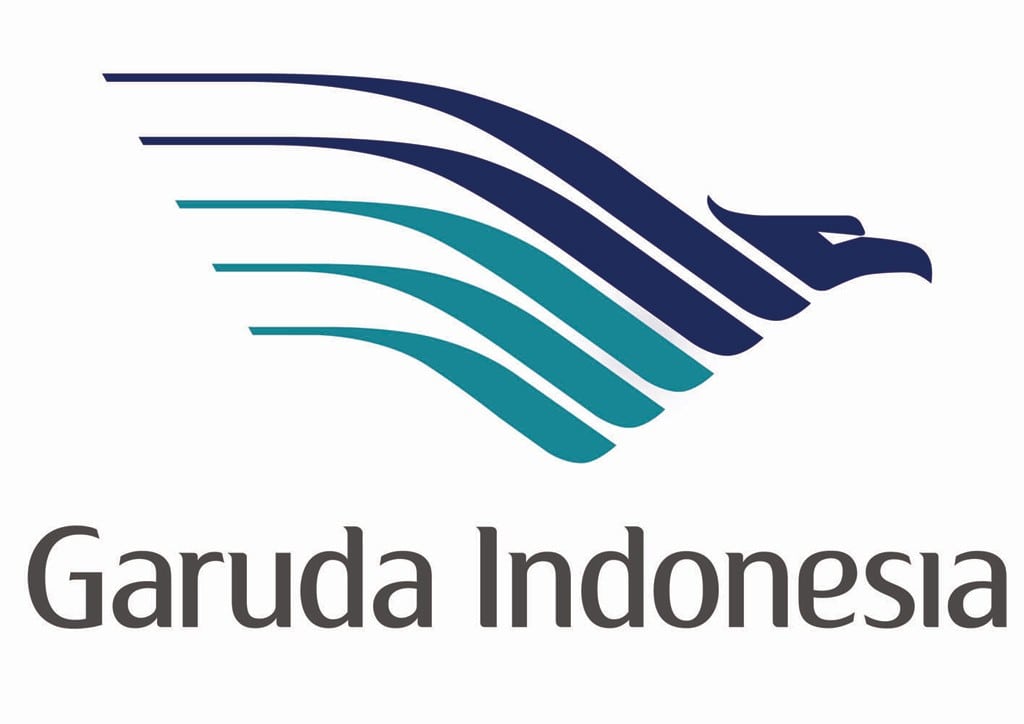
Garuda Indonesia logo: The national carrier of Indonesia, Garuda's logo dates back to 1950s, when it introduced a bird logo: a triangle stylized eagle-like Garuda with red and white shield. In 2009, a new branding, developed by brand consultant Landor Associates, put a new spin of the idea called "nature's wing", with blue and aqua shades. The "nature's wing" graphic was inspired by the wings of tropical birds as well as the ripples of waves upon the water. 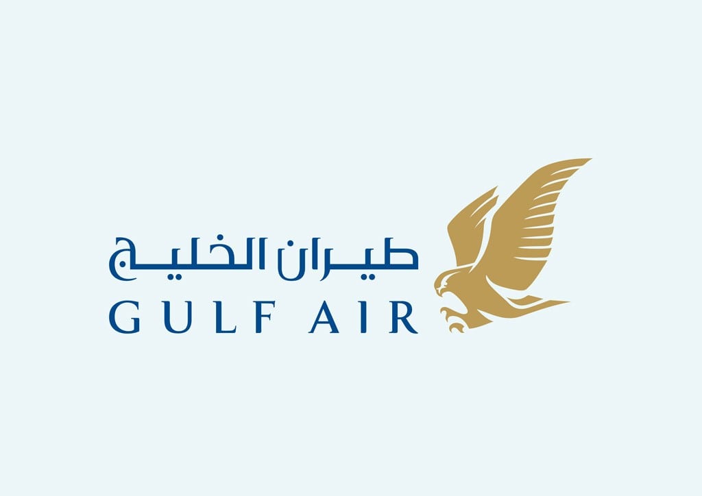
Gulf Air logo: The flag carrier of Bahrain, Gulf Air's logo is a handsome golden falcon, and was updated in April 2004 by Landor Associates. The old falcon symbol was extensively redrawn to occupy a large part of the aircraft’s tail. 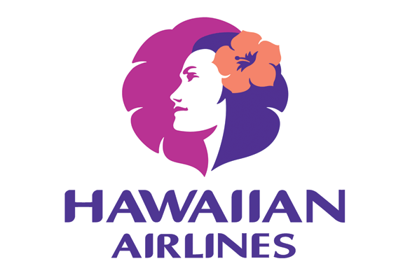
Hawaiian Airlines logo: Hawaiian's original 1975 Pualani logo was designed by Landor Associates, and in 2001, it was updated with the current one. . The contemporized island girl symbol is depicted in "a realistic, more genuine way, in keeping with the current Hawaiian cultural renaissance that has revived dance, music, language and other native traditions." 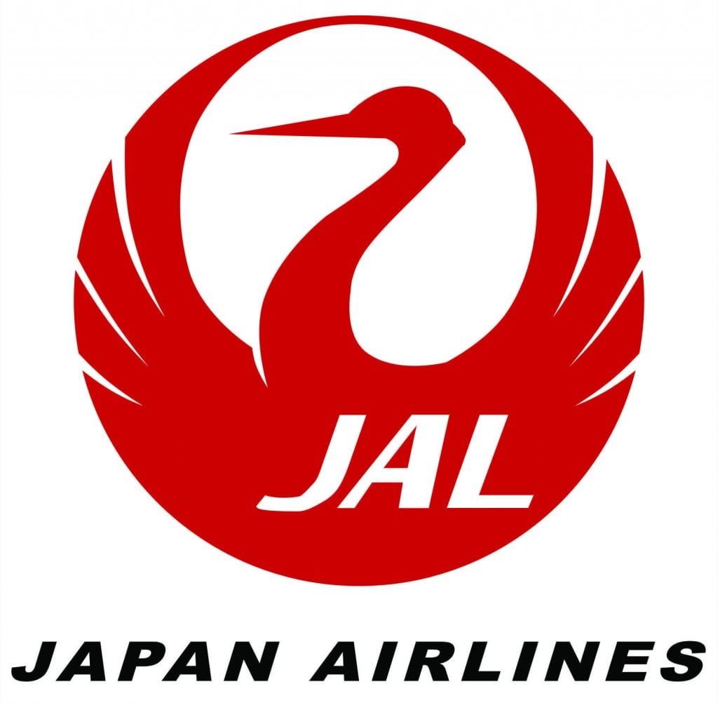
Japan Airlines logo: Its famous crane logo was in use from 1959-2002, and then revived again in 2011, in a corporate rebranding. In Japanese culture, the crane is viewed as a symbol of long life, prosperity and good health, and red is the color of happiness. That’s why for weddings, anniversaries and other auspicious occasions, the custom is to decorate with a thousand origami cranes to express good wishes. 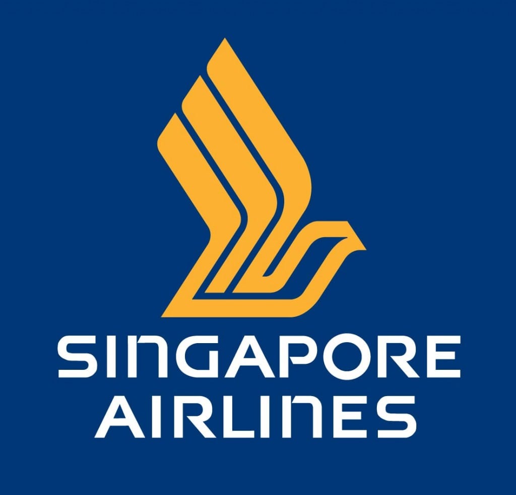
Singapore Airlines logo: The iconic SA logo includes the "bird" (also known as the Silver Kris) logo. The bird has remained unchanged since its inception, but the logotype and stripes used since 1972 were changed in 1988 to the ones still in use today. 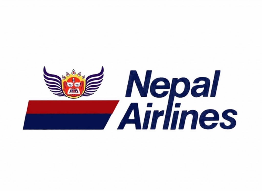
Nepal Airlines logo: The flag carrier of Nepal, the logo incorporates Akash Bhairab, the Hindu god of sky protection. 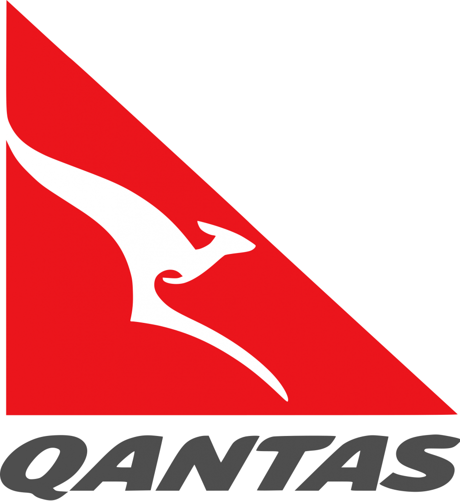
Qantas: One of the oldest airlines in the world, Qantas logo has gone through four iterations, after its first use in 1944. In 1984, a new refreshed logo designed by Hans Hulsbosch and his company Hulsbosch Communications debuted, dropping the wings from the kangaroo. A refreshed logo debuted in 2007 with different text positioning, primarily to deal with technical issues arising from changes to the shape of airline tails and surface areas on stabilisers being designated as no paint areas on the Airbus A380s 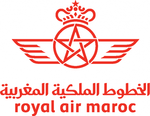
Royal Air Maroc logo: RAM is the flag carrier of Morocco, and its current logo was updated in 2009. The star of the logo is the national symbol of Morocco. 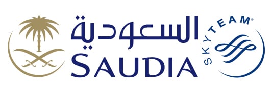
Saudia: The flag carrier of Saudi Arabia re-branded last year and adopted its old name of "Saudia". The airline logo mirrors the logo of the country, consisting of two crossed swords with a palm tree in the space above and between the blades. 
Wow Air logo: WOW air is a low-cost airline based in Iceland that launched a year ago, and also acquired failing Iceland Express. 
Boliviana de Aviación logo: The national airlines of Bolivia, BoA was established by Bolivian govt under the president Evo Morales, replacing the troubled Lloyd Aéreo Boliviano as flag carrier. 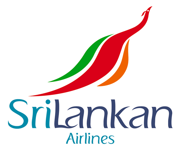
SriLankan Airlines logo: The flag carrier of Sri Lanka uses a stylized peacock in its logo, and was update din 1998, as the airline began a decade long partnership with Emirates. 
Capital Airlines logo: Capital is a local airline in China, and part of f Hainan Airlines. The stylized tiger logo is a holdover from the previous Deer Jet airline it was part of. 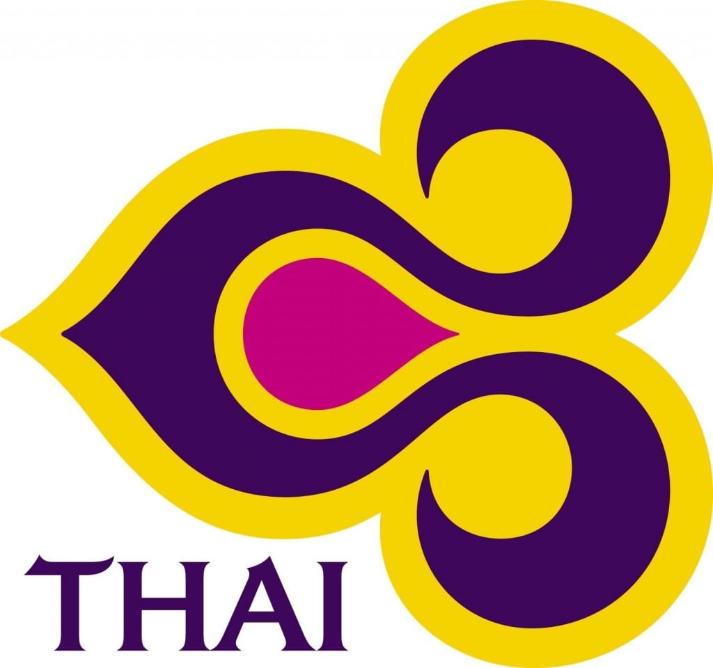
Thai Airways logo: The logo first originated in 1975 through Landor Associates, where it combined several visual elements, suggestive of a tropical orchid, the richness of Thai silk and hints of classical design motifs. It was reworked over by Interbrand in 2005, as part of a overall redesign, giving it a three-dimensional appearance. 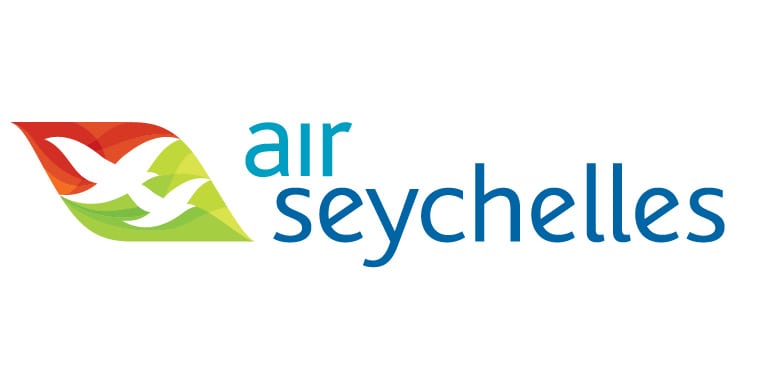
Air Seychelles logo: The new logo of the national carrier of island country of Seychelles is a mix of striking colors with the abstracted images of the birds and leaves, aimed at evoking the Seychelles’ Creole spirit. The new logo was introduced as part of redesign in 2011.
We’re obsessed with travel branding here at Skift, and earlier this year we came up with a fun list of the "20 Most Colorful Airlines in the World," which was very well received.
This time we decided to go a little deeper, and explore logo design with this new list. The criteria wasn't exactly scientific, or deep, just in the eye of the...well, us Skifters. It was a mix of what looks great on an airline tail, plus what would look great on a t-shirt.
These 30 airlines from around the world represent a broad geographic mix, and show the predominance of national flag carriers when it comes to conveying a sense of history through the logo design.
Some observations:
- Birds dominate airline logo and branding, for obvious reasons. Other animals come second.
- The flag carriers (the national carriers) are the ones with most eye-catching and historic logos.
- Ironically, Iran Air, which has been severely hampered by the international sanctions against the country it represents, Iran, has one of the most eye-catching logos of all.
- Most of the ornate ones have been refreshed for the modern era, and hence you see a lot of them with curved lines and pastel colors.
- Some of the Middle East airlines, with their cool Arabic calligraphy/typography, work very well when it comes to conveying brand distinctiveness.
- Landor Associates is everywhere as the design agency of choice when airlines around the world need to refresh their branding; followed by Interbrand and Futurebrand.
- Low-cost airlines have been at the forefront in making their airline design colorful, as our previous list highlighted, but don't figure anywhere in intricate logo design.
- Africa is under-represented, which shows the state of airline branding and marketing in the continent, though that is rapidly changing with new entrants, especially the low-cost ones.
- Three U.S. airlines show up in the list -- Alaska, American and Hawaiian -- though Southwest may qualify in a bigger list.
- We chose not to include British Airways because of the ubiquity of its design and color scheme, and with its actual logo being too generic and simplified to figure in our litmus test of t-shirt design.
- Etihad and Qatar need to catch up with its bigger cousin Emirates, which is miles ahead when it comes to overall branding and marketing.
Up Next

Experiences
How Travel Brands Can Seize the ‘Q5’ Opportunity on TikTok
Driven by increased spending on experiences and the digital habits of younger audiences, TikTok has emerged as a key platform for inspiring and shaping travel decisions. Leveraging the platform’s reach early in the year presents a unique opportunity for travel brands to connect with eager travelers.
Sponsored 
Airlines
U.S. Tariffs Cloud Airline Industry Outlook as Stocks Plummet
The global nature of the airline industry means companies near and far will be impacted by Wednesday’s announcement.

Hotels
Oyo’s Strong UK Performance Spurs Ambitious Growth Plans
With budget hotels facing increasing challenges in the UK, Oyo is smartly shifting its focus toward premium properties. With this, Oyo is not just diversifying its portfolio, but also ensuring a sustainable, long-term growth.

Podcasts
Tariff Impact, TikTok Ban and Kid-Free Cruising
On today's episode we discuss tariff impacts on travel, TikTok uncertainty, and Virgin's child-free cruising success.

Tourism
Lady Gaga's Singapore Tour Drives Surge in Interest from Indian Travelers
Lady Gaga’s highly anticipated Singapore tour is not just a musical spectacle, it’s also a tourism booster.