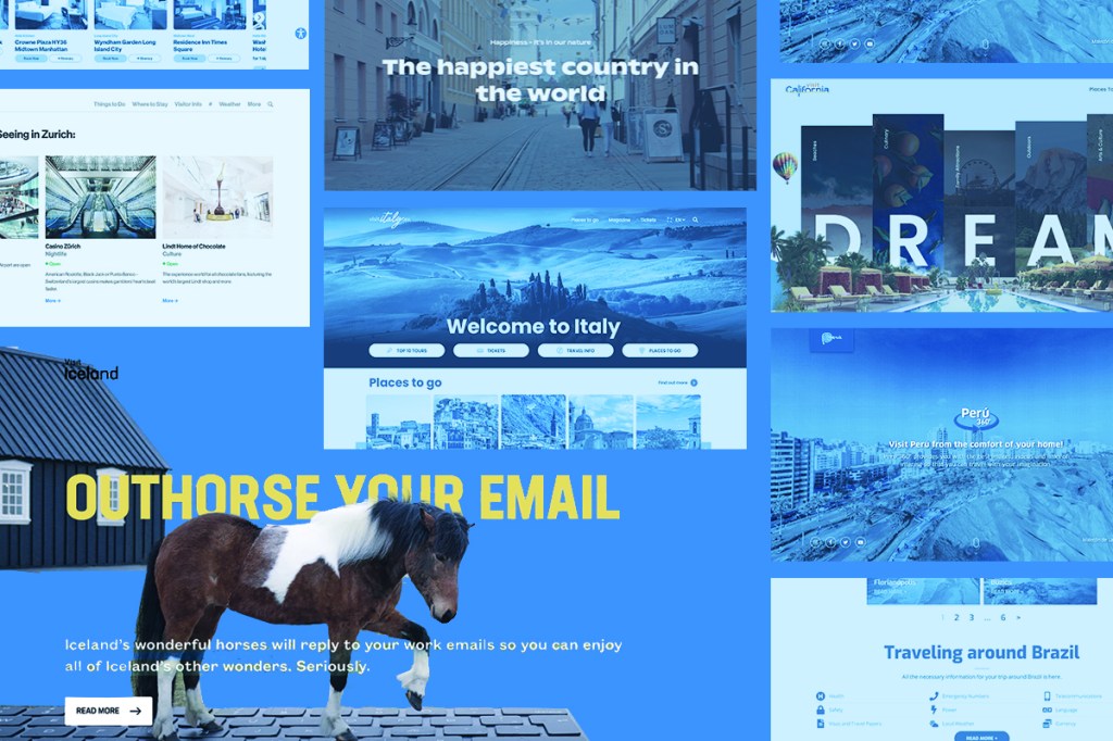
The 10 Best Designed Tourism Websites in the World 2022

Skift Take

In a frantic attempt to avoid being left behind, official tourism organization websites are doing their best to catch up to the high expectations of the new traveler — tourists of the post-pandemic digital age.

Almost every tourist these days is making decisions about their travels based on what they see online. From themed trips to budgeted food tours, travelers crave previews of potential destinations and surf the internet to learn anything they can about a new and exciting spot.

Due to intense levels of pent-up travel demand followed by impulsive and impatient post-pandemic travelers, tourism website design is more important now than ever before. The competitive space for well-designed websites is more ambitious, and reliance on digital platforms as a dependable resource for travel inspiration is at an all-time high. Looking at the Gen Z traveler, it’s easy to notice that attention spans have shortened immensely, and tourists are treating trip planning like a shopping experience, picking and choosing elements of their vacations after engaging in a few seconds of appeal.

With that being said, tourism organizations are slowly learning that the old ways simply don’t work anymore — paragraphs of information on the screen, redirection that continues tab after tab, slow and clunky navigational experiences, depressing color palettes, and promotional descriptions of sites that don’t answer any of the truly important questions, especially for a more conscious traveler worried about climate change, and other threats.

After two years of rapidly-evolving digital growth, several websites have succeeded in breaking out of that dull and repetitive cycle. Here is Skift’s 2022 list of best designed tourism websites — ones that hit the spot both visually and navigationally, and are taking note of what the modern traveler wants, how they think, and most importantly, how they behave.

1. Visit Iceland

The clean-cut and minimalistic nature of Nordic graphic design works well to communicate visual appeal, send concise messages with clarity (or humor), and entice further curiosity with minimal effort, especially in the website world. Visit Iceland leads our list with a transitional homepage display, decorated with background images that hover along the page as they overlap and interact with the text on the screen, making the website feel inviting and alive.

As users scroll further down, the website displays excellent examples of utilizing the organized nature of drop-down menus and vertically moving lists. With a clean white background and bold capitalized black font, readers are able to quickly catch sight of what they want to read, without feeling overwhelmed by options. Blog articles of potential itineraries and Iceland travel tips are also organized in a format reminiscent of Youtube, integrated with carousel elements that are easy to view via mobile phone. 

Accessibility to greener travel options within the website is always a plus — Visit Iceland has an entire page dedicated to helping travelers join in on Iceland’s commitment to preserving their nature, including a list of environmentally certified businesses, a carbon footprint calculator, and an easy-to-follow list of tips for sustainable travel in Iceland.

2. Visit California

While the homepage might look typical at first glance, Visit California’s “Experience California” layout is one of the best designs we’ve seen in the tourism website game. Swipe left as soon as you get onto the landing page (a surprising, but not too complicated way to navigate the site, which keeps visitors engaged), and users are immediately whisked into a three-dimensional space to explore what the state of California has to offer to their tourists.

To the new millennial and Gen Z traveler, design and aesthetic can be just as or more important as destination information and travel guidance. Interactive visuals and bold colors speak to the character of California as a vacation spot, filled with globally cultural experiences and advanced businesses in design and technology — adding to the visitor’s impression of what a trip to California could be like. 

As the home of Los Angeles and the land of influencers, Visit California also fully embraces the use of User-Generated Content as a promotional tool, and displays this in an easy-to-digest format.

3. Zürich Tourism

Speaking of Nordic graphic design and user-generated content, the official website for the city of Zurich is another example of the excellent use of white space. Dedication to sans serif typography, a two-to-three cool tone color palette, and an extremely simplistic, clean layout keeps visitors from feeling overwhelmed and allows for a breathing space to go through all the activities offered on the website. 

Beneath several of the suggested activities, restaurants, and bars, the Zurich website also labels whether the business is open or the service is being offered in real time, a unique feature that can be extremely helpful for travelers who are looking for last minute places to enjoy or spontaneously plan a day trip.

Their user-generated content page is a delightfully neat design, with the page tab linked as a single hashtag in the top menu. The entire page acts as a unified social media feed, making all their social media coverage on Facebook, Twitter, and Instagram visually accessible in one view.

3. Visit Brazil

Visit Brazil has all information and links available on their homepage, split into four sections: Experiences, Destinations, Regions, and Travel Information. 

Aesthetically, a framework of yellow is filled with a line-up of action-packed visuals, picture and video, and a section dedicated to Instagram content. They know their visitors, and they recognize that in-your-face video content appeals to those who are looking for some sort of adventure. The video that takes up the entire homepage display keeps visitors engaged at initial glance, and while the website prioritizes promoting their adventurous activities, they balance “fun” with “necessity” and make sure to give easy access to the safety information travelers will need to know when coming to Brazil.

5. NYCgo

We all know New York City could be its own state, with experience offerings that are equivalent to those of a country.

Set up like a booking site, the NYCgo’s most impressive elements include the UX framework that is deeply familiar to the modern traveler — searching for hotels or accommodations via a search engine reminiscent to short-term rental or airline sites, being able to “like” and save posts or articles for later referral, and of course, a function that offers filtered options to find activities and locations catered to the visitor’s personal preference.

The bold, graffiti-like font that covers the homepage and is used throughout the website is simple, which is a necessary move considering how much text is on the front page. It’s also a great aesthetic choice, a subtle way of speaking to the headlines that cover billboards in NYC. While the website offers slews of information on the homepage, the way it is formatted and presented to the user keeps the aesthetic uncluttered and down-to-earth.

6. Visit Finland

From the logo, to overall design, to choice of font, Visit Finland’s website displays similarities to another extremely popular rental booking site, but when it comes to approachability and visual appeal, borrowing those design elements works in their favor.

The website is a smooth, transparent, and, of course, familiar experience — one that is both modular and linear, showing dedication to navigational simplicity. The design does not shy away from white space and minimalism much like its Nordic counterparts also on this list. Complete use of full-screen photos and stunning imagery is a highlight, as well as the level of scroll-responsive interactivity visitors experience as they explore the site. 

This website also displays various Finnish activities and locations through the save/heart feature, referencing a user experience often seen in online shopping or Pinterest mood boards. The layout feels particularly responsive to the nature of the Gen Zers who spend all their time on social media “saving” posts and ideas.

7. Visit Australia

The website’s Explore Australia in 8D page

Like we’ve seen on other websites on the list, the Visit Australia website is hugely loyal to the tile format, which could feel silly if overused, but because the tiles are lined up and sectioned in a cohesive manner, visitors will find it extremely easy to find options for each and every aspect of destination planning. The homepage is lined with left-right carousels of vertical images, appealing to younger generations and optimized for mobile formats.

Drop down menus are also a highlight for this website design. Instead of cluttering the frame with an overwhelming amount of text, the tile format keeps the menu options visually engaging for the user. Integration of beautiful imagery within every step of the user experience shows great dedication towards marketing the destination, which is, ultimately the main purpose of a tourism organization. 

The Visit Australia website offers everything, from itineraries and cultural or geographical activity guides to budgeting and accommodation deals. Recognizing that budget is an important factor for many travelers is also a major plus for any tourism website, as it keeps website visitors within the website instead of browsing other platforms for “best or most affordable deals”. 

Perhaps the highlight of the site is Explore Australia in 8D, an interactive exploratory experience that allows visitors to move through a map of the entire mainland of Australia, including a few islands surrounding the area, and see what each region has to offer, from attractions to lodging and food.

8. Peru

The website’s Peru 360 page

As much as Peru is receiving growing interest as a travel destination in recent years, the country also seems to be extremely conscious about communicating COVID safety measures and restrictions to potential tourists. The immediate landing page of the tourism website gives visitors easy access to ways to prepare and plan for a trip to Peru from home, beginning with multiple avenues to check and double check updated Covid protocols. Showing this level of diligence to Covid measures not only communicates the fact that Peru takes safety protocols seriously, but also allows for international travelers to cross ‘testing or vaccination requirements’, still a major concern at this time, off their list of potential worries.

The team at Peru Travel also takes advantage of the numerous recognitions, media coverage, and awards that Peru receives as a tourism destination, and pushes that at the forefront of their website design. 

The most exciting part of the website is perhaps the VR page, called Peru 360, where one can “visit” various sites throughout Peru in a virtual reality. While this is a method that has grown in popularity amongst a lot of brands during the pandemic, very few official tourism websites have been successful in offering a well-established experience that feels interactive beyond typical images or videos. 

9. Visit Italy

Italy has long-been a tourist-heavy destination, and the team at Visit Italy knows it. At the forefront of their website are easy ways to search, budget, and book the top tourist attractions through the best deals. Viewers barely need to scroll down the homepage before getting immediate access to the Ticket Carousel, with exact prices listed by attraction or location.

Visit Italy’s website isn’t the most ambitious platform design-wise, but it prioritizes digestible formats, such as buttons for each step in planning or tiled carousels, and feels easy-to-navigate overall, especially considering all the information on their homepage.

It’s clear that the website knows what their visitors need — to beat lines, to get the best prices, and to make the most of their time in one of the most famous cities in the world that Italy has to offer. The site is ideal for the tourist who needs to prioritize planning and booking over aesthetic photo inspirations. The website also acts as a search engine of sorts, and does not shy away from redirecting their visitors to other booking sites or options in order to make the best decisions.

10. Visit Greenland

Visit Greenland’s website also sets up like a familiar search engine site (a trend we are observing across most of the designs on this list) but serves mostly for travel inspiration and local informational purposes. The layout of the website is simple and loyal to the use of white space, which allows for their unique graphic design elements to shine through in this particular design. 

Not only are the three-dimensional illustrations beautiful, but they are also interactive, acting as links to the respective relative pages. 

Aside from engaging geographic and cultural graphics, the website also lines up options of various package tours that lead to external provider links, who are more well-versed in helping potential visitors move forward in their planning and exploration process. Because Greenland is a nature-heavy travel destination, the website focuses on displaying a variety of outdoor activities — based on personal interests or geographical location — in order to prevent travelers from feeling deprived of diverse activities. 

_________________________________________________________________________________________

Innovative methods in the digital world are getting increasing ambitious day by day and website designs are trying to be as responsive as possible, as to make sure they maintain their presence in the travel planning space.

In addition to the websites on our list, several other tourism organizations are diving into unique measures to gain attention from the ever-so-hungry tourist of the post-pandemic travel world. Interactive games, like Cape Town’s Virtual Game Tourism Campaign, are one of the few ways these organizations hope to attract younger audiences and give a virtual taste of their destination to potential travelers. The Machu Pichu 360 website invites visitors to enter the world of VR and includes auditory stimulants, a step up from the Peru 360 page in our list, that engages both eyes and ears to fill the void travelers have all been experiencing during Covid.

With the competitive space for tourism websites expanding at an increasing speed and mobile apps taking the spotlight from website platforms, tourism organizations and designers will most likely continue to borrow elements of the newly digital world to keep their platforms running.

Tags: climate change, design, digital, Digital Marketing, generation z, online booking, online travel, pandemic, tourism, tourism boards, tourism campaigns, websites

Up Next

Loading next stories