The 25 Best Tourism Websites in the World in 2016
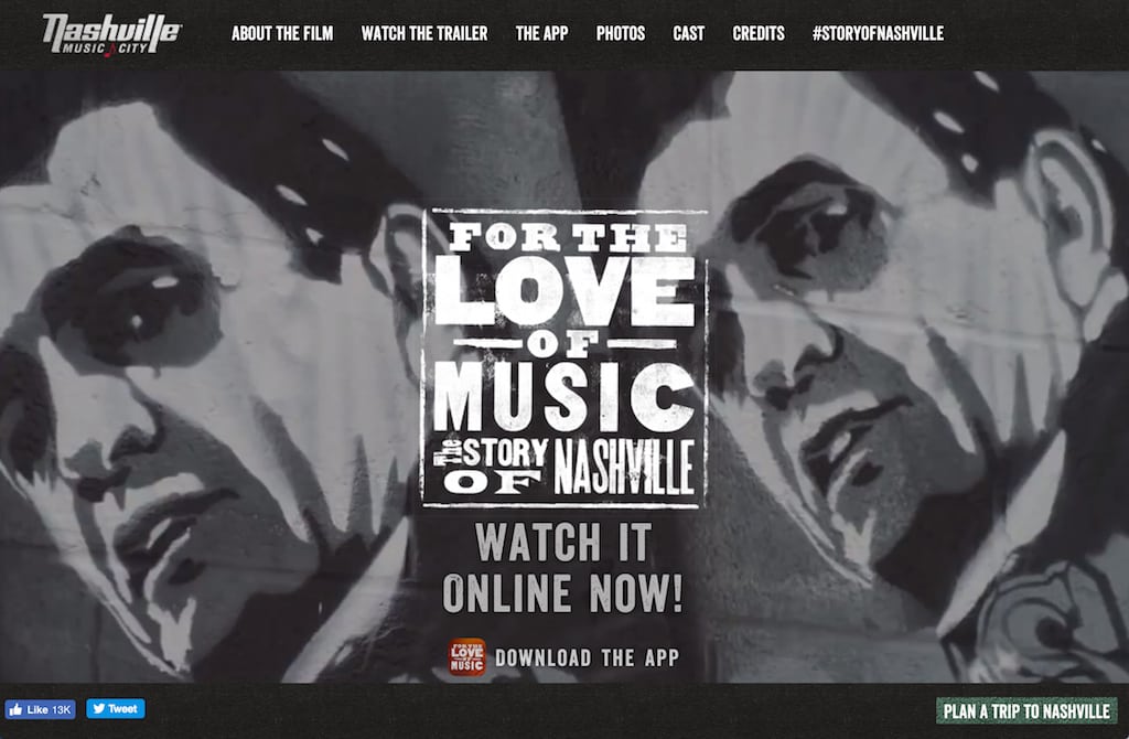
Photo Caption: Nashville Music City uses music and entertainment to define its brand.
Skift Take
The most modern tourism bureau websites today emphasize neighborhood storytelling, more nuanced content for different consumer profiles, mobile-first modular design, and full-width photos and videos with a strong human voice.
[gallery ids="188577,188527,188540,188549,188529,188568,188524,188525,188578,188542,188543,188852,188855,188522,188544,188521,188532,188533,188839,188548,188557,188799,188538,188586,188965"]
Choosing the world's best tourism websites is more difficult in 2016 than it was the last time we picked our favorites in late 2013, but that's not because there are so many better online experiences today in the destination marketing world.
It's more challenging because tourism bureaus are all simplifying their websites on the front-end. The best sites are adopting a similar full-width modular design, flat architecture, and streamlined navigation structure due to the demand for speed and efficiency on mobile.
Bells and whistles are getting thrown out in favor of load times and intuitive user experience.
That's not to suggest the best sites aren't more sophisticated than ever before. It's just that the real innovation is happening in the back-end.
The internal engines of today'
