Behind Spirit Airlines’ Yellow and Black Rebranding

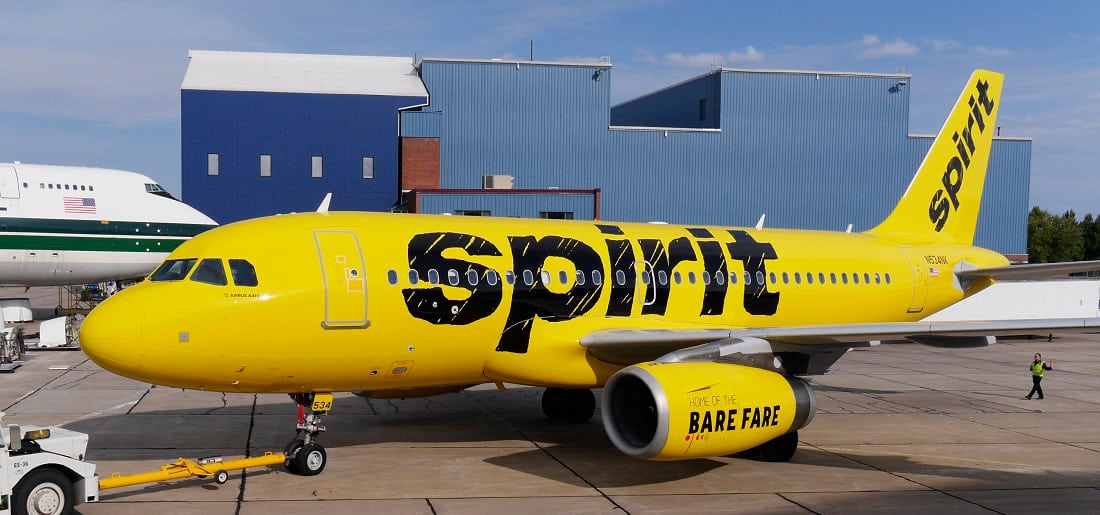
Photo Credit: One of Spirit's planes featuring the new paint job. Spirit Airlines
Skift Take
That's a lot of yellow on a plane. Our guess is CEO Ben Baldanza bought it all in a close-out sale.
Spirit is the latest low-cost carrier to revisit their branding, just a few days after both Frontier and Southwest, following a trend that TheDesignAir predicted last week.
The new design fits with the new website and brand positioning that has been rolled out, offering a simple bold message, with a bright and colourful design.
The first aircraft, that rolled out of the hangar two days ago features a two colour design on both fuselage, and nacelles. The bold yellow look certainly stands out and as “Spirit does not spend money on expensive advertisin
