Virgin America Quietly Unveils New Website and Back Pocket-Sized Boarding Pass

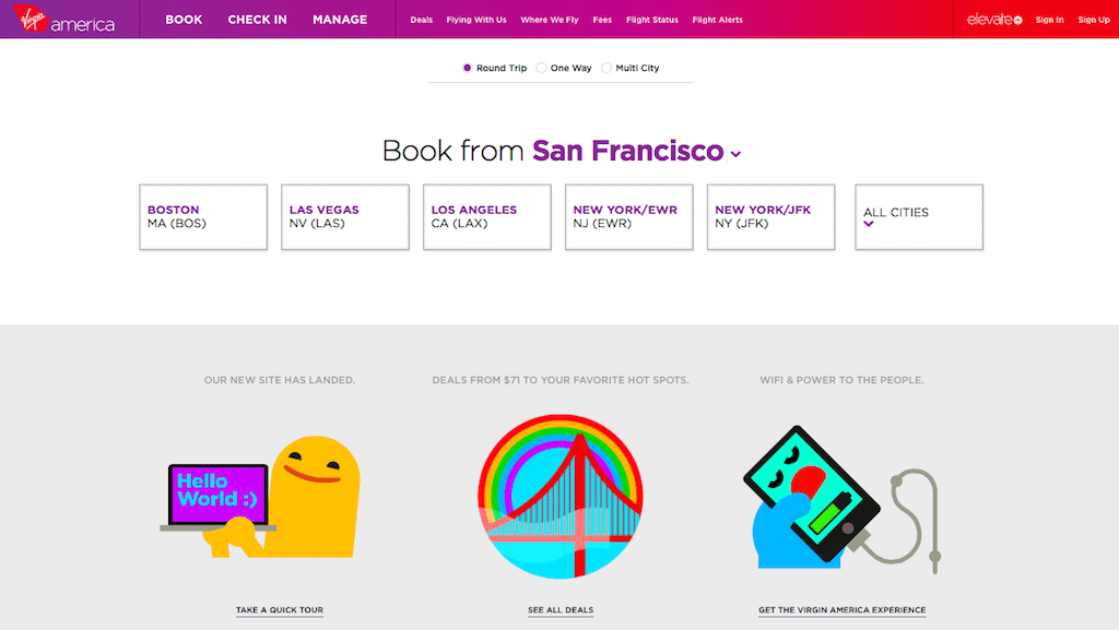
Photo Caption: This is the homepage of Virgin America's new under-the-radar beta site. It is geared to making booking an airline ticket easier regardless of travelers' computing device of choice.
Skift Take
In its website redesign, Virgin America is going for simplicity and responsive design regardless whether a traveler is on a smartphone, tablet, or desktop. The idea is to ease the pain of booking by making it visual and easy.
Virgin America has quietly launched a new website in beta that it believes will streamline the booking process and make it more intuitive regardless whether travelers are using mobile or desktop devices.
The new website is live at https://b
