Kayak Homepage Redesign Keeps Pace With its Biggest Rivals

Skift Take
-

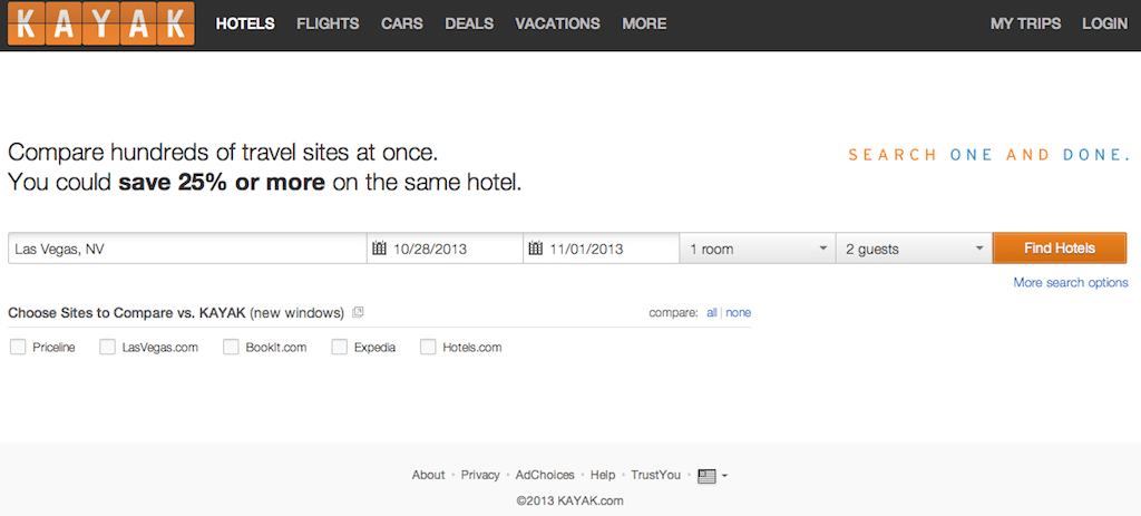
- Kayak's new homepage removes Your History and online travel agency advertising from the right side of the page (see next slide for the prior homepage to compare), and streamlines hotel search widget by neatly placing all the boxes that travelers have to fill in on one line. Quietly, it's a trend. Google Hotel Finder and Trivago also have one-line search, and their search widgets are even simpler.
-

- The previous version of the Kayak homepage had elements of hotel search on three lines, and pop-up windows from other online travel agencies got it the way. A users' search history is no longer visible on the new homepage. That mess and distraction is gone.
-

- Google Hotel Finder has one of the sleekest homepage search widgets: Just four boxes on one line, and Google doesn't even immediately need to know how many guests or number of rooms.
-

- Trivago has a one-line hotel search widget, as well. Just three boxes: city, one box that contains dates and an icon depicting the number of guests, and a search button. Very simple -- except for the clunky calendars underneath.
-

- Hipmunk's hotel search has not caught up with the one-line search trend yet. Guests have to navigate along three lines to fill in the city, check-in date, check-out date, number of rooms, number of people, and a search button. The right side of the page is filled with clutter or information (depending on your perspective) about how Hipmunk is positively superior than its peers.
Kayak has redesigned its homepage for the first time in two years, and the meta search company has streamlined its hotel-search widget into one line, instead of the previous three.
Compare Kayak's redesign homepage with the prior version, and those of several other leading hotel search sites in the slideshow (above).
Kayak's new hotel search from the homepage gets all linear: the city name, check-in-date, checkout date, number of rooms, number of guests, and the Find Hotels button all run across the page in one line.
In the previous version of the Kayak homepage, they were displayed in three lines, and the "Choose Sites to Compare vs. Kayak" feature intervened, appearing between the check-in and checkout dates, and the "Find Hotels" button.
The new Kayak homepage also goes for a lighter shade of gray in the background, and loses a lot of clutter on the right side of the page.
This one-line search, which is all about simplicity, pleasing white space, and increased conversions (turning lookers into bookers), has become a downright trend.
Google Hotel Finder probably has the sleekest homepage and hotel-search widget around, with merely four boxes (city, start date, end date, and the search icon) running in one line across the page, and so much soothing white space. It's Interesting that Google gets all original calls them "start date" and "end date," and not check-in and checkout.
Priceline owns Kayak, and Expedia controls metasearch rival Trivago, which, like Google Hotel Finder, has a simpler hotel-search widget than Kayak's than the one on Kayak's new homepage.
Trivago has just three boxes (city, dates/number of people, and Search button) in its hotel-search widget compared with Kayak's six boxes, and Trivago's, too, takes up just one line flowing from left to right across the middle of the page.
Hipmunk is either a contrarian or just hasn't caught up with the trend. Hipmunk's hotel-search widget takes up three lines, and the right side of the page is basically Hipmunk patting itself on the back about how good it is, with little utilitarian there.
Photo Credit: Kayak's redesigned homepage ensures that you don't have to bob and weave up and down the page to input your hotel requirements. Kayak
Up Next

How Data Quality Issues Impact Global Hospitality Operations

Coldplay Effect? High Prices, Full Rooms at Mumbai Hotels

Emirates Bets on Cambodia as Chinese Travelers Stay Away

Skiing Is Obscenely Expensive. The Resort That Makes a $329 Lift Ticket Feel Worth It