Marriott, Hyatt and Hilton Are Shedding Their Dated Design Legacies

Skift Take
- Marriott Marquis Houston
- Hyatt Regency San Francisco Airport
- Hilton Cleveland Downtown
- JW Marriott Austin
It wasn't that long ago when Marriott, Hyatt, and Hilton were never uttered in the same sentence as the phrases "trendy design" or "hip social spaces."
Today, however, new and newly renovated properties like the JW Marriott Austin, Marriott Marquis Houston, Hilton Cleveland, and Hyatt Regency San Francisco Airport are emphasizing fashionable design that looks good and encourages a sense of community. That in turn encourages higher spend on food and beverage, it makes single travelers feel more comfortable, and it attracts more of the local community.
These properties won't compete with the best lifestyle hospitality brands in terms of design anytime soon, but they've clearly evolved light years beyond the dark and depressing "big box hotels" of the past.
More natural light, more open spaces, and more expansive sightlines are the main architectural trends impacting the next generation of hotel construction. More organic materials and more varied options for live and virtual networking are the primary trends in hotel interior design.
For example, the 11 years separating the opening of the JW Marriott Austin in 2015 and the nearby Hilton Austin in 2004 illustrate the dramatic shift, in the minds of corporate hotel owners, developers, and brands, toward hotel design over the last decade.
The Hilton's disconsonant lobby, restaurants, and bars are broken up among different hallways meandering in different directions. The main seating area in the middle is somewhat disconnected from them in the path of the registration area, and there's really no social hub tying everything together.
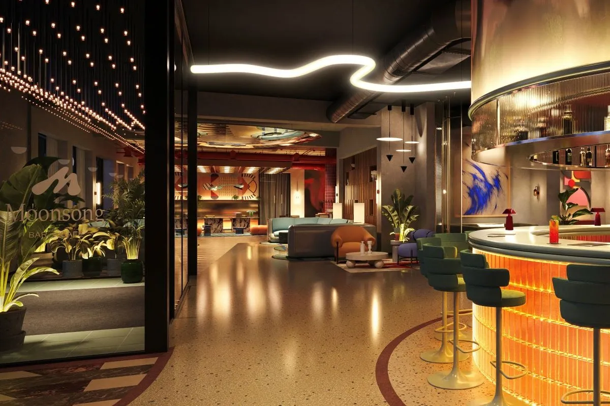
At the JW, the large lobby bar is the lobby. The contiguous space with tall ceilings, a full wall of windows, a variety of communal and private seating areas, and natural organic materials was the most popular social gathering area during the buzzy South by Southwest (SXSW) conference this spring.
According to the Austin Business Journal, the JW Marriott Austin recorded the highest liquor sales in the city in March when SXSW took place, selling $921,000 of alcohol. The second busiest hotel was W Austin with monthly liquor sales totaling $509,000.
On the JW's rooftop, the sleek pool, cabanas, bar, and large outdoor deck wouldn't have been recognizable as a downtown Marriott property in a second- or third-tier city even five years ago. The social hotel of the future — a concept that's been around for years, everywhere from Ace to citizenM — is now actually really a thing in corporate hospitality.
"The whole move toward communal areas in chain hotels, with a popular central bar and group tables designed for mixed use, started 5-10 years ago and it's just continuing even more so," says Kathleen Dauber, a partner at Santa Monica-based Hirsch Bedner Associates, which specializes in hotel design. "There's now much more hang out space. We want the guest to hang out in the lobby. We want them in the living room, the library, and as many different social spaces in the same area as possible."
Along with everyone else, Dauber attributes the rise of hotel lobby socializing to Morgans Hotels' founder Ian Schrager. But, she told Skift, "The evolution in the last five years is the shift from Schrager's club-like atmosphere to more of a community atmosphere."
Dauber says designers also go to great lengths to create communal areas specifically for solo travelers to feel more comfortable. This is aligned with what's often referred to as a Millennial trend, where hotel guests want to be "alone together." They want their privacy but they don't want to feel lonely.
"As downtown areas get denser, we're losing that personal space we all want, so hotels want to bring that back to the guest," Dauber said. "I've seen a shift in how lobbies and lobby bars are utilized, because guests aren't staying in their rooms anymore. There are more individual spaces where you can be alone, but not feel like you're on display so that everyone sees you're alone."
That open, social design experience swamped in natural light is informing a batch of big chain properties opening soon.
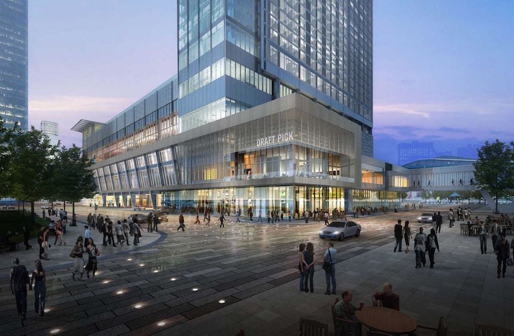
For example, the first two floors of the new Marriott Marquis Houston opening this winter are wrapped in floor-to-ceiling windows. It's designed very much like the JW Austin, except there's even more emphasis on activating an integrated lobby experience anchored by a large lounge.
Part of that was inspired by the success of the giant "Great Room" lounges with towering glass walls at the JW Marriott golf resort properties in places like San Antonio and Palm Springs.
The three-level lobby and mezzanine at the new Hilton Cleveland Downtown is fronted by 30-foot glass walls framing the grass roof of the Cleveland Convention Center across the street. To accomplish that in Cleveland and other new large properties, the low slung port-cochere of yesteryear is moving away from the front doors to secondary sides of the building to create a greater sense of theater, a "bigger reveal," more art and animation, and more natural light.
"We don't really think of ourselves as just a convention center hotel," said Ronnie Collins, director of sales & marketing at Hilton Cleveland, during a hard hat tour last year. "We'll also be catering to locals and leisure guests who want to have a great time downtown any day of the week."
One flight up at the Hilton, the mezzanine-level bar overlooks all of the drama in the lobby from directly above. And because of the height of the windows, the bar patrons will have excellent sightlines, almost like a Broadway playhouse.
"Newbuild hotels now definitely have so much more window space and taller ceilings, although sometimes to achieve certain green certifications there's a maximum limit to window size," explained Dauber. "Another big change is the removal of drapery from these spaces. In the past there were a lot of layers of drape, so we're taking all that down to open up the vistas. It adds more light and you're taking away barriers between the guests and the outside."
The Future of Airport Hotel Design
Hyatt Regency San Francisco Airport is undergoing intensive interior surgery, scheduled for completion later this summer. The atrium has been gutted to replace everything from the elevators to the broadband pipes and Wi-Fi infrastructure in an effort to convert the Hyatt into a destination hotel, due to the booming economy in the Bay Area.
Almost half of the hotel's overnight guests are now visiting for meetings and events, many for multiple nights compared to quick layovers, says Irby Morvant, general manager of the Hyatt Regency property. Therefore, the owners are investing heavily in interior design to modernize the guest experience in alignment with lifestyle hotel trends. There are also two new ballrooms under construction, and both have expansive window views of San Francisco Bay.
"The idea with everything here wasn't just to become a nicer airport hotel," said Morvant. "It was a true redesign to become a great hotel. So design has moved to the front-of-mind here, as overall demand in the Bay Area continues to grow. The goal now is to play well beyond just our own little neighborhood to attract more business, really nationwide."
The signature project is the reimagination of the enormous atrium lobby. Previously, the area was overly segmented and confusing to navigate. The new lobby now integrates the restaurant, bar, and small market to create a wide variety of social spaces with different energy levels for guests to gather.
"We integrated linear seating elements and stairs with built-in benching to give people more casual ways to work," said Meghann Day, a designer at Hirsch Bedner Associates, who's part of the team leading the Hyatt Regency San Francisco Airport renovation. "And since everybody wants to be connected all the time, we electrified all of the furniture to be used as workstations."
In terms of the aesthetic mission, Day said, "The majority of the materials are recyclable, which is pretty much standard in San Francisco, but that wasn't the case five years ago. So we used a lot of cool polished stones, warm woods, earthy textures to create a more organic experience."
The Hyatt's lobby art program, showcasing local artists specializing in aviation and nautical themes, includes wall sculptures created with recycled aluminum airplane parts. The overarching goal, explained Day, is to compel people to move around the atrium much like a modern museum is designed.
"It's all about encouraging a sense of discovery by removing all of the walls that segregated everything," she said. "So now you can see the full expanse of the atrium, and it lets all the natural light fill the space, too."
Morvant added, "People want to see, be seen, and know where they're going. So with the improved sightlines, you're no longer looking all over multiple floors for multiple spots to eat and drink. Everything today is about connecting everything more seamlessly."


