The Subtle New Alitalia Look Has Small Risks, Big Rewards

Skift Take
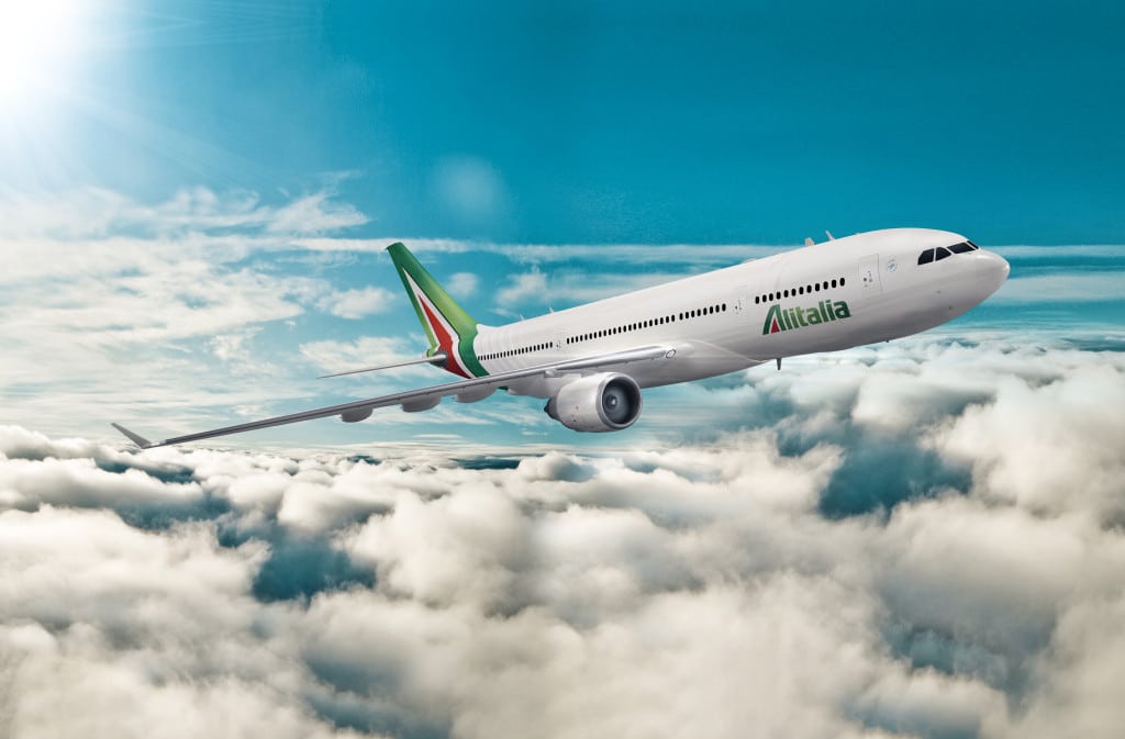
- New Alitalia livery and branding.
- New Alitalia Livery.
- New Alitalia livery and branding.
- New Alitalia branding.
Yesterday, the world met a new Alitalia, and found it familiar. A fine thing, when you can pull it off properly.
Alitalia’s new image can best be described as honouring its past. The new livery, logos, and design elements, by Landor, harken to the original concept which Landor developed for the airline in 1969.
Peter Knapp, Global Creative Officer at Landor explains: “Walter Landor was involved in the design of the project nearly 50 years ago and now is the time to evolve this enduring brand and update it for today’s market challenges. We have added a subtle sophistication to the design, to the interior and exterior of the aircraft, which connotes the style, passion and craftsmanship of modern Italy.”
It is modernized, brought up to date with today’s aesthetics, reflecting what the airline describes as “a young and seductive new look to represent the airline’s ambitions, utilizing the design elements of the airline’s previous iconic livery.”
Alitalia says the point of debuting a livery which had much in common with its past was “to reflect longevity and the airline’s illustrious history.”
Brand Longevity
This is the first major rebrand for Alitalia in 46 years, retaining the same green, red and white colors of the Italian flag. The logotype has been updated with a more dominant ‘A’ which Alitalia hopes will make “a bold statement of the heights the airline is striving to reach and its enviable experience in the field of aviation.”
The new logo is more dimensional, more alive, rich. The lines, Alitalia says, are “inspired in part by the striking lines on Formula 1 racing cars, striations have been added to the red triangular interior of the Alitalia ‘A’, creating a pinstripe effect which reflects exclusivity, attention to detail and a strong focus on design”. White on the fuselages is replaced by a calmer ivory, “reflective of understated Italian style”, and tone-on-tone bands at the rear of the fuselage create a sense of “movement, speed and unhindered progress.”
Rather than start over from scratch, the airline has held on to its core identity. Doing so takes a considerable amount of brand confidence, especially for an airline as troubled as Alitalia has been, over the years. And that’s the point.
The Classy Approach to Rebranding
Had Alitalia put on a radical makeover, taken a “tabula rasa” approach to its revival, it risked being mocked as whatever the aviation design equivalent is to ‘mutton dressing as lamb.’ It might have been accused of trying too hard. A complete departure also risked offending those within the organization—and within the Italian community—who take pride in that strong ‘A’ tail. What Alitalia desperately needed in this second age was to demonstrate stability, and this image does that.
There is some risk in this conservative ‘reimagining’ of Alitalia, to borrow from Etihad’s own design lingo, but it is a more manageable risk. That some might say: “what’s new?” is less risky than many saying: “what’s that?”
Thus, the new image Alitalia has committed to, which will carry over into its new Airbus, Boeing and Embraer aircraft, and possibly for the next 50 years, is a continuation of a brand story, not an attempt to rewrite brand history.
“The Alitalia brand is widely regarded as a design classic and is recognised throughout the world,” says Knapp. “We knew we had to maintain the iconic ‘A’ tail fin but added subtle detailing to it, and to the rest of the fuselage to create more depth and dimension. The logotype too has been re-crafted to align with the new styling. On the inside, the experience exudes a sense of Italian sophistication and glamour, referencing both design motifs from the Alitalia archives and also looking forward to modern design details.”
Silvano Cassano, Alitalia Chief Executive Officer, says of the not-too-new Alitalia:
“The pride we hold for Alitalia is palpable. From today, this quintessential Italian brand is beginning a new journey, with a refreshed livery, and with the infrastructure and expertise in place to achieve its true potential. This new identity will allow us to bring a timeless and uniquely Alitalia style to everything we do the world over. The Alitalia brand is as potent today as ever, looking to the future with renewed vigour and optimism.
“The people of Alitalia remain the enduring heart of our company and the embodiment of this most beloved national symbol. They represent Italy’s massive cultural influence on the world - a country as famous for its history, generosity, and tradition, as it is for its innovation, style, and sophistication. Their tremendous experience will bring this brand to life.”
We’ve previously pondered whether Hogan’s claim that Alitalia is ‘bringing sexy back’ was enough to save the airline. If you define sexy as enduring confidence (we do), then it just might be.


