Skift Take
The new American Airlines logo will be hated by everybody for its sleekness, and the new typography for its blandness. But that's how it goes with any big design change, especially an iconic high profile one as AA.
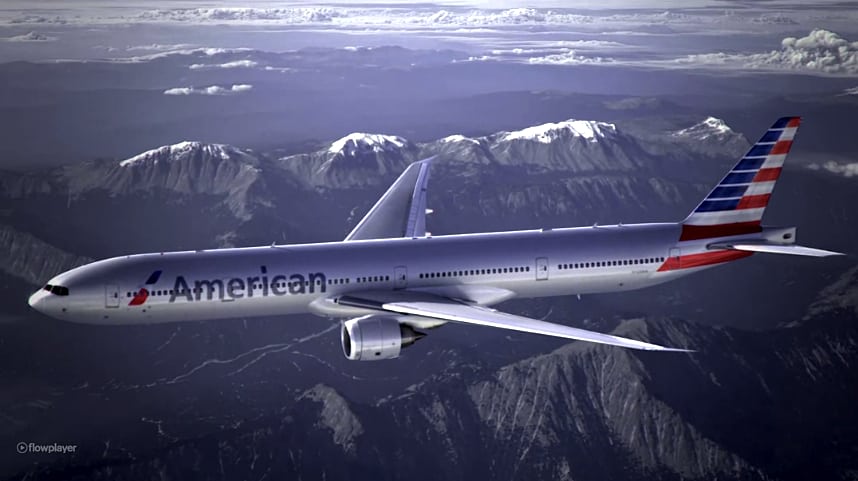
American Airlines has confirmed its new logo and livery designs. CEO Tom Horton announced on a webcast this morning that, “We know there are still big decisions to make about our future,” but the redesign is the next step.
A spokesperson for American Airlines tells Skift the airline started on the redesign two years ago, and it came down to a business decision.
“American Airlines, which is taking delivery of hundreds of new, lighter aircraft with composite materials that must be painted, is unveiling a new livery and logo for its aircraft as several – including the new 777-300ER — must enter service, the spokesperson says.
The airline has several Boeing 777-300ER aircraft waiting to be painted, and it’s taking delivery of 60 additional aircraft soon.
“We knew we had to start painting planes,” the spokesperson says.
Another factor is that US Airways CEO Doug Parker has stated that the American Airlines brand would take the lead in any potential merger with US Airways.
American announced the changes on Twitter too:
We are becoming a #newAmerican. https://t.co/WxgEKkWz
— American Airlines (@AmericanAir) January 17, 2013
In its press announcement about its “new, modern look,” American Airlines describes its thinking behind the color scheme.
“American is preparing to take delivery of hundreds of new, lighter aircraft featuring composite materials that must be painted. Since the polished metal look was no longer an option, the importance of the paint selection became critical to honoring American’s silver bird legacy. Silver mica paint was chosen as a way to maintain the silver heritage which American’s people and customers are passionate about, yet progress ahead with a clean new look.”
And Virasb Vahidi, American’s chief commercial officer, provides more:
Our new logo and livery are designed to reflect the passion for progress and the soaring spirit, which is uniquely American. Our core colors — red, white and blue – have been updated to reflect a more vibrant and welcoming spirit.
The new tail, with stripes flying proudly, is a bold reflection of American’s origin and name. And our new flight symbol, an updated eagle, incorporates the many icons that people have come to associate with American, including the ‘A’ and the star.
And, Horton did put the announcement in the context of the merger, saying:
“While we complete the evaluation of whether a merger can build on American’s strengths, we remain steadfast in each step we take to renew our airline, a step we take with great respect for our name American. Today marks important progress in that journey as we unveil a new and updated look for the first time in more than 40 years.”
The redesign effort was a collaboration between American and FutureBrand, which has images of American’s new logo and livery all over its homepage today, and notes that it also is partnering with the airline “on the overall look and feel of the customer experience.”
Earlier: Enterprising travel entrepreneur Tristan Gatsby Mace figured out the American Airlines’ logo on the airline’s teaser site and we’ve embedded it below. One word: WOW.
![]()
![]()
Here is a 360 degree tour of the new livery:
http://www.flickr.com/apps/slideshow/show.swf?v=124984
For comparison sake, here’s the old logo which has been in use by the airline for the last 30 years:
![]()
The announcement of the redesign of American Airlines’ iconic design is coming at 10 am EST today. This will include a new logo and livery as well. AA CEO Tom Horton will debut American’s new look via a livestream available at www.aa.com/newamerican.
Our previous coverage of impending AA redesign:
- Readying for the imminent American Airlines rebranding
- Please, American Airlines, stop being a tease — out with your new look!
- SkiftDesign: If American Airlines redesigns its brand…
The Daily Newsletter
Our daily coverage of the global travel industry. Written by editors and analysts from across Skift’s brands.
Have a confidential tip for Skift? Get in touch
Tags: american airlines, livery