Skift Take
"Honest to Goodness Indiana" speaks authenticity, and more of a statewide focus than "Restart Your Engines," but forward thinking? We see nothing forward-thinking about the branding or the campaign. Sorry.
Visit Indiana discarded its tourism brand, “Restart Your Engines,” which it has used since 2006, in favor of the slogan “Honest to Goodness Indiana,” which it considers to be more authentic, statewide in focus, and forward-thinking.
Mark Newman, executive director of the Indiana Office of Tourism Development, and Lieutenant Governor Sue Ellspermann, unveiled the new credo and branding at the Indiana Historical Society in Indianapolis February 12.
Ironically, despite the fact that the unveiling of the rebranding took place in Indianapolis, the state’s capital, one of the reasons the tourism office decided to scrap “Restart Your Engines,” which conjures up images of the Indianapolis 500 and its race kickoff, “Ladies and gentlemen, start your engines,” is that officials wanted the new branding to represent all of the state, and not skew toward Indianapolis.
“Honest to Goodness Indiana is reflective of the entire state and for the first time in many years, our consumer brand incorporates all regions of Indiana,” Newman said.
An advertising campaign, using a story-telling platform to highlight Indiana’s diverse attractions and cultural heritage will include placement in 10 regional and national magazines, including Midwest Living, Food Network Magazine, and Cooking Light.
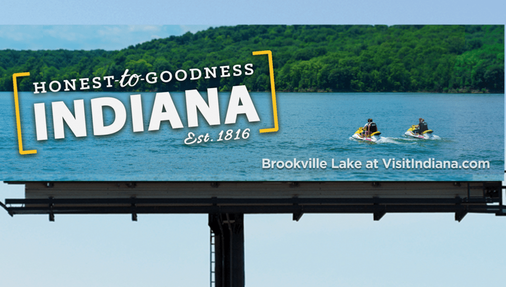
Indianapolis and St. Louis, Missouri, which is an easy drive from the Hoosier State, will also be targets for outdoor billboards, TV and radio advertising, and these will be expanded to other geographic areas as funds allow, officials said.
Williams Randall developed the campaign after consulting with 30 people in government, and the public and private sectors, as well as conducting a consumer survey and focus groups.
Here’s how the tourism office describes the meaning of the new mark:
“The mark, pictured above in the primary color scheme, will have a broad and diverse color palette applied to it, reflecting the diversity of Indiana’s assets. The brackets are intended to give the mark a “stamp” feel; the Honest to Goodness Indiana stamp of approval.
“The logo is intentionally tilted to add playfulness to the design and the 16-degree tilt is a subtle doff of the cap to 1816, the year of Indiana’s statehood.”
Here’s the previous branding:
The Daily Newsletter
Our daily coverage of the global travel industry. Written by editors and analysts from across Skift’s brands.
Have a confidential tip for Skift? Get in touch
Tags: advertising, indiana, marketing, tourism
Photo credit: Billboards are going up in St. Louis and Indianapolis with Indiana's new consumer branding, "Honest to Goodness Indiana." Visit Indiana


