Behind the Redesign of the New Hilton Paris Opera

Skift Take
In 1889 during the first day of the World's Fair in Paris, visitors arriving by boat along the Seine entered the fairgrounds under the newly erected arches of the Eiffel Tower, which had just opened the night before.
Over on the Right Bank near the Paris Opera House, the Grand Hotel Terminus also opened in 1889, adjacent to the Gare Saint Lazare train station where millions of out-of-town folk arrived enroute to the World's Fair. Some of Claude Monet's most respected urban impressionist paintings depict Saint Lazare.
During those early days of the grand hotel epoch, the Grand Hotel Terminus helped to define the spirit of the World's Fair, considered the catalyst that sparked the age of Modernity.
A few weeks ago, the newly reflagged Hilton Paris Opera opened inside the hallowed Haussmann-style building following a $50 million renovation.
So how exactly do you retrofit and retool a 126-year-old Belle Epoque hotel and make it work for today's latte sipping, lobby socializing, laptop wielding business travelers? That is the kind of question that spurred the formation of the Hilton Design Studio in 2012. Understanding that the Hilton brand at the time wasn't immediately synonymous with the hip hotel movement reshaping hospitality, Hilton's senior executives realized the need for a design attitude shift starting from the very top.
The Hilton Design Studio is a platform for in-house corporate designers and architects to work with third party designers and architects. The idea is that a successful global hotel brand today needs the outside input from regional creatives, who are comfortable working within the parameters established by Hilton's design brand standards.
The Studio puts forth a series of academic "design narratives" for different sections of a hotel that inform the interior design and redesign of Hilton properties worldwide. In today's hotel world, the lobby design narrative is by far the most elastic and important.
For example, the pre-existing Le Grand Salon lobby inside the hotel previous to Hilton Paris Opera was an unmitigated disaster and a direct affront on proper Parisian lobby protocol.
"The reception desks were in the back of the Grand Salon so people were crashing right through the lobby space and disrupting the entire atmosphere," says Celia Geyer, senior director, architecture & design, Hilton Worldwide. "The Salon was basically a luggage thoroughfare, so it was really pretty unfortunate.... It's one of our key objectives to understand how lobbies are going to work in the future."
Geyer partnered with Fiona Thompson, principal of Richmond International design firm in London, to recreate the Grand Salon to align with today's guest expectations. The reception desks were moved forward onto the landing above the entrance staircase leading into the Salon. There is less room there but that's not as much of an issue with straight-to-room technology pending.
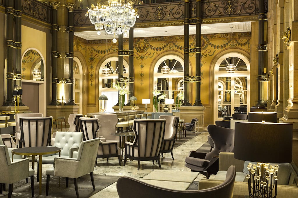
In place of the old reception area, a wall-to-wall bar was designed with Christian Lacroix-inspired fabrics and simple modern lines to provide counterpoint to the handprinted mosaics on the walls and grand Corinthian columns supporting the 46-foot ceiling and massive skylight.
Sitting with Thompson in the Salon, she told us, "First we had to understand what's real and what's not, because there were a lot of layers added over the years, and then we thought about how to make the hotel flow better, and utilizing the space we have in a better way."
The Lobby Redo
We wondered exactly what it's like working with the Parisian office of the French Heritage Society when you're tearing into a landmark hotel in the center of the city.
"The heritage preservation people are actually very positive when anyone is trying to bring a building back to life," says Thompson. "And nobody really knew what was here before because there were no records in terms of coloration or palette."
During the initial phase of stripping the generations of paint, Thompson's crew came upon a lot of garish green and golds, "which of course signify the Victorian era," she says. "But when they peeled everything back there were a lot of terracottas and dark beiges and it was much nicer."
Based on that process, the Grand Salon was then painted colors matching the original, and many small lights were set strategically into the frieze around the roofline to spotlight interesting elements.
Thompson also sourced a few retro Art Nouveau and Art Moderne furniture from the 1940s, '50s, and '60s, which were then fully restored with pale pink, celery and other color leather upholstery. A few brown leather, Danish-inspired Arne Jacobsen "egg chairs" and other one-offs also helped create a richer design experience.
"We purchased quite a few vintage pieces and had those restored so it felt like there was a more layered history in the Salon, so the building wasn't old and then suddenly new," says Thompson. "We very much want this hotel to be as comfortable for Parisians as it is for international travelers."
She acknowledges that Hilton's design team was completely hands off in terms of esthetic choices for the redesign. The Hilton crew is more there to discuss design elements affecting operations as they apply to Hilton brand standards.
Speaking with Geyer, she explains that her lobby design narrative uses various bubbles that expand and contract to show space adjacencies that adapt to different lobby shapes. The bubbles are similar to what we typically refer to as energy zones for people to experience a space how they want based upon their personal preferences.
"The trend in lobby design is to try and activate different areas to create a much more lively and vibrant atmosphere," says Geyer. "The role of lobbies has changed so that makes layouts change. People still want discreet and private spaces, for example, but they also require visual lines to see everybody else in the room."
Greg Oates covers hospitality and tourism development. Email him at go@skift.com.


