Skift Take
Lesson: Always look beyond the signals emanating from early adopters on Twitter.
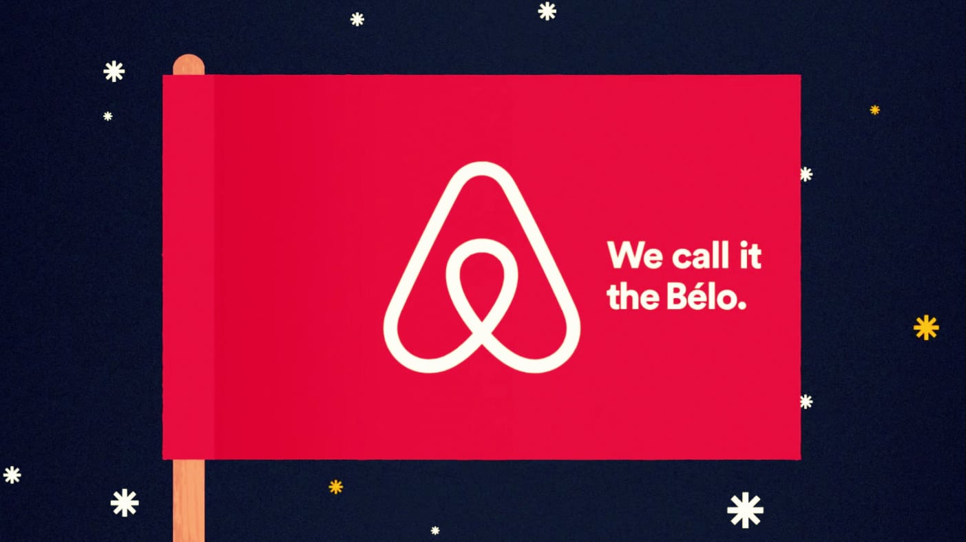
The new Airbnb logo has been the butt of jokes — literally — in the week since it was unveiled, where everyone has a take on what it looks like, from the funny, to the cute to the obscene.
The jokes have been all over social media, especially Twitter, and there is even a Tumblr dedicated to modified Airbnb logos.
But beyond the echo chamber of early adopters who tend to react to redesigns lot more quickly and harshly, what do regular people, current and future Airbnb customers, think? We decided to put that exact question to the general American, and the results are, well, a disconnect from what you’ve heard in reactions so far.
Important: This single-question survey — not served to Skift users — was administered to the U.S. internet population in July 2014, through Google Consumer Surveys. The methodology is explained here. See previous Skift Surveys here.
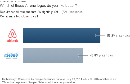
We actually administered the survey twice, with two different versions of Airbnb’s new logo, just to test for design bias, and came back with the same topline result: By a double-digit margin general audiences prefer Airbnb’s new logo. Just over 56 percent of American Internet users prefer the new Belo logo from Airbnb, over to its old speech bubble font logo.
Survey 1 Topline Result:
Survey 2 Topline Result:

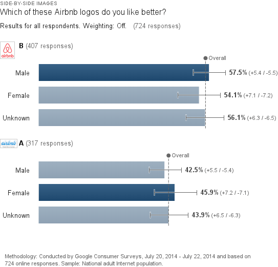
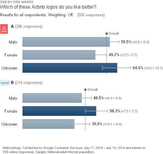
As for the demographic divide, turns out more men like the new Airbnb logo, more women like the old, but the differences again are not hugely pronounced.
Survey 1 Men Vs. Women:
Survey 2 Men Vs. Women:
Dwell Newsletter
Get breaking news, analysis and data from the week’s most important stories about short-term rentals, vacation rentals, housing, and real estate.
Have a confidential tip for Skift? Get in touch