Skift Take
This is the most integrated hotel mobile website we've seen to date. It's designed especially well for people with a phone in one hand, a watermelon cucumber martini in the other, and a desire to shop for spontaneous experiences on the fly while partying by the pool after midnight.
Three months after launching, the new SBE hotels and entertainment website is logging 53% more visits and 86% more page views, driving 500% more direct bookings than the previous website.
Those stats were provided by SBE during an interview with Callie Peck, associate creative director at Sideways Creative in New York, who constructed the new digital platform.
Peck says the primary objectives for the new site were to provide a cohesive shopping experience across all of the SBE verticals, build SEO through content integration and optimization, and drive awareness of the SBE brand.
There has never been a hotel group website with this much information per hotel count designed with such an intuitive and streamlined user interface for mobile. The navigation architecture is ruthless in its efficiency, designed to sell hotel and nightclub product with SBE’s always punchy photography and editorial content relevant to each individual page.
When you need to quickly search the full food menu at Katsuya by Starck at SLS South Beach, the baked crab hand rolls come with a detailed description. The cocktail menu downloads to Evernote, automatically saving it on your phone, which then links back to the dedicated cocktail photo gallery on the website.
If you want to read about the opening of the SLS Seattle on Bloomberg.com, even though the hotel doesn’t open until late 2016, there’s a link for that too.
For the desktop experience, navigation is orchestrated by a main sidebar that pops out from the left side of the screen into the full screen imagery. That is mirrored on the right with the blog tab. The minimalism and symmetry of the two signal the brains and beauty of the site, freeing up screen real estate for the high impact visuals while delivering a highly intuitive user interface that clearly delineates SBE product.
On mobile, the sidebar and blog populate the main dropdown menu.
“One of the challenges we faced was creating a tight organization for an enormous amount of content, and also there’s a big push to introduce all of SBE to a larger audience,” says Peck. “The ability for this sidebar to quickly establish what SBE is was very important to show all of the business verticals…. And it’s a great way to pull people into the site without making a grand brand statement that loyalists are going to have to see again and again.”
As we’ve written about other recent website launches, the “long scroll” is becoming prevalent in hospitality website design, with all of the information for each hotel profiled or previewed in horizontal panels running down the length of one long page.
Peck explains this “hamburger effect” was originally a mobile user interface designed for best possible user orientation, which designers have since defaulted to for desktop.
“Essentially it’s a collection of dozens of websites within one website,” explains Peck. Because there are multiple sites nested inside the SBE wrapper, that allows for dual navigation systems to rapidly jump between properties from the vertical sidebar, or down the page of a specific hotel from a horizontal secondary menu.
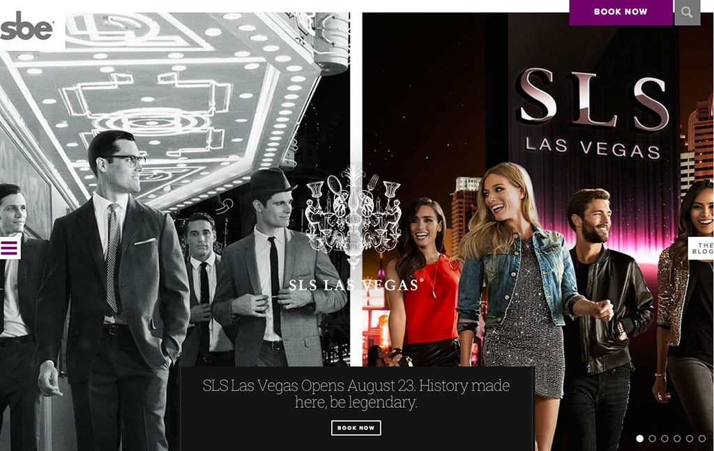
The prioritizing of the mobile site is aligned with the SBE portfolio and “fresh, modern” consumer attracted to a lot of day and night party venues, including all of the SBE nightclubs, lifestyle restaurants, trendy local bars, and upcoming SLS Las Vegas Hotel & Casino next month.
Peck describes the SBE customer as a tech-savvy audience who is always actively looking for spontaneous experiences. That means there’s a lot of opportunity for mobile shopping on the fly across the spectrum of SBE products and events.
Helping close those booking decisions, the blog content is fully integrated with every hotel, restaurant and nightclub page, contextualized by theme. So a nightclub page will pull a DJ story into the browser, while a hotel page might populate with a blog post about luxury travel.
“The intention here is to capitalize on the moment of inspiration,” says Peck. “So if I learn that a great DJ is playing at Greystone Manor in Los Angeles, I can go and make my reservation right then and there. We’re really hoping to capture people with that lifestyle content because that’s what you get access to when you come to an SBE property.”
Social and product review integration is found near the bottom of the pages, just before the blog content and Google Maps. Labeled “Some Like it Social,” the panel toggles between Instagram photos, Twitter streams and TripAdvisor reviews.
Peck explains, “We had to lead with Instagram because the content is irresistible.”
Overall, Peck attributes the success of sbe.com to date to the consistent optimization and integrated content delivery across the full SBE portfolio.
“The brand values for SBE really revolve around the voice they project,” she says. “The key thing of this is we’ve taken all of the independent properties that had disconnected websites, and now we have a very templated hosting platform at sbe.com, so there’s a much more fluid transition and consistent voice.”
Greg Oates covers hotel/tourism development and travel brand media. email/twitter
Have a confidential tip for Skift? Get in touch
Tags: design, sbe hotels
Photo credit: SLS Las Vegas Hotel & Casino landing page SBE