Expedia Homepage Redesign Emphasizes Simplicity and the Mobile Revolution

Skift Take
- The redesign of Expedia.com emphasizes simplicity, photo-led search and responsive design for the benefit of mobile devices.
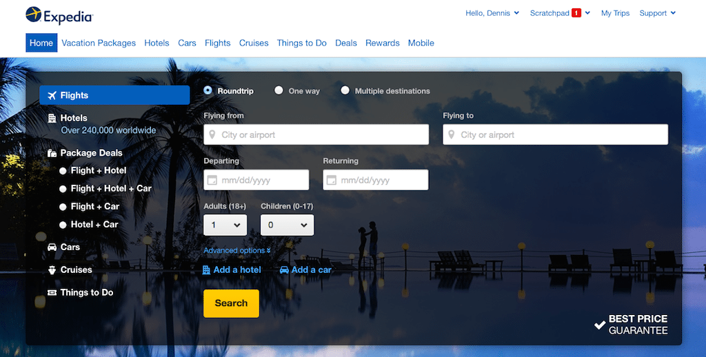
- The top of an older version of Expedia.com (from January 2014) was simple, but very bland and unappealing. Wayback Machine
- CheapOair's homepage design has some parallels to Expedia's -- the look is relatively simple, and the lower portion of the page (not shown here) emphasizes images for easier searching.
- Priceline redesigned its homepage in August 2013 to emphasize Express Deals. It's an appealing look, but there's no emphasis of photos for searching.
- The Orbitz.com homepage is busy, busy, busy. Definitely out of fashion.
Expedia.com trumpeted the official launch of its redesigned homepage, which follows an industry trend emphasizing a simple, uncluttered look.
An important element of the revamp is that it features responsive design so it should have an appealing look regardless if the user is on a Kindle, iPhone, Samsung Galaxy or desktop.
In a bow to Pinterest, Bing and untold others, the lower portion of the page emphasizes photo-led search through hotel and deal images. Just click or tap on the image and a search is launched.
There is a lot of white space on the page, especially below the "fold."
In a plus for the tours and activities market, "things to do" gets prime real estate in two portions of the homepage.
You can view Expedia.com's new homepage, its much-blander predecessor, as well as homepages from CheapOair, Priceline and Orbitz in the gallery above.
CheapOair’s homepage design has some parallels to Expedia’s — the look is relatively simple, and the lower portion of the page emphasizes images for easier searching.
CheapOair redesigned its homepage in May 2013; it features responsive design.
Priceline redesigned its homepage in August 2013 to emphasize Express Deals, and the star power of William Shatner and Kaley Cuoco. It’s an appealing look, but there’s no emphasis on photos for searching.
Do photos enhance or hurt conversion? Expedia and CheapOair, to name two practitioners, are betting on the enhanced-conversion premise.
The Orbitz.com homepage is busy, busy, busy. Although Orbitz says it incorporates responsive design in several ways, the homepage is not yet marching with the simplicity trend. Orbitz last redesigned its homepage in October 2013.
Time will tell if simplicity in homepage design simply turns into bottom-line results.


