Skift Take
Compared to the mishmash it was, this is a big improvement in term of simplifying the look. It still will have to cater to the ornate taste of its royal rulers, so unlikely to ever be hip.
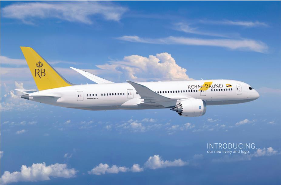
Royal Brunei airlines, the national airline of the tiny nation of Brunei, has gone through a year of restructuring, and it now attempting to raise its profile after. To that end it has launched a new logo and livery/design, modifying its rather ornate-pedestrian look prior to this.
It still retains the signature yellow color (rather close to our own Skift yellow color), but its use has been simplified with only the aircraft’s tailfin and fuselage logo now painted. The carrier has also dropped the “A” from its “RBA” abbreviation, with “RB” now appearing on the tailfin. Some have remarked it looks rather bland now: “Whilst the logo on the side of the plane is brilliant, and understated…the tailfin is sadly really under-developed…The RB lettering is small, and too light, nor is there any real purpose or ‘logotype’ behind the typeface here.”
The new livery and logo is the first step on RB’s rebranding efforts, it said: Over the next year, it will be rolling out a new site and social media presence, new uniforms and new lounge and ticket office environments. To help in that, it recently signed on with media-happy airline branding/marketing consultancy Simplifying.
The completion of the rebranding process will coincide with the new 787 Boeing Dreamliners launching with the airline on Sept 1, 2013, making RB the first airline in South-East Asia to do so.

The Daily Newsletter
Our daily coverage of the global travel industry. Written by editors and analysts from across Skift’s brands.
Have a confidential tip for Skift? Get in touch
Tags: branding


