TripIt streamlines itinerary design for nimble user experience
Skift Take
TripIt redesigned the "look and feel" of travelers' itineraries on TripIt.com to provide for a streamlined user experience.
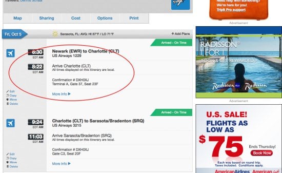
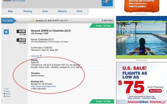
One of the key changes is that instead of defaulting to include details such as connecting flight information, length of layover, aircraft type, number of miles and booking information, users can toggle between "More Info" to show these specifics, and "Less Info" to hide them.
In other words, now you see it.
And, now you don't.
 Ironically, the TripIt desktop redesign, unveiled in a blog post, seems particularly geared toward mobile users wielding small-screen devices, but TripIt's mobile apps have not yet been similarly streamlined.
Other new features of the redesign include the enhanced ability to monitor trip costs in one place, and an easier way to share links about trips on LinkedIn, Twitter and Facebook.


