The 10 Best Designed Tourism Websites in the World 2022
Skift Take
Almost every tourist these days is making decisions about their travels based on what they see online. From themed trips to budgeted food tours, travelers crave previews of potential destinations and surf the internet to learn anything they can about a new and exciting spot.
Due to intense levels of pent-up travel demand followed by impulsive and impatient post-pandemic travelers, tourism website design is more important now than ever before. The competitive space for well-designed websites is more ambitious, and reliance on digital platforms as a dependable resource for travel inspiration is at an all-time high. Looking at the Gen Z traveler, it's easy to notice that attention spans have shortened immensely, and tourists are treating trip planning like a shopping experience, picking and choosing elements of their vacations after engaging in a few seconds of appeal.
With that being said, tourism organizations are slowly learning that the old ways simply don’t work anymore — paragraphs of information on the screen, redirection that continues tab after tab, slow and clunky navigational experiences, depressing color palettes, and promotional descriptions of sites that don’t answer any of the truly important questions, especially for a more conscious traveler worried about climate change, and other threats.
After two years of rapidly-evolving digital growth, several websites have succeeded in breaking out of that dull and repetitive cycle. Here is Skift’s 2022 list of best designed tourism websites — ones that hit the spot both visually and navigationally, and are taking note of what the modern traveler wants, how they think, and most importantly, how they behave.
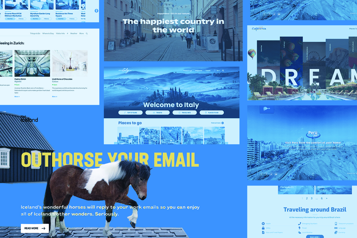
1. Visit IcelandThe clean-cut and minimalistic nature of Nordic graphic design works well to communicate visual appeal, send concise messages with clarity (or humor), and entice further curiosity with minimal effort, especially in the website world. Visit Iceland leads our list with a transitional homepage display, decorated with background images that hover along the page as they overlap and interact with the text on the screen, making the website feel inviting and alive.
As users scroll further down, the website displays excellent examples of utilizing the organized nature of drop-down menus and vertically moving lists. With a clean white background and bold capitalized black font, readers are able to quickly catch sight of wh