Google Flights' New Look Moves Away From Travel Inspiration

Skift Take
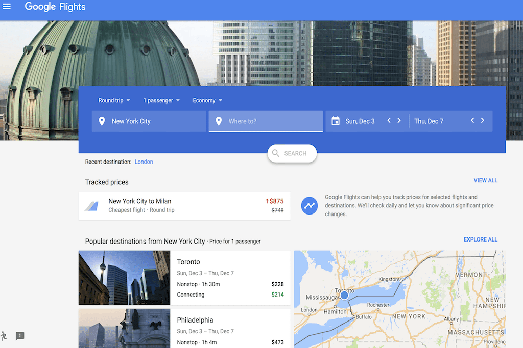
Google made its claim to fame partly on the simplicity of its user interface. Its new interface for flight search is a return to its elegant design roots.
Google began rolling out a new desktop interface for its Google Flights metasearch product in earnest on Friday.
Most users who visit Google Flights in the U.S. on the Chrome Web browser are being prompted to click a button on the right-hand side to update to the new experience. Users of Safari and Firefox were not yet seeing that option as of publication time, but could visit the new experience by clicking this link and choosing the U.S. as their home country.
The design is simpler, with many of the options to customize a search upfront removed.
In this beta test, Alphabet’s Google appears to be scaling back its ambition to inspire people to consider new destinations.
In spring 2016, Google Flights had its last major redesign in which it pushed front-and-center a flexible-destination search interface.
From then until now, desktop visitors to the Google Flights interface would see a prominent "Discover Destinations" box. Users could check out possible itineraries by general time periods (like "January" or "weekend"), location ("Africa" or "Johannesburg"), and interest ("honeymoon" or "winter sports").
The new look drops the box. Forget inspiration. Google