Skift Take

Operators of online travel websites, if they know what they are doing, never finish testing and learning, and always consider their products works in progress. TripAdvisor officials are obviously in no hurry to settle Instant Booking into a consistent user interface that won't confuse the hell out of consumers because they want to perfect it first. Public company or not, they are in no rush despite investor impatience.

Consider the scenario that you are a loyal TripAdvisor user, always scoping out its consumer reviews of hotels before choosing where to stay, and you’ve even booked a hotel on TripAdvisor without leaving the site or app using what the company refers to as Instant Booking.

Comparison-shopping using metasearch sites or features such as on TripAdvisor, Kayak, Google or Hipmunk can be confusing enough for consumers who often think they booked on Kayak when they clicked a link and actually booked through Booking.com or Hilton.

But the loyal TripAdvisor user who wants to book on TripAdvisor — let alone the consumers who have no clue where they are booking when clicking around metasearch sites — could have a dizzying experience trying to find the TripAdvisor booking option because it is presented in a divergent way, each time they return.

And the book on TripAdvisor option, which most of the time isn’t branded as such in initial search results, even varies from hotel listing to hotel listing.

TripAdvisor’s stock price has been halved over the last year and was trading in late December at around $46 per share, just above its 52-week low, as it labors to get the Instant Booking feature humming even as the company just had a big win in drawing Expedia into the fold.

TripAdvisor’s goal is to retain metasearch and the click-based revenue it generates, but to transform itself into more of a booking site. Becoming a book site would presumably be a more efficient option in light of the proliferation of mobile devices. TripAdvisor seeks to tip its balance sheet toward commissions from bookings instead of merely click-based revenue from referrals.

So TripAdvisor is aggressively testing this book on TripAdvisor feature, and there are countless experiments under way at any given moment, but this must be very confusing to both casual and avid users.

Let’s take a look:

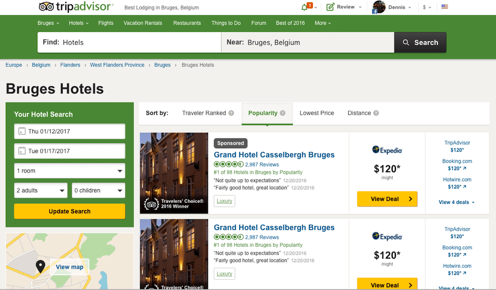
We searched for a hotel in Bruges, Belgium on TripAdvisor’s desktop website for a January 12-17 stay.

Consider the listing below for the Grand Hotel Casselbergh Bruges. The center column of the listing features an Expedia rate of $120 per night with a prominent View Deal button. The TripAdvisor booking feature — in this case through Booking.com as the fulfillment partner, although consumers wouldn’t see it on the main results page — is tucked away at the top of the right-hand column in smaller print than the Expedia logo.

The prices for the four websites in the Grand Hotel Casselbergh Bruges listing above, namely Expedia, TripAdvisor, Booking.com and Hotels.com, are all the same, $120 per night, and there is nothing to tell the consumer that they can click on the TripAdvisor option and book right on the site without having to navigate away, as consumers would have to do if they selected Expedia, Booking.com or Hotels.com.

In the Hotel Prinsenhof Bruges listing above, the TripAdvisor booking option, this time in partnership with its own Jetsetter unit, is handled similarly with the same placement and no special branding or designation. In this listing, there are a few differences compared with the Grand Hotel Casselbergh Bruges display on the metasearch end of things, such as the $127 Expedia rate, replete with a strikethrough price of $169, being dubbed Top Deal in a bold red. Booking.com’s $169 price, which is $42 higher than its competitors’ rates, is flagged in red, and customers get to view five deals in total on a landing page as opposed to just four for the hotel listing above it.

Things get more interesting for the TripAdvisor booking feature when looking at the listing below for the Hotel Dukes’ Palace Bruges. Now, instead of the TripAdvisor booking option being tucked away atop the right-hand column, it is featured solo in the center column. The TripAdvisor logo is displayed along with the words “with Hotel Dukes’ … ” as the booking partner.

This book on TripAdvisor option — as opposed to the click and navigate to partner websites in the right-hand column, features a $156 rate, which is $2 lower than the listed competitors’ prices, and the TripAdvisor booking option is supported by the yellow Book Now button. Prices mean everything in hotel search so the $2 discount might entice bookings. The right-hand column touts seven deals instead of the four or five shown for the previously discussed hotels. That’s another variable for TripAdvisor to consumer when trying to perfect these listings.

In the listing below for Hotel Ter Duinen, the unlabeled book on TripAdvisor option, with the reservation and customer service handled in the background by Booking.com, reverts from the featured center-column position and logo treatment to its position heading the right-hand column. Remember: In the booking game, little things mean a lot. So in the Hotel Ter Duinen listing, the TripAdvisor rate is $142 — a dollar lower than the rates presented by Expedia.com, Orbitz.com and Hotwire.com (and these three brands are all owned by Expedia). Is $1 a difference maker? TripAdvisor assuredly has the answer but is testing things out anyway.

In the Flanders Hotel listing below, the book on TripAdvisor option again gets logo treatment in the center column, but this time with a logo for booking partner Booking.com, too. The rates for the four deals are all the same, $124 per night. So when a consumer views this display, what would be the advantage in selecting TripAdvisor with Booking.com for $124 versus selecting the Booking.com option for $124? There’s no visible reason for the consumer to book one or the other, although TripAdvisor would likely prefer that consumers select the TripAdvisor with Booking.com option, which gets favored treatment.

In the above display for Hotel Heritage – Relais & Chateaux, the Book on TripAdvisor option gets no partner citation (consumers would learn the booking partner is TripAdvisor’s own Tingo unit after selecting the Book Now button) as it does for the Flanders Hotel above it, where the display indicates that Booking.com is the booking collaborator.

Which one converts better? We’re guessing that this is one of the points of the exercise.

To make these hotel displays even more perplexing, the listing below for the Hotel ‘t Keizershof has no option for booking on TripAdvisor. These are all metasearch links to navigate to the partner sites to make the booking. And here is no option to view all the deals on a subsequent pages as there was on all the other listings discussed above.

That’s another variable for TripAdvisor’s engineers to ponder. Or perhaps TripAdvisor didn’t have a booking partner available for this property or maybe the company merely wanted to test the metasearch-only option for whatever reason.

TripAdvisor is obviously obsessed with testing and trying to optimize its booking/metasearch features.

CEO Stephen Kaufer, playing the long game, is in no rush to turn off the experimentation frenzy to please impatient investors — or journalists.

Perhaps one day consumers using TripAdvisor websites and its mobile apps will know what to expect when looking to book a hotel on the site. But for now the varying booking/metasearch options are consistently inconsistent.

Have a confidential tip for Skift? Get in touch

Tags: metasearch, tripadvisor, user experience

Photo credit: TripAdvisor's hotel search is a mix of metasearch and booking options, and the display variables are too numerous to count. TripAdvisor

Up Next

Loading next stories