And Here's the New New Skift

Skift Take
You know you're growing up when you go through your first rebranding exercise.
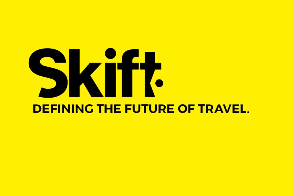
And so here it is, the new new Skift you see in front of you: new logo, new site design, new color scheme, and overall new brand identity.
Now that we are a multi-product company spanning two continents (and more to come), we realized we needed a simplified and cohesive brand that shows the boldness of our ambition. We especially needed something that matched our rather audacious tagline: "Defining The Future of Travel."
And so we did. Working with our longtime design agency DesignRocket, what you see is what we came up with.
We have changed everything: the Skift font is a new modern minimalistic custom font; the iconic Skift yellow color is now a brighter shade (and actually closer the original yellow color that we launched with four years ago); the Skift tag is now a tucked into the "T," and we are using a modern version of the logo with angular lines for various iconography around the site and our products.
 For me, what sealed it is this image on the right, the playfulness of the new logo -- how great it looks blown up large size -- and what we can do with it in imagery and iconography across all our current and future products.
And instead of us giving you psuedo-design speak about how we came up with this new look, we are posting the full final design document from our branding agency explaining the rationale of our new look and uses of it for us. Send me bouquets and brickbats at ra@skift.com, we can take it all.
P.S.: Thanks to the awesome work from Kajal Gala and her team at DesignRocket, and our developers Johnathan Ross, Mike Linden, and Rachel Bronstein!
[gview file="https://skift.com/wp-content/uploads/2016/09/skift_brand_guidelines.pdf"]


