Interview: The Design Journey of Eurostar's First New Trains in Two Decades
Skift Take
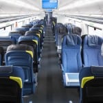
- The coach cabin of the new Eurostar e320 trains/Digital News Agency for Eurostar
- The lounge of the new Eurostar e320 trains/Digital News Agency for Eurostar
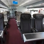
- The premium cabin of the new Eurostar e320 trains/Digital News Agency for Eurostar
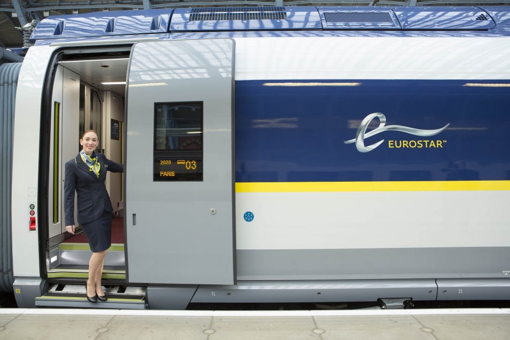
- The new Eurostar e320 trains/Digital News Agency for Eurostar
- The livery of the new Eurostar e320 trains up close and personal/Digital News Agency for Eurostar
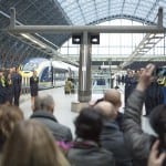
- Gathering for the reveal of the new Eurostar e320 trains/Digital News Agency for Eurostar
Eurostar revealed its new state-of-the art e320 trains at St. Pancras station on the eve of its 20th anniversary, with much fanfare and media attention.
Enthusiastic rail fans across Europe have long-anticipated this reveal. The very name Eurostar is revolution: the final conquering of the channel divide. Eurostar has set itself a high bar for innovation, and the technical features of the new trains do not disappoint.
The e320 trains carry 900 passengers and can reach speeds of 320 kph (200 mph). We will be able to enjoy free Wi-Fi throughout, complete with an infotainment portal to help pass the time—if just being on the train is not enough. There is a new bar buffet, and ergonomically designed reclining seats, increased legroom, and increased luggage areas.
The Big "But”
We interviewed the Christopher Jenner, the designer of the new romantic St. Pancras ticket hall, characterized by elements of the Victorian and the Art Nouveau. At the time, we had a peek at what--Jenner emphasized--was only a concept cabin. One which, none-the-less, attracted with its blend of future past—an elegant, refined “flight of fancy,” in the words of the designer; a Steampunk vision of sunshine to us.
Its only flaw, a major one: impractical. This was something the designer acknowledged. It was, after all, not intended to be realized, only to be dreamed about.
When were granted the opportunity to interview Fabio Filippini, Designer of the renowned house of Pininfarina, we were beside ourselves with excitement. This is the design firm which legend Sergio Pininfarina built from his family business Carrozzeria Pinin Farina, in the 1950s. Along with a long and enviable list of accomplishments, Pininfarina has Ferrari caché—a flasher form of fast transport.
He granted us a unique perspective: that even the most ambitious and the most talented designers, have to be constrained to deliver a viable product. We also learned why, in the end, that's not such a bad thing.
We'll let Filippini explain in his own words.
Skift: You have a very established and respected design language. How is it reflected in the Eurostar experience?
Filippini: In fact, when Pininfarina design something, for whichever customer, we always have a specific design touch which comes from our DNA. The DNA of Pininfarina design is based on key important values which are: elegance, purity, and innovation. We always try to integrate those three elements. We don't want to do design that is just fashionable at a certain moment and follows some trends. We want to do design that lasts.
That is even more important in terms of trains or public transport, because a train should live a very long life. It shouldn't be something which, within years, is out of fashion. We fully respected that aim on this project. In the meantime you have a certain measure of elegance which is typical of Pininfarina. For example, the range of colors are very subtle, very sophisticated. The medium warm grey, cobalt blue, the matching of them, the little stitching in green. These are details which express elegance and that, again, is a typical aspect of the Pininfarina design touch.
Skift: What were the major experiential the elements you wanted this is design to communicate?
Filippini: Actually, our focus was on individual comfort—giving the customer the feeling of having a personal private space. It comes from the presence in every class, even the standard class, of a certain amount of functional accessories, associated with each seat. That goes from power point plugs to personal lighting, to cup holders—to all those typical features you get, for example, on an airplane rather than on a train. Then, also, the emotional and sartorial feeling of your own personal space.
The different colors that separate your visual space from the visual space of the other passengers..a human craftsmanship touch. For example, you have the headrest which is made with ecological leather, with a little stitching detail in a different color. [It] creates an extra feeling of handmade craftsmanship quality. From those little details, you get more comfort. The seats are ergonomically configured, and you getter space because the seats are lighter and thinner. You get extra legroom, but you also get visual comfort from the color and all of those little details.
Skift: How did these design elements communicate the Eurostar brand?
Filippini: Eurostar is more than just a simple service of transportation. It's something that completely, twenty years ago, transformed travel from England to the rest of the Continent. It's a very unique service that also created a better union among the different countries of Europe. We wanted to make sure that our design expressed a more warm and social aspect, not just a purely technical transportation. It isn't imagining trains as a simple means of transportation. It's more about people. It's more about socializing. It's more about the experience of traveling through the different countries.
At the same time they have their own identity, their own colors. For example, the blue and the yellow which was very bright and vibrant colors in a more subtle and elegant combination because we added two tones of grey on the of the livery, which makes a more refined and more sophisticated feeling. It integrates the different functional parts of the trains. The windows are all integrated, so you don't see each element separately, but you see a stripe all along the train and the coaches. We could say that Eurostar tried to integrate the different colors in Europe and we tried to integrate all the different elements in a more coherent and smooth and elegant aesthetic expression for the train.
Skift: What challenges or limitations did you find in designing for mass transport, compared to some of the more bespoke and high-end luxury products you've worked on?
Filippini: Interiors and even the livery for the train is always a challenge because of the safety regulations [and other] constraints: durability, ecological aspects. For a public transport, like the train, [these] are very extreme. What is interesting in the work of design is being able to match those rational, practical and economic and functional expectations with that extra feeling coming from the emotional aspects and the visual aspects.
That's what we tried to do best on this train: answering those functional aspects and those strict regulation expectations; at the same time offering an extra emotional feeling to it. That goes onto the choice of the color of the material, of the rhythm of the color we put on the interior design. Just by having an alternate row of seats with two different colors, instead of a simple one single color for all the seats on the coach—that's a very simple example. Just in those subtle colors we offer a practical functionality: recognizing your seat [after you've gone] for a while.
You come back and immediately you know you're on the grey seat rather than in the blue—instead of finding a long row of seats that are the same. This goes to your personal comfort because you feel that you are in a space that is yours, because the color is different from the one in front of you. You create a visual rhythm in the coach, which is emotionally more interesting than when you [have] monotone color all around the coach. These are the sorts of constraints that make the challenge of this project very interesting.
Skift: What about financial constraints?
Filippini: That's typical of these public transport projects, but that's almost on every project. Even if you do a hyper-luxury car, you have economical constraints. You know American designer Charles Eames said in the '50s: "Constraints are the best friend of the designer." That is our job to find the right balance between the functional, economical and emotional aspects.
Skift: How does this compare to the passenger experience on other forms of transport, such as aviation?
Filippini: If you look at the evolution of trains design and train services in the last 30 years, and you look at airplanes they're almost getting closer and closer. Trains start to offer services that concur with airplanes. Trains especially have evolved from a simple transportation service to [something] more cosy, more luxurious. [You have] different services, which are more about the experience of travel, rather than just offering you a simple transportation.
The universe of aircraft interiors is the most immediate reference to take, to introduce this class of feeling of experience in travel. That's why the quality of the material, the quality of the shape, the quality of lighting, the quality of plenty of little details that function to create your own personal space, are very similar to [what] you get when you are on Business Class on an airplane.
Skift: How does the design reflect and embody other technical featureless introduced on these trains, the speed and connectivity?
Filippini: All of those aspects like connectivity and functional elements, electronics, and more interactive aspects are part of the experience of travel. [They are] also part of the common life of every customer. The most important thing is to integrate them in the most natural and sophisticated way. Not something [where] technology or communications are invading our personal space.
We wanted to make sure that all of those possibilities are there, but integrated. Not a multiplication of complex things. We wanted..all this complexity and new technology..smoothly integrated [in the] overall experience of travel. You have information when you need it. You have comfort when you need it. You have the plug-in area when you need it. But if you don't need it, you don't even realize that it's there. It's something subtle, discreet, understated. It should be a human approach to technology, and not just technology for its own sake.
Skift: What are your favorite features of the design?
Filippini: Actually, the bar and the toilets are very nice. They become a more integrated space. They go much farther than the usual functional aspects. [At] the bar you feel you are guided by the different colors, by the different shapes. There are very smooth surfaces. All the partitions, all the common areas have surfaces and volumes that are smooth enough to favor the flow of the customers, without becoming rigid and dangerous that you can [bump into]. [It amplifies] the feeling of socializing, of being in the middle of a smooth and human experience.
The bar is also a completely integrated design that announces the flow of [passengers]..creating a relation and a more effective service. The other important [feature] is [how] the different colors on the seats create a rhythm inside each cabin, which also has a very strong impact on the perception of the space in the cabin.
