Inside Scoot Airlines’ Clever Copycat Branding Kit for Spirit Air
Skift Take
Last week Scoot CEO Campbell Wilson called out on Facebook fellow low-cost carrier Spirit Airlines for being too inspired by Scoot’s branding and advertising.
Scoot, which flies throughout Southeast Asia, had long used a combination of yellow and black for its livery and was known for an informal, slightly edgy approach to advertising. While Spirit had long had its own slightly offensive approach to advertising, it wasn’t until last September when it ditched its traditional colors for a brand that looked much more like Scoot.
In his Facebook video, Scoot’s CEO offered to send Spirit CEO Ben Baldanza an official Scoot branding kit to help the airline finish off the job more effectively. Thankfully, he also sent Skift the kit.
“We could be brothers from another mother,” Wilson writes in an enclosed letter to Baldanza.
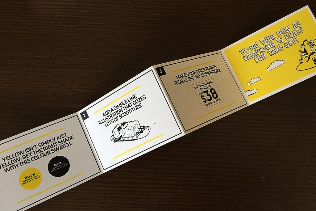
There’s a handy “How to Make a Scoot Ad in 5 Minutes” brochure, as well handful of cards comparing the two airline’s very similar ads and websites, and tracing paper that Scoot suggests Spirit uses in the future to speed up the copying process. “Your website and ours could be long-lost digital twins,” Wilson says.
Even more helpful, Scoot includes its brand identity kit, which explains every aspect of the airline’s branding, from the Pantone shade of yellow it uses, to the correct fonts, to the types of photographs acceptable in its marketing efforts.
Spirit has yet to comment on Scoot’s efforts to draw attention to the similarities, but we’re expecting something both cheap and clever if they do.