Inside Look: Behind Kimpton Hotels’ Complete Digital Overhaul

Skift Take
- Kimpton Karma rewards program
- Kimpton Hotels homepage
- Kimpton Hotels homepage
- Kimpton Hotels homepage
- Kimpton Hotels meetings page
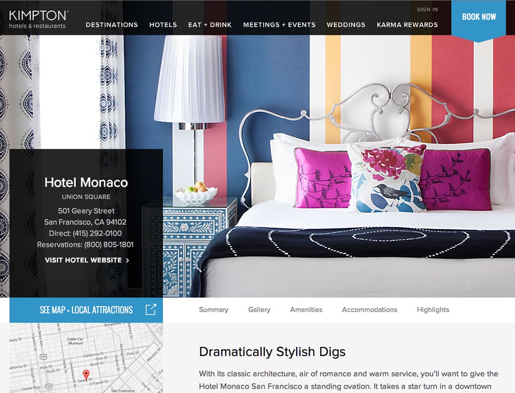
- Hotel Monaco Union Square, San Francisco page
- Surfcomber Miami hotel page
- General information page
- Kimpton Hotels’ Life Is Suite blog
- Dirty Habit Bar, San Francisco
Kimpton Hotels launched an all-new version of its website this morning, designed by the San Francisco-based FINE agency, following the relaunch of the hotel group’s Life Is Suite travel blog in June.
Kimpton reached out to Skift for an advance look to highlight some of the changes.
According to Kathleen Reidenbach, SVP of marketing at Kimpton Hotels, the focus of the new website and blog goes beyond just being more photo-centric and more streamlined in its navigation architecture. She says the new Kimpton platform is an attempt to make viewers feel something on a deeper personal level, engage them on a year-round basis, and most importantly, make people smile.
“Our goal was to ensure that our digital experience really matches and aligns with the hotel experience, or the feeling you have when you walk into one of our hotels,” says Reidenbach. “Anyone can put a great website together that has glossy pictures and cool content, but does the website and blog make you smile? We want to make sure that the love affair that occurs between guests and Kimpton is happening when you plan your next trip.”
To begin the redesign process, Reidenbach and her crew looked at the primary brand values—”different, original, down-to-earth, healthy, simple and carefree”—and started working backwards.
Kimpton already had strong brand recognition and loyalty, and its differentiators are well communicated. Reidenbach says the goal with the new website and blog revolves around “sharpening the pencil a bit,” and establishing or maintaining guest engagement better on a year-round basis via the ramped up blog content.
The trick was aligning the website design and content with Kimpton’s stylish, casual sophistication, while keeping things fresh and fun.
“For our approach in terms of design and content, we looked at ensuring that those values came across, and you’ll notice that a lot of them are very feeling words,” says Reidenbach. “We really feel our purpose statement, our ‘why’ for Kimpton, is that we want to make a difference in people’s lives. And you see that when you read through our TripAdvisor reviews. About 80-90% of them say, ‘This is how you make me feel’…. So when we started looking at that, it really opened up our minds.”
Step one was bringing the travel blog up to standard both in terms of design and content. The new iteration is more dramatic and visual-first in its delivery, and the content is more indepth with a 50-50 split between hotel and destination editorial. The non-hotel content is further split between travel information, such as the top ten places to go for bike rides near a hotel, and lifestyle-oriented posts with actionable takeaways like a summer pasta recipe from Savannah.
In order to build up the blog content, Kimpton retained an initial stable of 16 content producers around the country, some of whom include hotel staff, with more content providers expected to be contracted in the future.
Previously, each Kimpton hotel had a “Live Like a Local” page where the staff supplied insider tips about things to see and do in the destination. That has been discontinued, which we have reservations about, but Reidenbach insists those employee suggestions will now be funneled into the blog.
“The Life Is Suite blog allows for us to get a little more personal, and to integrate ourselves into the lives of our guests,” explains Reidenbach. “When we think of the Kimpton guest journey, we don’t think about it just as the 2.1 nights you’re staying with us at the Eventi in New York or the Rouge in D.C. We think about the Kimpton guest journey as a 365-day experience. And we feel that we have an opportunity, and we feel we take responsibility, for providing a role in the lives of our guests and our employees.”
With the editorial supply chain in place to build a content repository now embedded within the KimptonHotels.com backend, phase two of the website redesign will organically push blog content related to each hotel into the specific hotel pages.
We asked Reidenbach how Kimpton decides on editorial direction.
“We’re pulling from studies we’ve done on Kimpton guests and their psychographic behavior and buying behavior, and how they’re living their lives,” she says. “For Kimpton guests, compared to those guests of our competitive set, they over-index in things like health and wellness, and pets, and wine and travel, and it’s also really important to them that they have a local experience.”
Additionally, Kimpton’s customer base is almost 75% business travelers, but you won’t see a lot of posts about points and miles. Reidenbach asserts that Kimpton business guests are looking for much the same type of experiential travel info on the blog as leisure travelers.
“Business travelers tell us, ‘I like staying at Kimpton because I’m looking for an experience,’” Reidenbach says. “We’re hearing they want to learn something…. So I think that experiential business travelers love to learn about things like our Wines that Care program, for example, that have a really cool story. That’s the type of content where someone will say, ‘I feel like I learned something. I feel like I’m a better person after having stayed with you.’ That’s sort of inherent in what we do.”
Connecting The Dots
The new Kimpton platform employs a flatter architecture than before, with most of the information for each section of the hotel experience placed on one long page, versus individual pages. The exception to that is for the hotel restaurants, which have dedicated pages with detailed info and OpenTable reservation functionality.
That one-page design is standard practice with next generation hotel and travel websites because people are more inclined today to scroll than click with mobile devices.
We spoke with Lisa Demoney, senior director of digital marketing and media at Kimpton Hotels, about some of the motivations behind certain design strategies.
“We thought really carefully about how people shop online and use different devices, how they’re going to be researching things while they’re watching TV, and how people like to swipe,” she said. “This whole thing about above the fold is kind of irrelevant. Tablets have just completely changed the way that people interact with digital.”
Demoney and her team made the site much more visual and interactive with full sleeve images and floating action panels, along with warmer backgrounds and subtle component color changes to correspond with the hues in the main photography.
“We really wanted you to feel like you’re ready to have a sip of that soup or you’re sitting in that particular lobby,” says Demoney. “We know the guest journey starts well before walking through the front door, and we look at KimptonHotels.com as really the digital front door to Kimpton. It’s the first place that people will often get to know the brand.”
Previously, travelers shopping on the Kimpton site would explore the different hotel pages throughout the portal for a cursory overview. Then, if they were interested in more indepth information and photography, they would go to the independent, standalone hotel websites.
With the new site, Kimpton wanted to provide the full shopping experience within its own platform. Strategies to accomplish that include more visible third-party validation and reviews on the hotel pages, a full-width slideshow with much more updated photography than before, Google Maps, a series of hotel “highlights,” and eventually, relevant blog content.
“There’s just this overwhelming amount of places to research travel online, so we want to help connect the dots and make it easier for people when they’re looking for information about Kimpton, to find it, recognize it and feel comfortable with it,” says Demoney. “It’s confusing if you go to a bunch of different sites and it doesn’t make sense as a whole.”
The goal is also to bring the Kimpton brand a little more to the fore, wherein the past that was sometimes diffused during the research phase. Viewers, for example, came across pages for the Kimpton-operated Monaco and Palomar hotels without realizing they were Kimpton properties.
The final phase of Kimpton’s digital evolution will target the individual hotel websites. They’re scheduled to be redesigned to look and feel similar to the main Kimpton site, but not duplicated exactly. The standardization process will especially focus on things like the navigation menus and booking engines to align them across the board.
Eventually, the individual hotel websites will also host relevant destination content from the Life Is Suite travel blog.
“We kind of did things backwards, we were one of the first hotel companies to focus on the individual hotel sites and build those out early, so we have this amazing visibility with the search engines that we don’t want to lose,” says Demoney. “And now as we bring the Kimpton site fully around, and shine a spotlight on the brand, we want those individual sites more to complement the brand site.”
Greg Oates covers hotel/tourism development and travel brand media. email/twitter


