
Dramatic redesigns have defined travel sites during the past five years, many of them for the better while some haven’t dispelled the clutter completely.
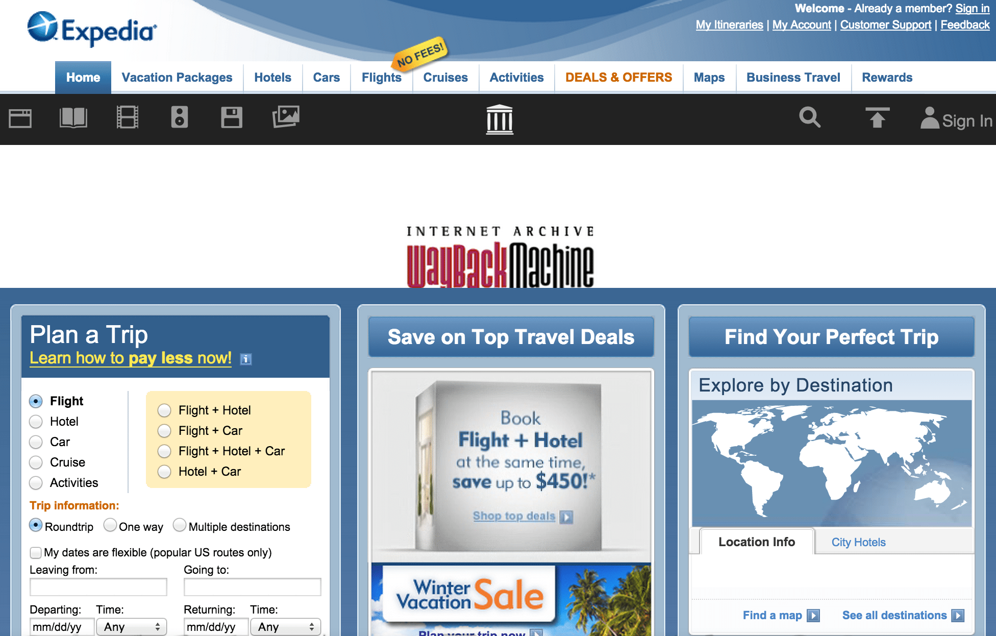
Simplicity best describes the overarching theme of how sites have evolved since 2010, moving towards showing users the search and booking fields first and then letting them scroll down to find more. Exhibits A, B and C: Expedia, Priceline and TripAdvisor- these three sites now have clean designs at the top of their homepages clearing away confusion and making the search and booking fields the focal points.
The messaging, or slogans, of these sites have of course changed along with how the sites grew during the past five years. TripAdvisor.com now says it’s the place to “Plan and Book the Perfect Trip” in its main search field when in 2010 “book” was absent.
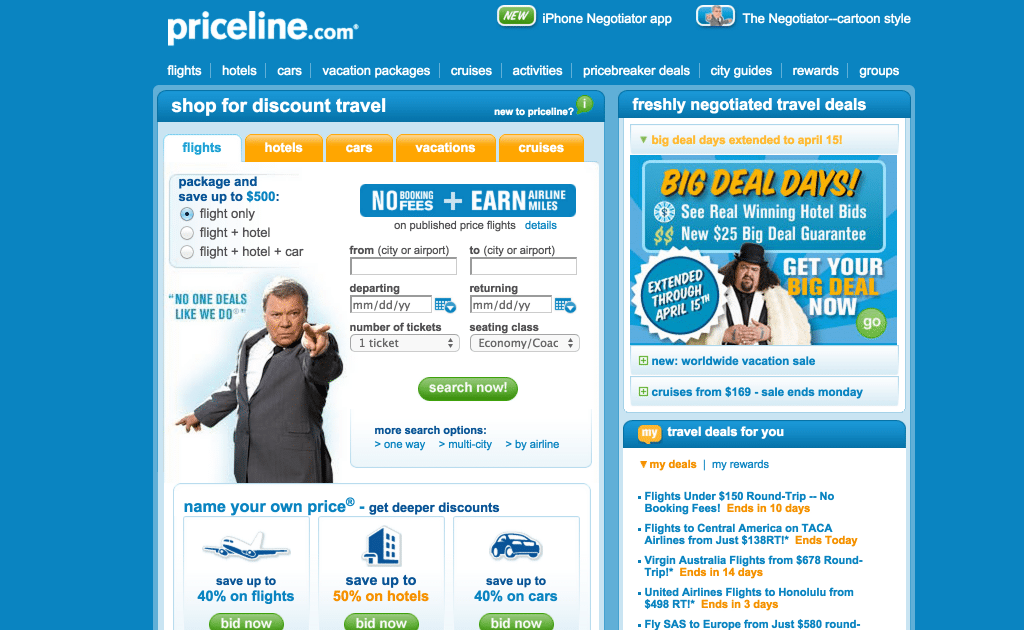
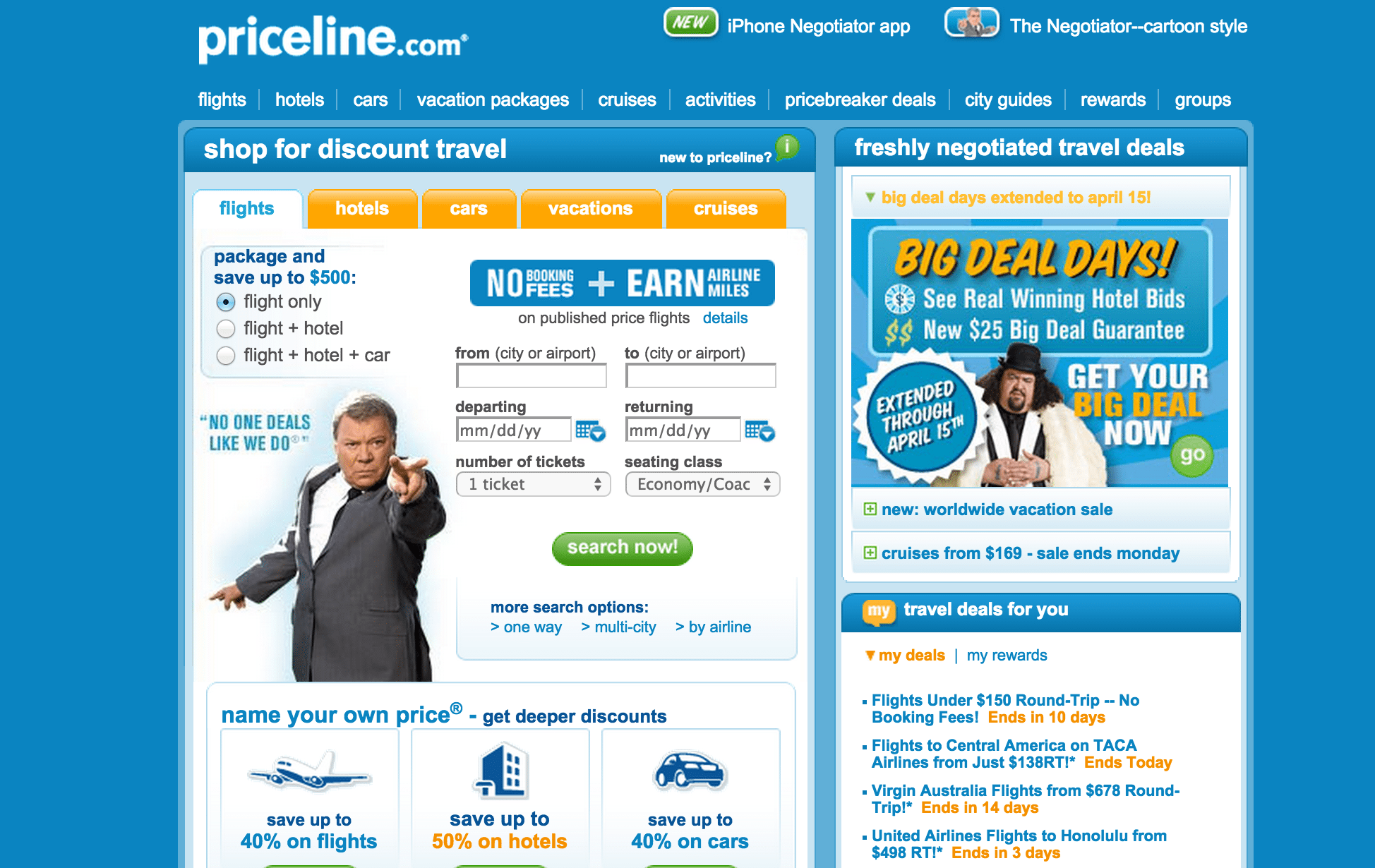
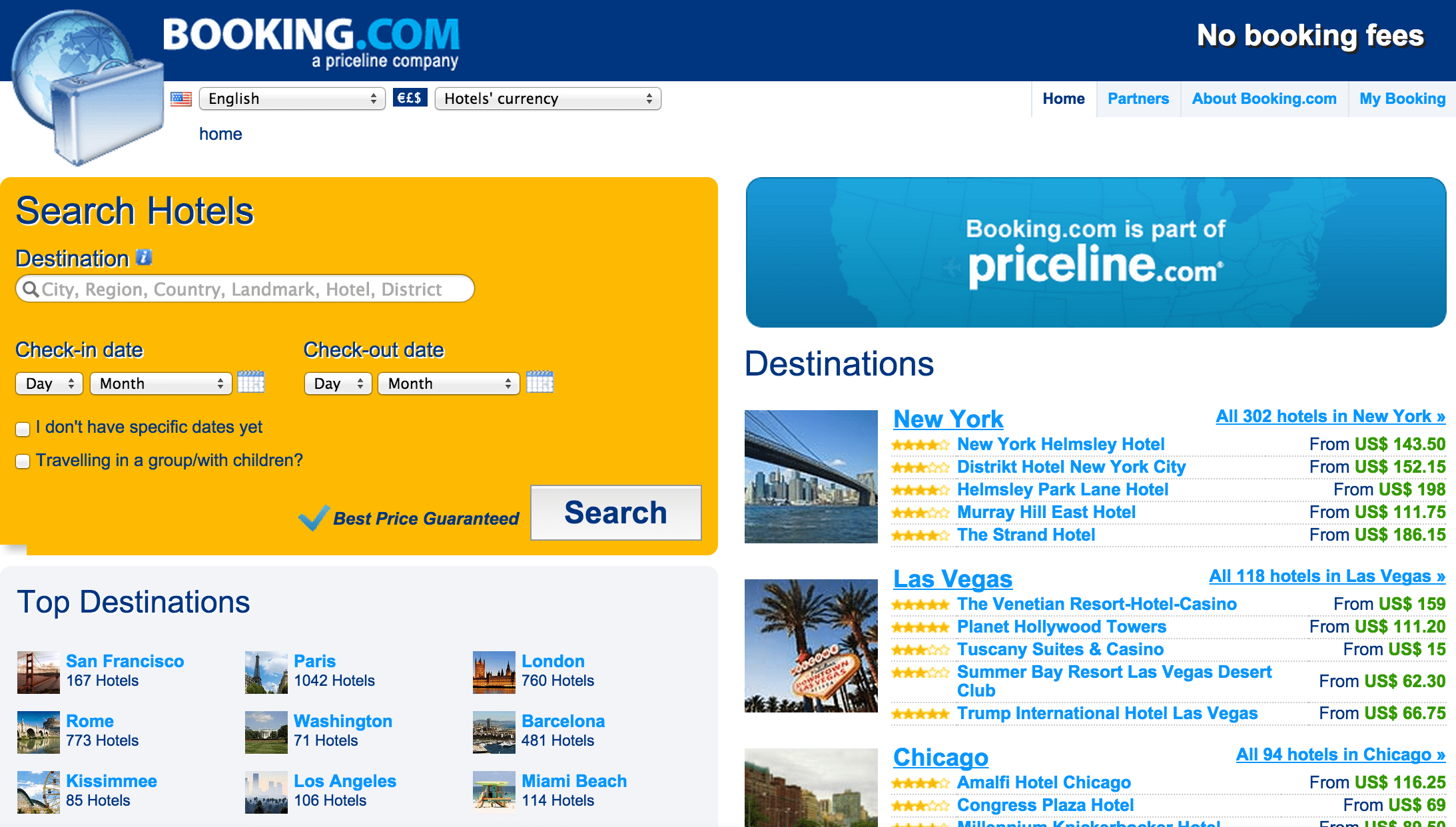
In 2010 Priceline.com said users could “Shop For Discount Travel” above its main search field and in the same place in 2015 it says “Search and Save on Hotels.” Booking.com did the opposite, removing “hotels” from its messaging in the main search field to read “Find the Best Deals” and in 2010 it said “Search Hotels.” This change likely reflects the diversification of accommodation types Booking.com now offers.
These booking sites were founded much earlier than the person-to-person travel sites generating buzz, and headaches, in cities around the world. Airbnb and Uber were still in their infancies in 2010 and their sites at that time certainly reflected it. To be fair, Uber is an app and not meant to be experienced on desktop but its homepage still illustrates how the sharing economy has grown up in less than a decade.
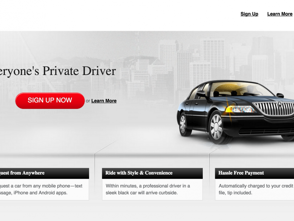
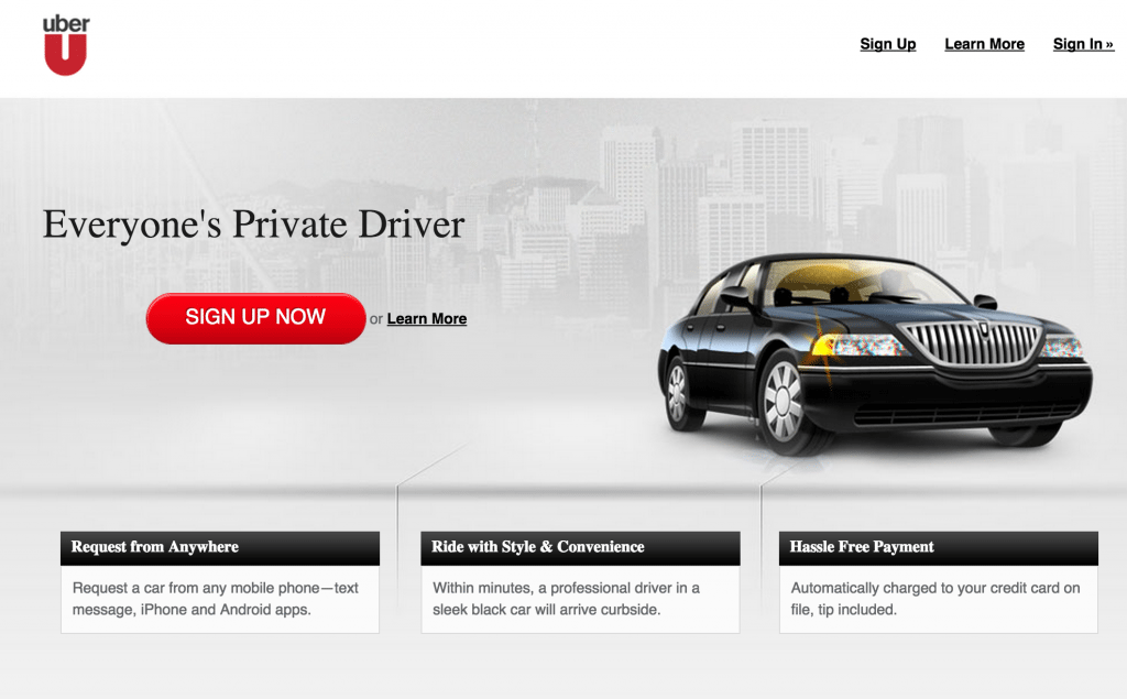
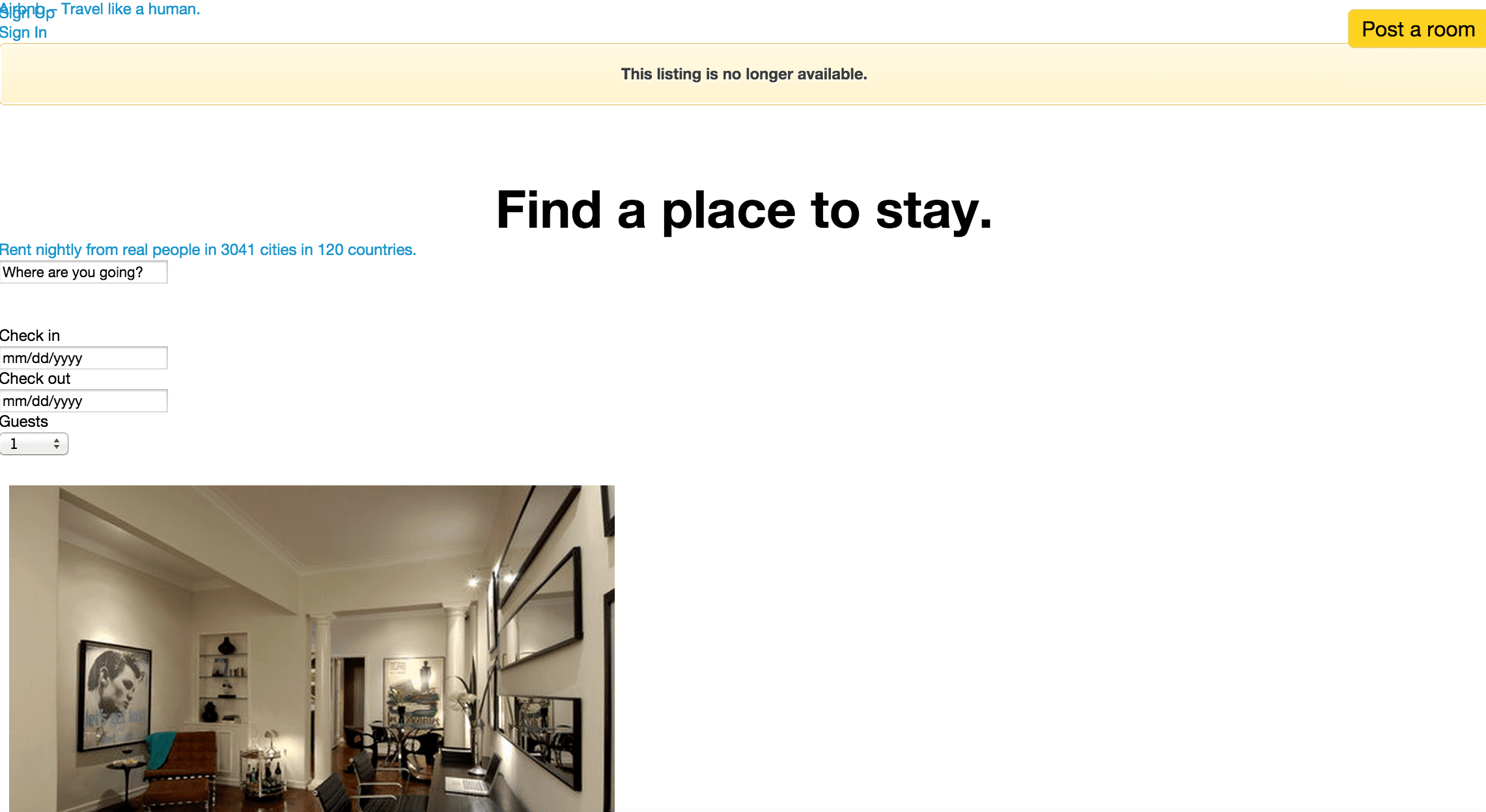
Both companies’ homepages sold services in 2010, with Airbnb prominently stating it was where users could “Find a Place to Stay” and Uber was “Everyone’s Private Driver.” In 2015 both sites obviously still sell services but also sell lifestyles, a trend that’s proliferated across all travel sectors. Airbnb’s homepage now greets visitors with a “Welcome Home” and Uber is “Your Ride, On Demand,” making these services seem more accessible and appealing to large audiences.
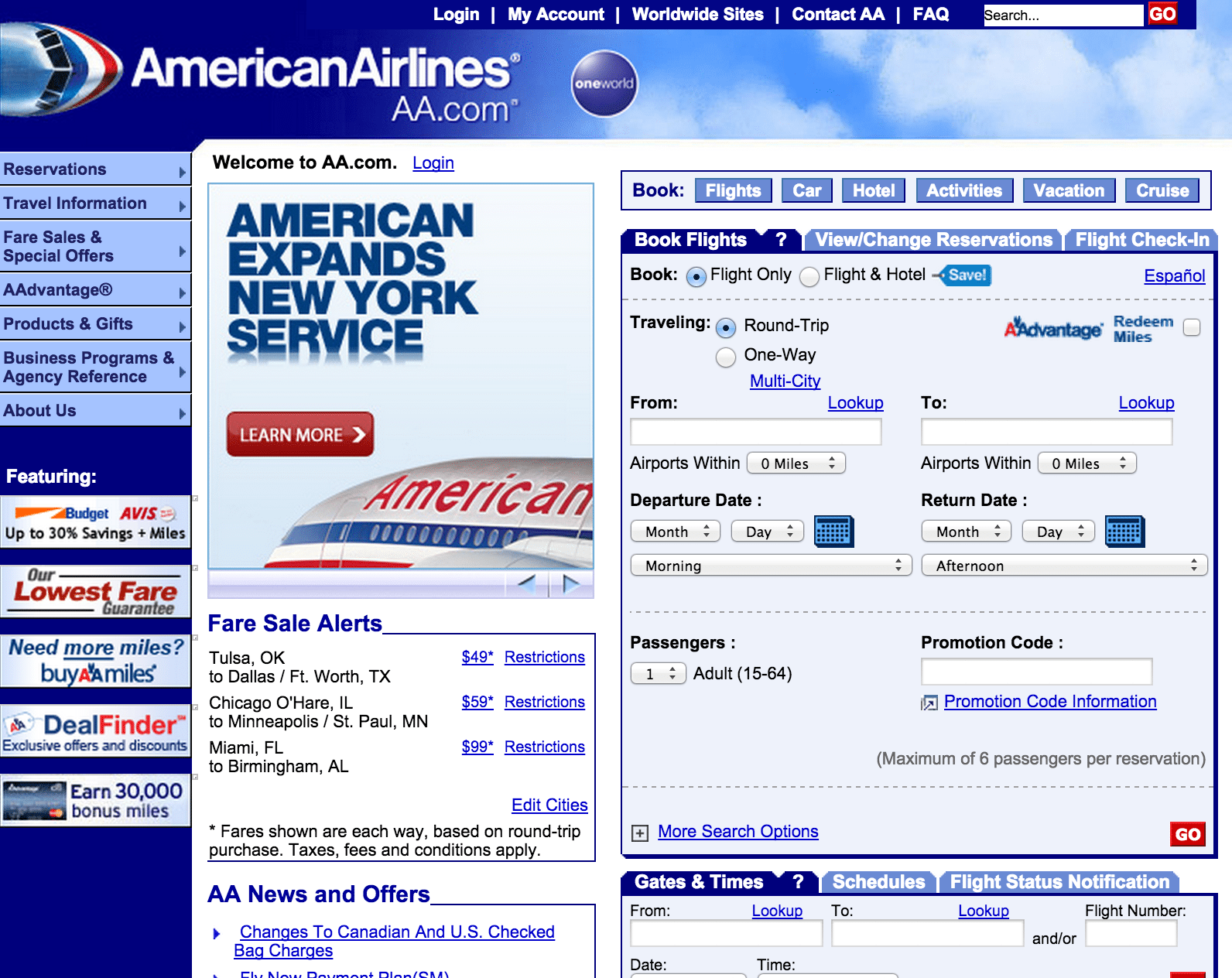
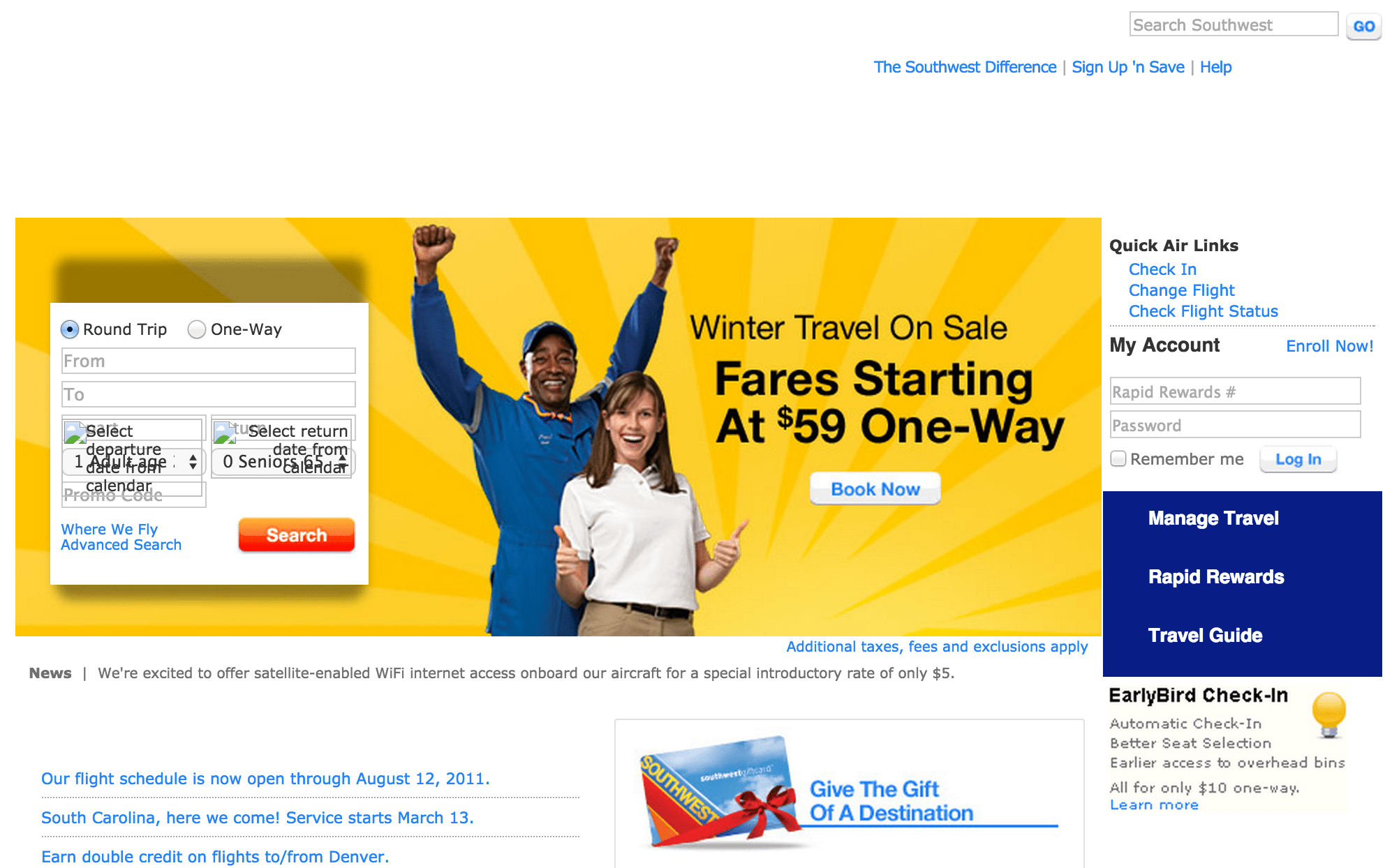
American Airlines’ site also made huge strides, throwing-out its previous column-oriented site design and replacing it with a more digestible horizontal design, although its main search field now sits below a carousel offering travelers ways to earn miles. Southwest Airlines chose a similar redesign while United Airlines’ site still emanates an outdated and messy feel.
We pulled desktop screenshots from 15 top travel sites using archive.org’s Wayback Machine to see what a particular site looked like on a given day in 2010. Following are those examples along with links to the present-day sites for comparison:
Expedia.com, February 4, 2010
Priceline.com, April 6, 2010
TripAdvisor.com, April 6, 2010

Booking.com, April 6, 2010
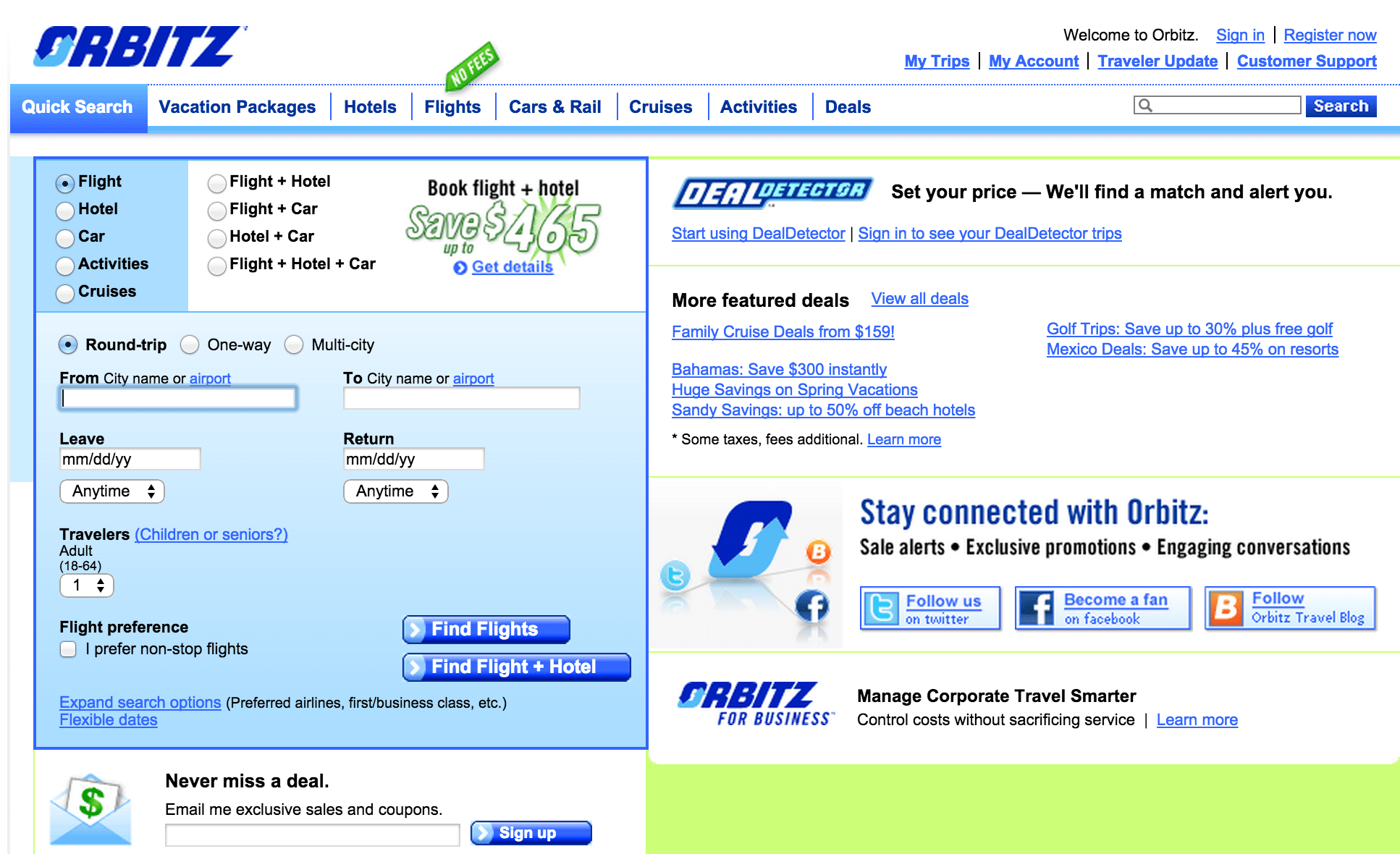
Orbitz.com, April 9, 2010
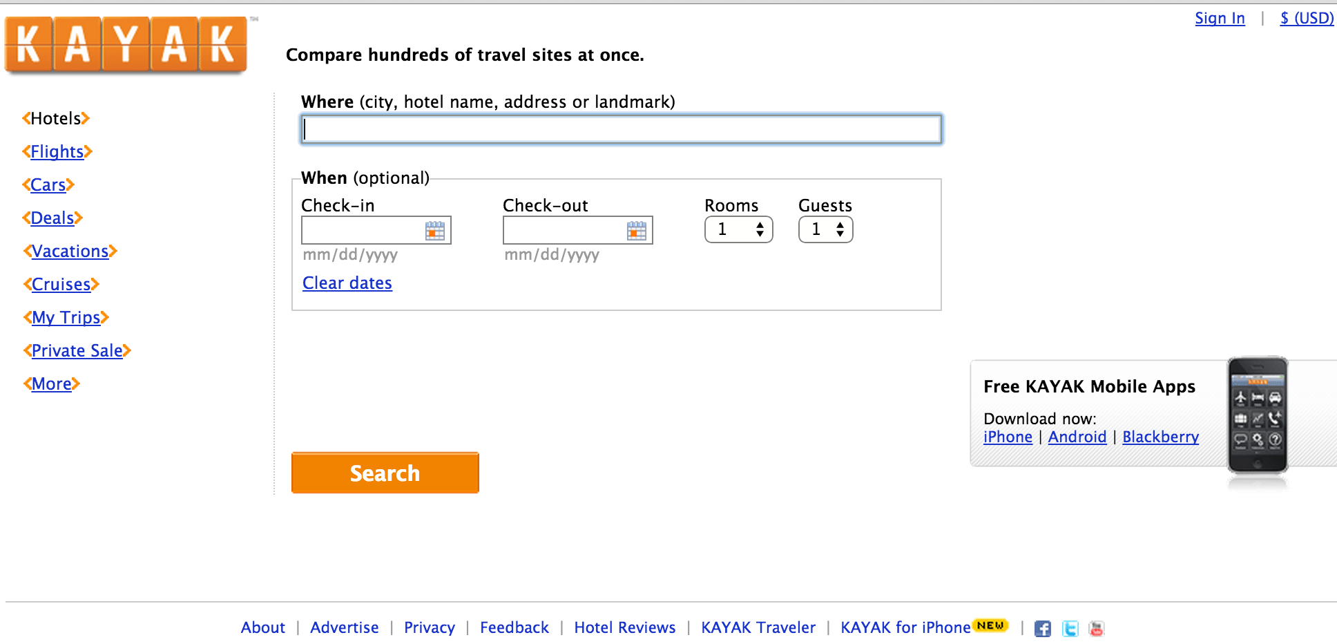
Kayak.com, March 25, 2010
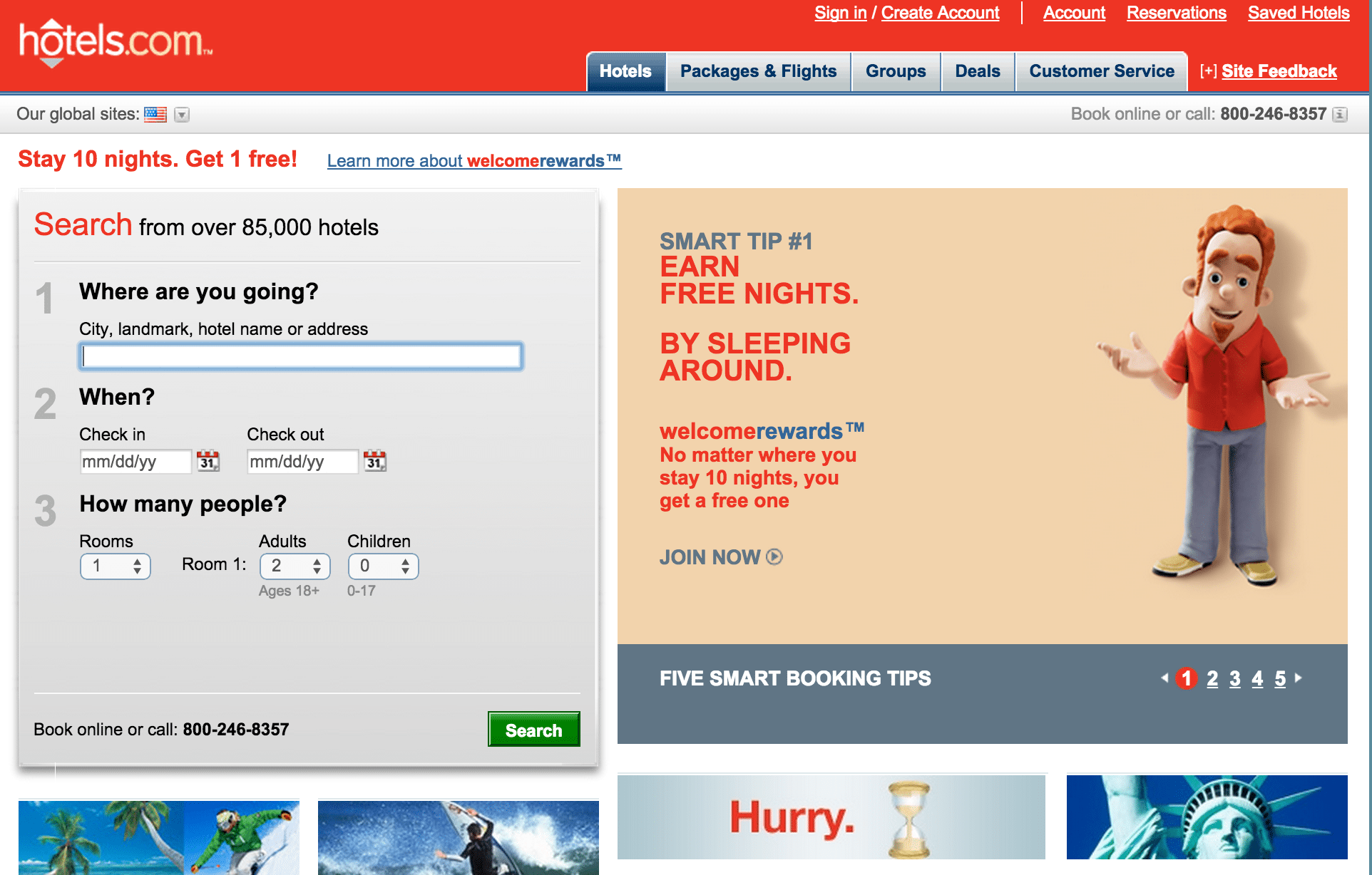
Hotels.com, February 18, 2010
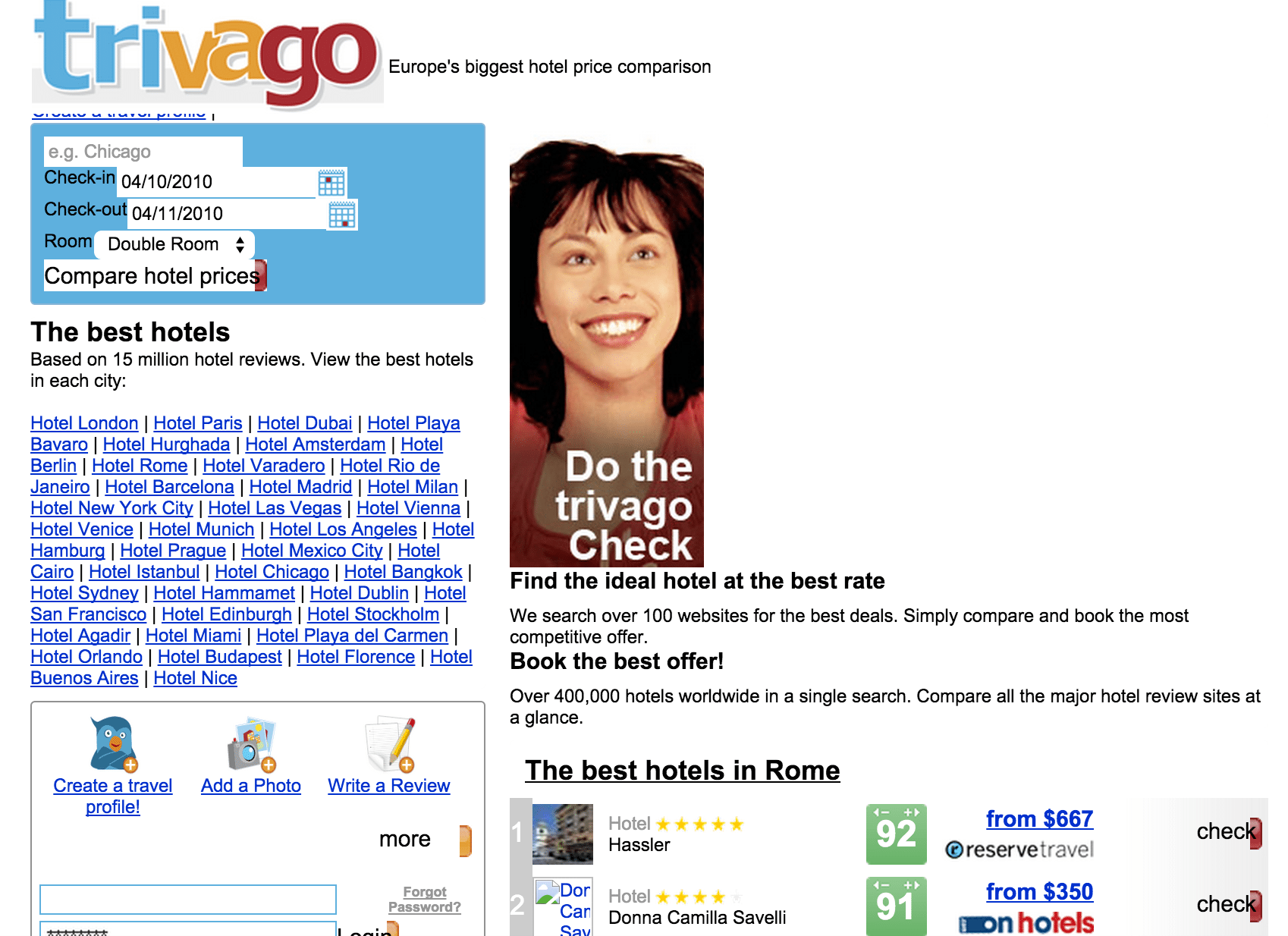
Trivago.com, April 5, 2010
Airbnb.com, April 5, 2010
Uber.com, January 4, 2011

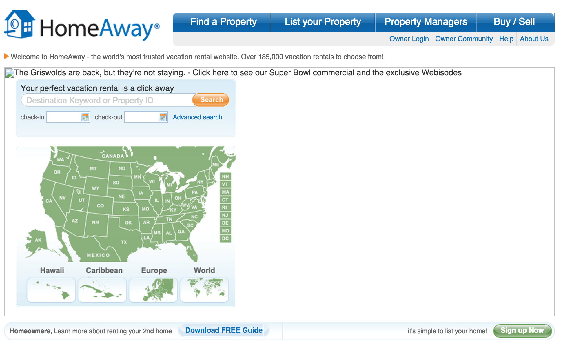
HomeAway.com, February 19, 2010
AA.com, April 8, 2010
Southwest.com, November 20, 2010
Marriott.com, April 6, 2010

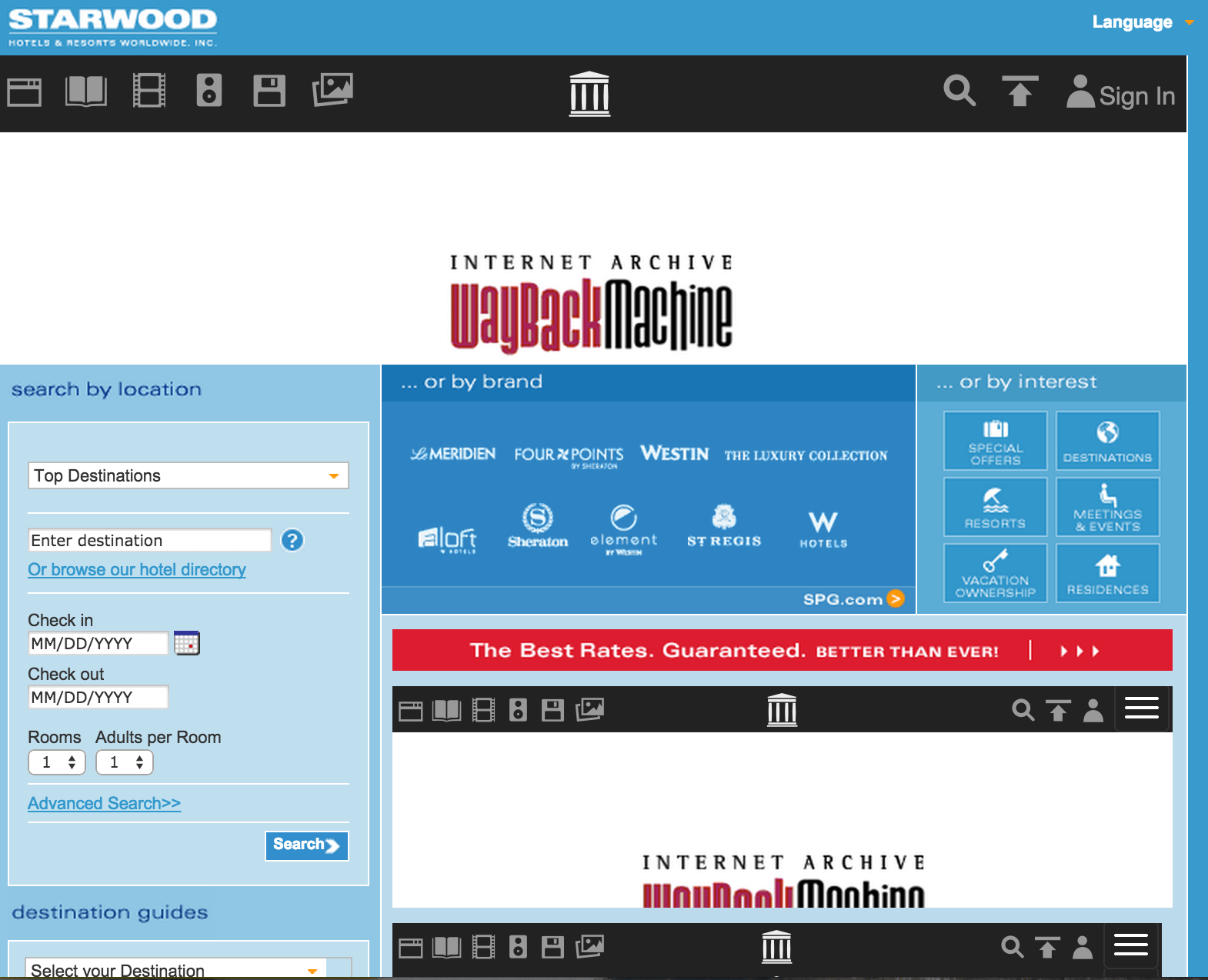
Starwoodhotels.com, April 3, 2010
Subscribe to Skift Pro to get unlimited access to stories like these
{{monthly_count}} of {{monthly_limit}} Free Stories Read
Subscribe NowAlready a member? Sign in here
Subscribe to Skift Pro to get unlimited access to stories like these
Your story count resets on {{monthly_reset}}
Already a member? Sign in here
Subscribe to Skift Pro to get unlimited access to stories like these
Already a member? Sign in here
