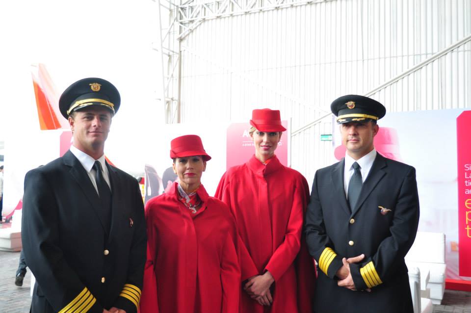
Latin American airline Avianca Holdings unveiled its rebranding yesterday; the result of a three-year effort to integrate TACA Airlines and represent a modern Latin American airline.
Avianca Holdings includes the two South American airlines, Galapagos carrier AeroGal, and Avianca Cargo (formerly Tampa Cargo).
The airline’s new look was designed by branding and design firm Lipincott, which also redesigned United’s and Delta’s rebranding.
Color was key to the rebranding and the airline describes the pallet as, “the Avianca red, a dark red which is the essence of TACA Airlines, the orange that represents the union of the companies, and a variety of grays to complement these colors.”
The blog Design Air keenly observes the similarities between Avianca’s symbolic Condor logo and American Airlines’ new logo, which give two airlines the misleading appearance of being sister companies.
The uniforms designed by renowned Colombian designer Álvaro Reyes will outfit 13,000 staff.
Two new ads released as part of the redesign are embedded below:
Subscribe to Skift Pro to get unlimited access to stories like these
{{monthly_count}} of {{monthly_limit}} Free Stories Read
Subscribe NowAlready a member? Sign in here
Subscribe to Skift Pro to get unlimited access to stories like these
Your story count resets on {{monthly_reset}}
Already a member? Sign in here
Subscribe to Skift Pro to get unlimited access to stories like these
Already a member? Sign in here
