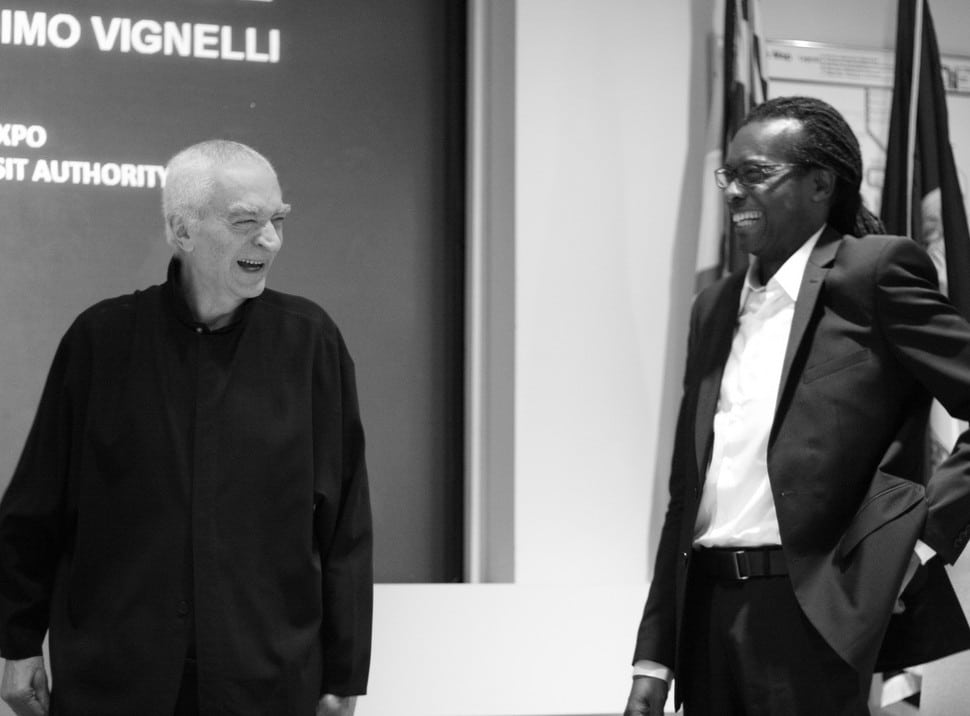
Q&A in BusinessWeek with designer Massimo Vignelli, the creator of the American Airlines’ outgoing logo.
What do you think of the redesign?
It has no sense of permanence. The American flag is great…But the American flag has 13 stripes, right? Not 11. Did American add only 11 stripes [to the flag on the tail] because they are in Chapter 11? I don’t think two more stripes would have been a disaster. And there are only two colors shown instead of all three. So is it a different flag?
What about the new logo?
Now they have something other than Helvetica that’s not as good or as powerful. Then they did a funny thing: Some may see an eagle [next to it], some may see something else. And they don’t even say it’s the eagle—they say it could be the eagle.
Subscribe to Skift Pro to get unlimited access to stories like these
{{monthly_count}} of {{monthly_limit}} Free Stories Read
Subscribe NowAlready a member? Sign in here
Subscribe to Skift Pro to get unlimited access to stories like these
Your story count resets on {{monthly_reset}}
Already a member? Sign in here
Subscribe to Skift Pro to get unlimited access to stories like these
Already a member? Sign in here
