Skift Take
You only need to look as far as Brazil's World Cup logo to see that travel graphic design is in a rather poor state at this moment.
Legendary graphic designer Massimo Vignelli died today at the age of 83.
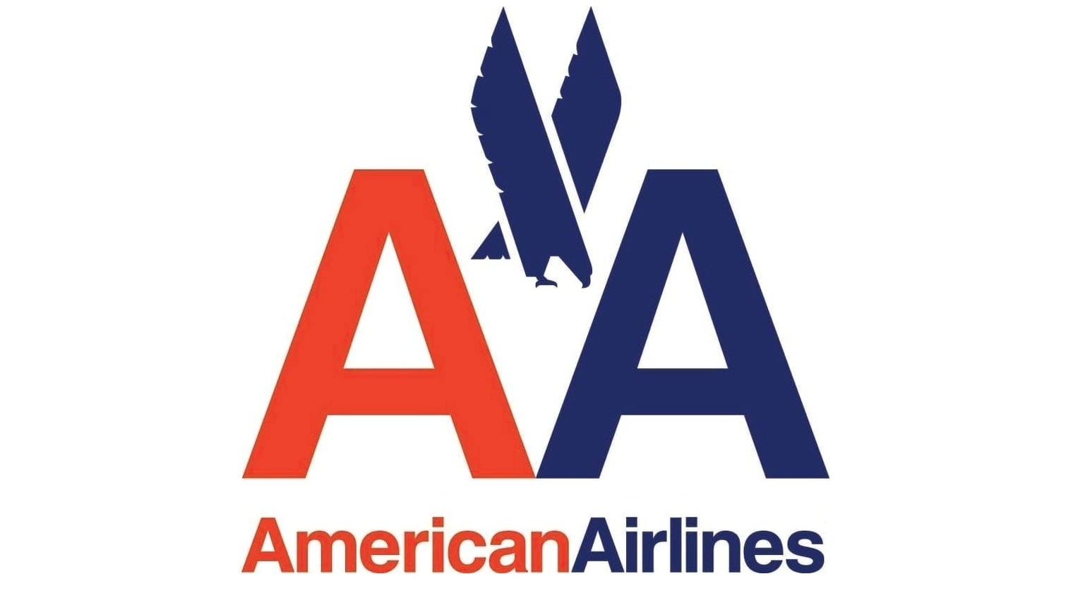
First with the design firm Unimark, then at his own firm Vignelli Associates, which he co-founded with his wife, Lella, Vignelli worked on projects including the American Airlines identity and signage for the New York City Subway system, as well as branding and brochure design for U.S. National Parks.
Outside of travel Vignelli did logos for J.C. Penney, Bloomingdale’s, and Ford.
His relationship with the MTA extended throughout his career. In 2013 Vignelli Associates designed the MTA’s Weekender app for iPhone and Android.
In January of 2013, BusinessWeek interviewed Vignelli about the new American Airlines livery. The designer was not impressed:
What do you think of the redesign?
It has no sense of permanence. The American flag is great…But the American flag has 13 stripes, right? Not 11. Did American add only 11 stripes [to the flag on the tail] because they are in Chapter 11? I don’t think two more stripes would have been a disaster. And there are only two colors shown instead of all three. So is it a different flag?
What about the new logo?
Now they have something other than Helvetica that’s not as good or as powerful. Then they did a funny thing: Some may see an eagle [next to it], some may see something else. And they don’t even say it’s the eagle—they say it could be the eagle.
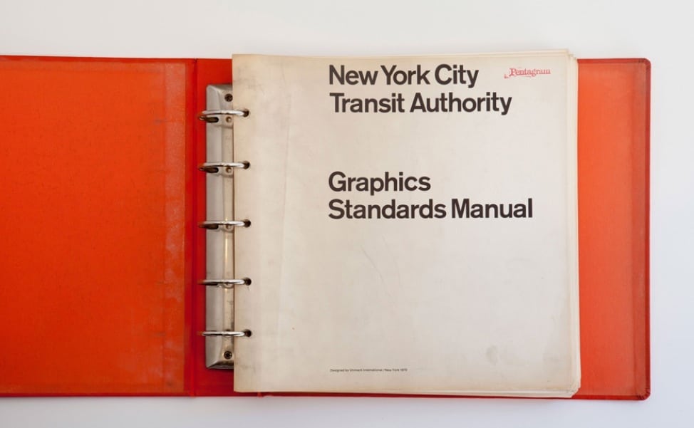
Read More: Pentagram’s Original Graphic Guidelines for the NYC Subway
The Daily Newsletter
Our daily coverage of the global travel industry. Written by editors and analysts from across Skift’s brands.
Have a confidential tip for Skift? Get in touch
Tags: american airlines, branding, livery, mta, nyc
Photo credit: Massimo Vignelli's iconic logo for American Airlines. American Airlines