Skift Take
These tourism websites still have improvement to make in terms of featuring real-time social activity and reaching visitors on mobile. But their design sense is right on and should be an example to destinations still stuck in the era of online brochures.
-
VisitFinland.com was chosen for its very clean typography and amazing visuals. The site is easily navigable and broken down into sections highlighting current events, destinations, seasons, and trip themes. Every image relay a message that’s reinforced byaccompanied text.
-
Greenland.com features a unique typeface that sets the tone of the country as a rough and vast destination. The bold typography matches the destination’s campaign promoting the “Big Arctic Five,” which include monumental glaciers, magnificent whales, and natural wonders. Being able to convey the destination’s main messaging via a typeface is an achievement worth noting in web design.
-
Ireland.com forgoes a traditional celtic look for a modern, visual, and highly functional website. The content is seen in a card-based unit in the middle of the home screen; however, visuals are really telling the story here. Users can flip through screen-wide photos and click on a small link for more information. Interactive Google Maps allow users to search accommodations and activities. The interactions throughout the site are also very clean. For example, after clicking on a link, the backdrop fades drawing focus to the featured text.
-
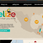
TravelBelize.org immediately pulls first-time and repeat site visitors in with an embedded Vimeo video. This is an advanced technique that few other tourism websites employ. The website continues to engage visitors with a scrolling homepage that uses large graphics and warm colors to highlight the activities at and tropical culture of the destination.
-
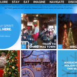
MassVacation.com is Massachusetts Tourism’s website. The homepage’s typography and colors relay a modern and clean feel. Its card-based design uses images to bring visitors to description pages of individual events and locations. The interactions are crisp and unique. For example, visitors can click on an arrow and the boxes of content will change rather than move the user.
-
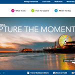
DiscoverLosAngeles.com features a bold clean font across a scrolling homepage. Each section of the homepage clearly represents the site’s top assets including large colorful images, regional guides, and celebrity itineraries. Content is seen front and center on the site. The site is easily navigable for a first-time visitors.
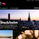
- VisitStockholm.com is a very visual site that employs a Tumblr or Pinterest-esque format that fills the full width of the screen with units highlighting activities, restaurants, and attractions. It also has a unique color scheme with a full black background accented by bright teal and purple elements.
-
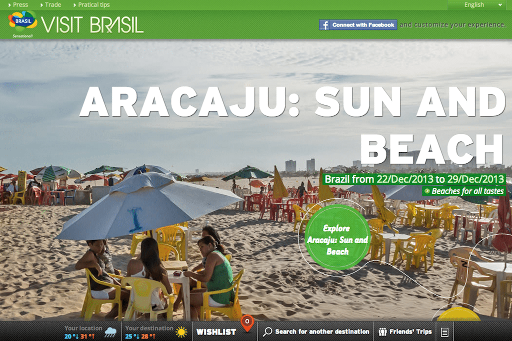
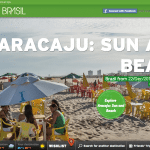
VisitBrasil.com is a super visual site that presents users with giant images throughout their visit. A thread draws visitors down the homepage through different sections of the site each as colorful as the one before it. The trail ends in a call to action, making it typical of the scrolling homepage design seen on several other tourism sites. VisitBrasil.com presents a different destination within the country each time someone visits the site.
-
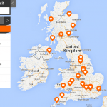
The LoveWall section of VisitBritain.com is a resource for exploration. The Pinterest-inspired homepage features images in boxed units highlighting different activities. A counter on the top left of every image shows how many people like a certain topic. There’s also an interactive Google map visualizes where searched for venues, shops, and activities are located throughout the country. Visit Britain is trying to interact with visitors in a new way with this site.
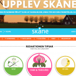
- VisitSkane.com uses photos the least of any of the sites on this list. Instead, it uses a distinct color scheme and playful illustrations to relay its message. The site is organized based on themes and each theme landing page features a new corresponding color scheme, creating an immersive design experience.
-
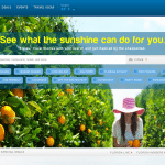
VisitFlorida.com makes an interesting design decision by putting search front and center on the homepage. It prompts visitors to search for something right away and personalize the information they are seeking. It shows an effort to give visitors the most important information as quickly as possible. Following the search field is rows of boxed units that allow visitors to find activities and destinations more serendipitously.
-
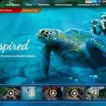
Tourism Malaysia’s website tells a highly visual story as visitors scroll down the homepage. A fading between sections of the homepage aids the flow and drives visitors past links describing events, places, and experiences to the bottom where a call to action, in the form of packages and promotions, awaits.
-
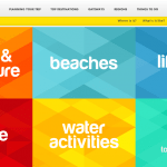
tsMoreFuninthePhilippines.com uses very bright colors to immediately capture the attention of site visitors. The interactions are strong and users are shown new content and images by simply moving their mouse over each square. The site also provides a very consistent experience in which all related content is tied to a color scheme and tied back to the “It’s more fun” messaging.
-
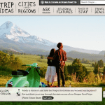
TravelOregon.com features a unique quaint typography that gives the site a welcoming familiar feel. The green and beige color scheme sets the tone of the destination as an outdoors state. And when visitors scroll over the top navigation bar, illustrations of thought bubbles, pillows, and maps appear adding a warm personal touch.
-
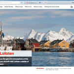
Outside of large images on the landing page, VisitNorway.com ignores the trend of large photos and text in favor of a more conservative, and Nordic, design sense. Past the first large visual, the typography becomes smaller and white space is embraced. The understated design style works well for destination such as Norway.
-
Washington.org draws visitors in with a strong landing page featuring large images and a bold, bright red typeface. The red color scheme is a consistent and connecting feature throughout the site. The site also drives action by putting a hotel search widget on the first page and clearly outlining site sections.
-
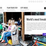
VisitCopenhagen.com features a strong color scheme featuring black, white, and purple. Content is laid out in a card-based design that allows visitors to discover activities. And a large map drives visitors to destination-based information. Social also plays a more prominent role on site than most other tourism sites on this list. Its consistent visual design paired with content that’s easy to search and discover provides for a seamless visitor experience.
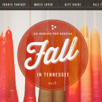
- Tennessee Vacation creates a special landing page for each season and its fall feature was this year’s best. The tone and typography is beautiful and unique, especially for a tourism website. The site is well designed from a usability perspective in that users can roll away one curtain to find more content underneath. The design of each curtain is also consistent: A large image, a small graph of text, and a call to action. The main site for TennesseeVacation.com features a traditional and safer design.
-
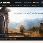
NewZealand.com marries the fantastical with reality with the visuals on its landing page. New Zealand has received a boom of tourism due to its connection to the Lord of Rings trilogy and the site makes that connection front and center. The images show the fictional side of the destination and how real people can interact with it. Below these images, the design is safe and content straight-forward.
Websites created by destination marketing organizations are some of the more underused resources in travel today.
Our recent analysis of the 50 most visited U.S. tourism websites found that no site had more than 570,000 visitors in October. And the most time spent on a site was five minutes, which was far longer than the average.
However, these sites are packed with logistical information like how to use public transit to get from an airport to city center, tourism resources like the opening hours to a city’s most famous museum, and beautiful imagery.
Tourism sites have matured over the past few years to add social data and offer mobile tools. They’ve also become more beautiful. We searched through hundreds of tourism websites for countries, states, and cities to produce this list of the 20 best designed sites.
Common Content Formats
Two content formats are used on the majority of the tourism websites that we examined. One is very content heavy with boxed units or text that allow users to discover new activities serendipitously.
The other content format is more visual and has visitors pick or search for what types of activities they are interested in before bringing them to a new page with related content related to that interest.
Design Trends
Two design trends emerged from the list of 20 sites.
One is a highly visual story that’s told in segments as a visitor scrolls down on the home page. The bottom is always a call to action in form of packages or booking links. Tourism Malaysia and Visit Brasil excel at this style.
The other design trend we’ve seen is the placement of strong visuals on the first section of the first page seen by a visitor. Almost all websites employ this technique, but Go To Hungary is the most extreme example. The home page does not scroll and features one woman as the permanent background image.
With the rise of mobile usage, especially among travelers, It’s very important for the websites, or a complimentary app, to be accessible on mobile devices. Eleven of these 20 featured sites have responsive websites.
Click through the slideshow above to see the 20 most visually stunning sites in tourism worldwide. The 20 featured tourism organizations are also listed below. The websites are not listed in any particular order.
- Visit Finland
- Visit Greenland
- Tourism Ireland
- Travel Belize
- Massachusetts Tourism
- Discover Los Angeles
- Visit Stockholm
- Visit Brasil
- LoveWall section of VisitBritain.com
- Visit Florida
- Visit Skane
- Visit Norway
- Travel Oregon
- Tourism Malaysia
- Philippines Tourism
- Tourism New Zealand
- Tennesee Vacation
- VisitCopenhagen
- GoToHungary
- Visit DC
The Daily Newsletter
Our daily coverage of the global travel industry. Written by editors and analysts from across Skift’s brands.
Have a confidential tip for Skift? Get in touch
