Skift Take
The balance between design and functionality have been causing trouble for some hotel booking websites in recent redesigns, read below to learn about the top mistakes to avoid.
This sponsored content was created in collaboration with a Skift partner.
Today, modern web designers have countless tools and tricks at their disposal to make a website look great. Design features such as parallax scrolling, ambient video, and interactive animation have arguably made for a more exciting and creative web.
But sometimes these fancy tricks get in the way of more important aims, such as functionality, ease of finding information, and—for anyone in e-commerce—making the sale. It’s why, for example, major e-retailers such as Amazon and Walmart rarely employ such design features. When your main concern is conversion, there’s little room for creative pursuits.
Many travel brands, particularly hotels, have to tow the line between both sides—being creative and eye-pleasing, while also being practical and functional. But in many cases, the desire to have a modern and “cool” website often trumps the need to have one that converts.
Here are some of the biggest problems that modern web design features sometimes pose:
Mistake #1: Distracting animation
When it comes to the use of animation, it’s often a case of less is more. Used effectively, animation can make a website visually engaging and help direct a user’s attention to relevant areas on the site.
But it can easily backfire. Go overboard and things can start to feel confusing and chaotic. In the example below from a Berlin hotel’s homepage, a floating “spaceship” of a hotel slowly comes onto the screen accompanied by low-fi sound effects and exotic ambient music.
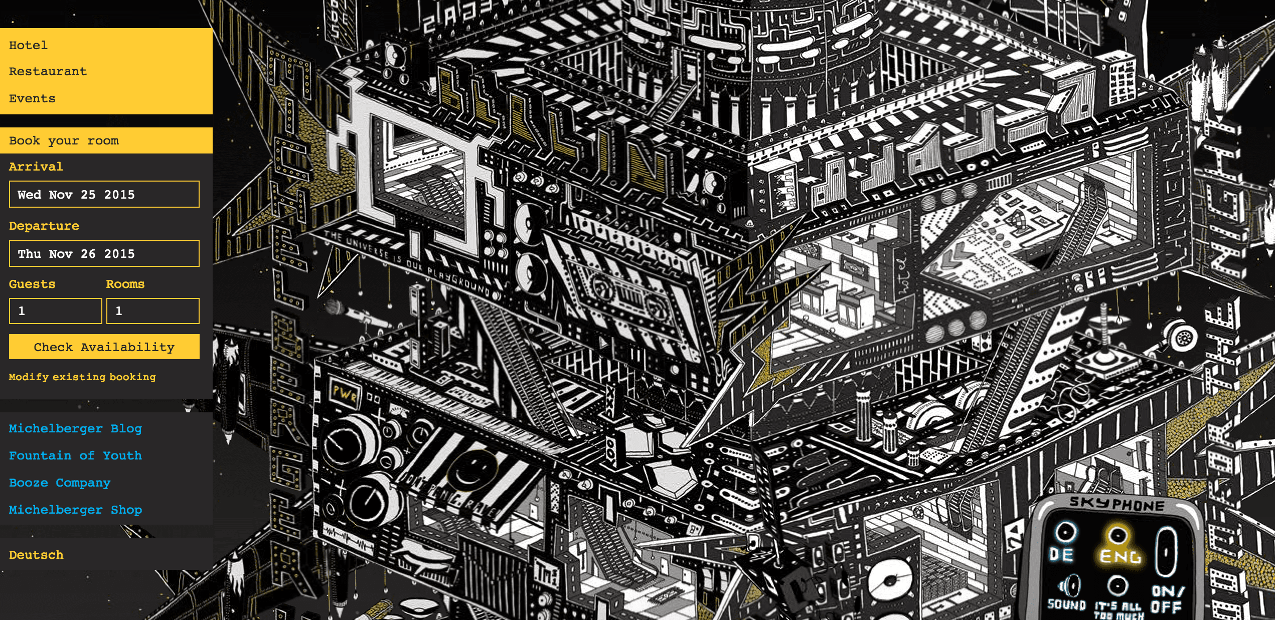
Even with skipping the intro, it still takes a moment to figure out how to turn off the autoplay music (still one of the web’s biggest faux pas). Ironically, that button is placed right next to one that says “It’s all too much.”
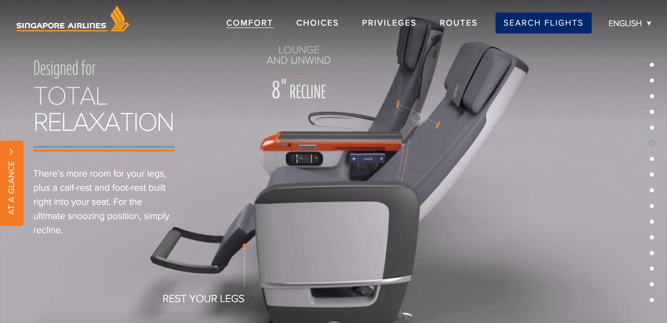
Animation can certainly add life and movement to a static site, but it should be used sparingly. Allowing the user to control the animation via mouse click or scroll is even better. A great example of this is Singapore Airline’s Premium Economy microsite, which walks viewers through the features of their cabin class.
Mistake #2: Hard-to-find navigation
Websites only have a few seconds to capture user attention; if users can’t find what they want within that short period of time, they’ll leave. That’s why the most important information has to be readily available in the navigation, and the navigation must be easy to find.
Some hotel websites have chosen to forego intuitive navigation in favor of a more creative or original approach. However, unconventional placement of navigation can instantly disorientate a user, such as in the example below, where the navigation is difficult to read and partially blocked by the dark background.
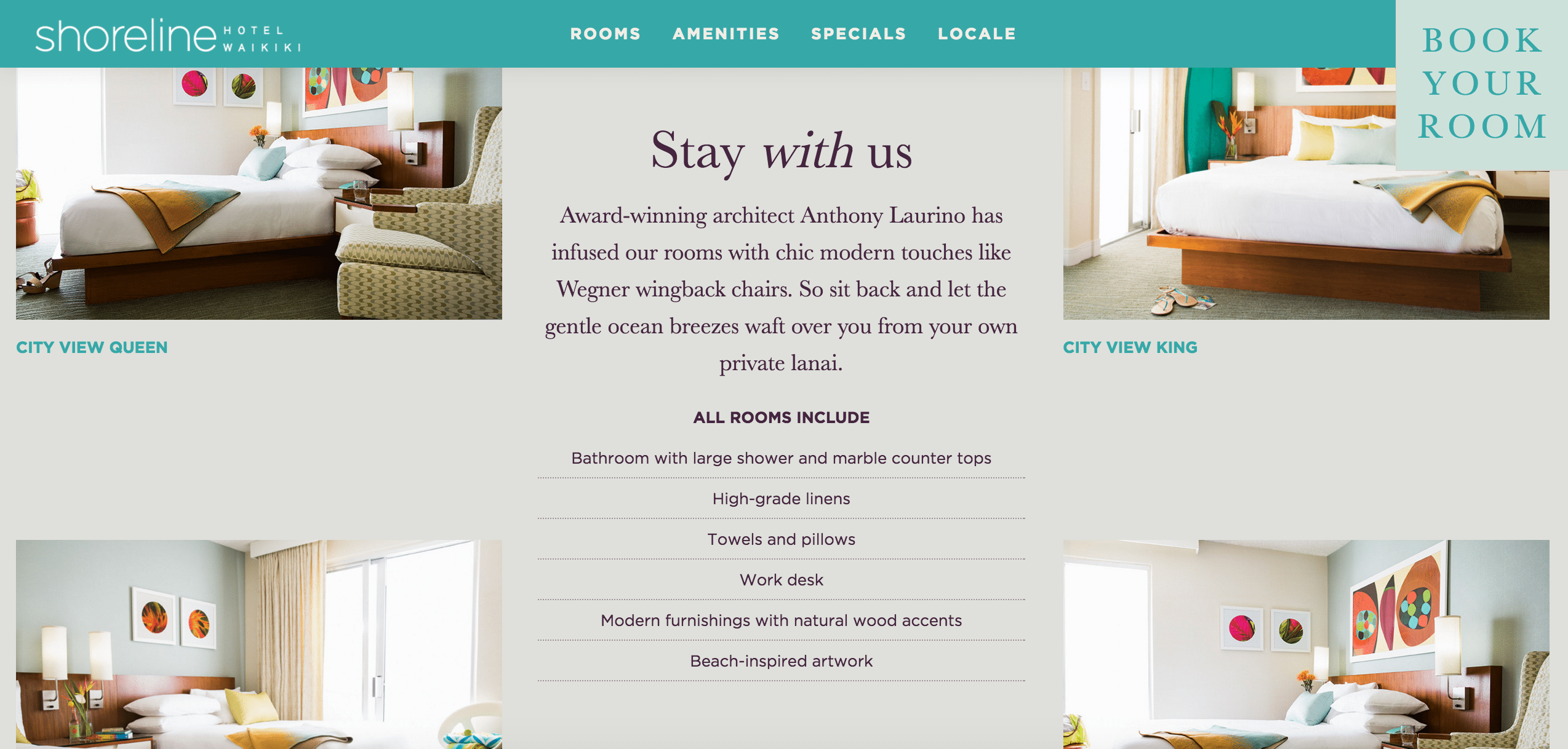
Contrast that with the following site by boutique hotel group Joie de Vivre. On the home page, the most important navigation element is top left (Hotels), and the call to action on the page (Choose a Hotel) also directs users clearly.
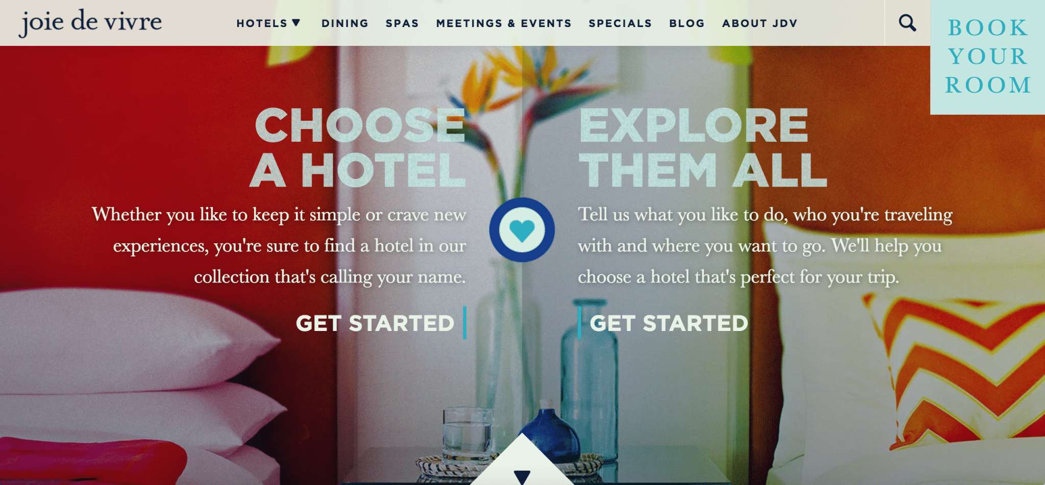
Once you choose a hotel and scroll down the hotel page, the navigation automatically switches from the Joie de Vivre navigation to a hotel-specific navigation, giving easy access to rooms and amenities pages.
Mistake #3: The missing-in-action Call to Action
Having a strong call to action is one of the most fundamentally important elements to a website. But if people can’t actually see your call to action, then it becomes ineffective.
Popular mistakes? Placing the call to action somewhere difficult to find, such as amid the clutter of web copy or hidden off page. Another common problem is using colors that blend in with the rest of the design. In the example below, not only is “Book a Room” partially hidden from view, the purple-gray color of the button does not stand out.
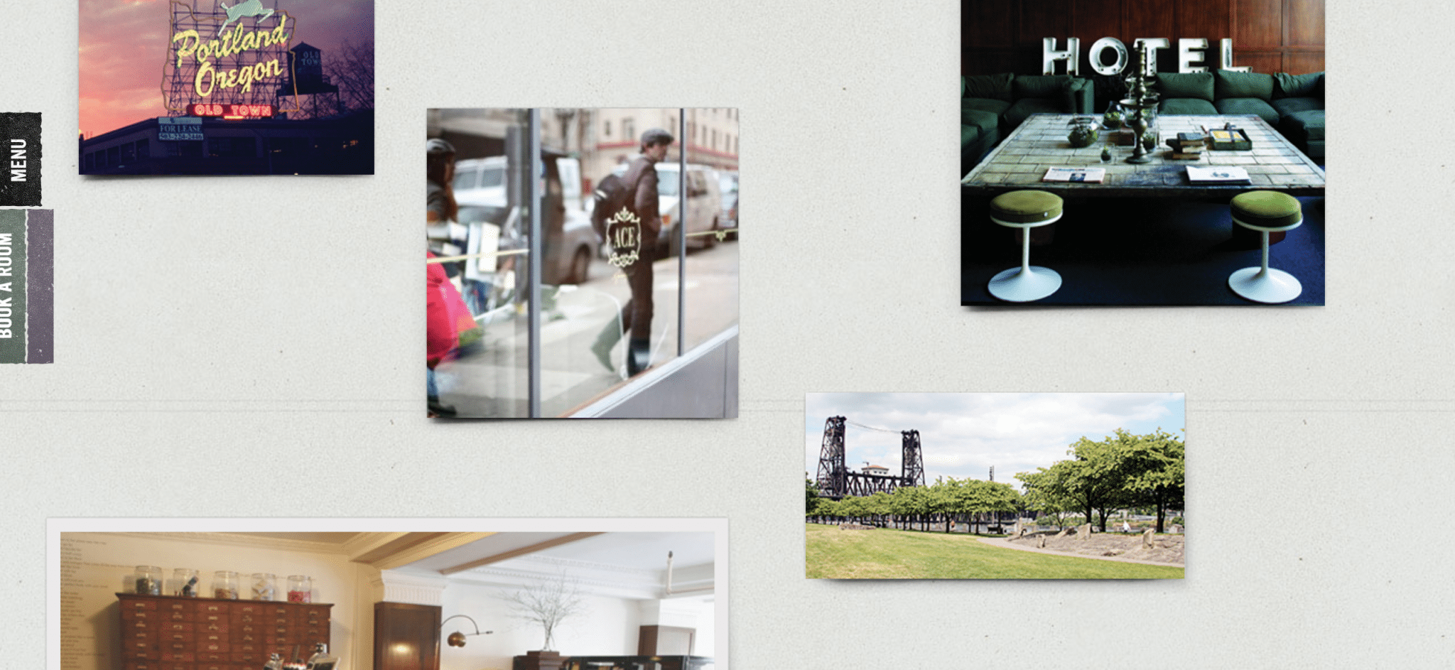
There are extensive studies on which colors convert the best, but at the very least the call to action should use a contrasting color to ensure it stands out. If it isn’t clearly prominent, people will give up trying to find it.
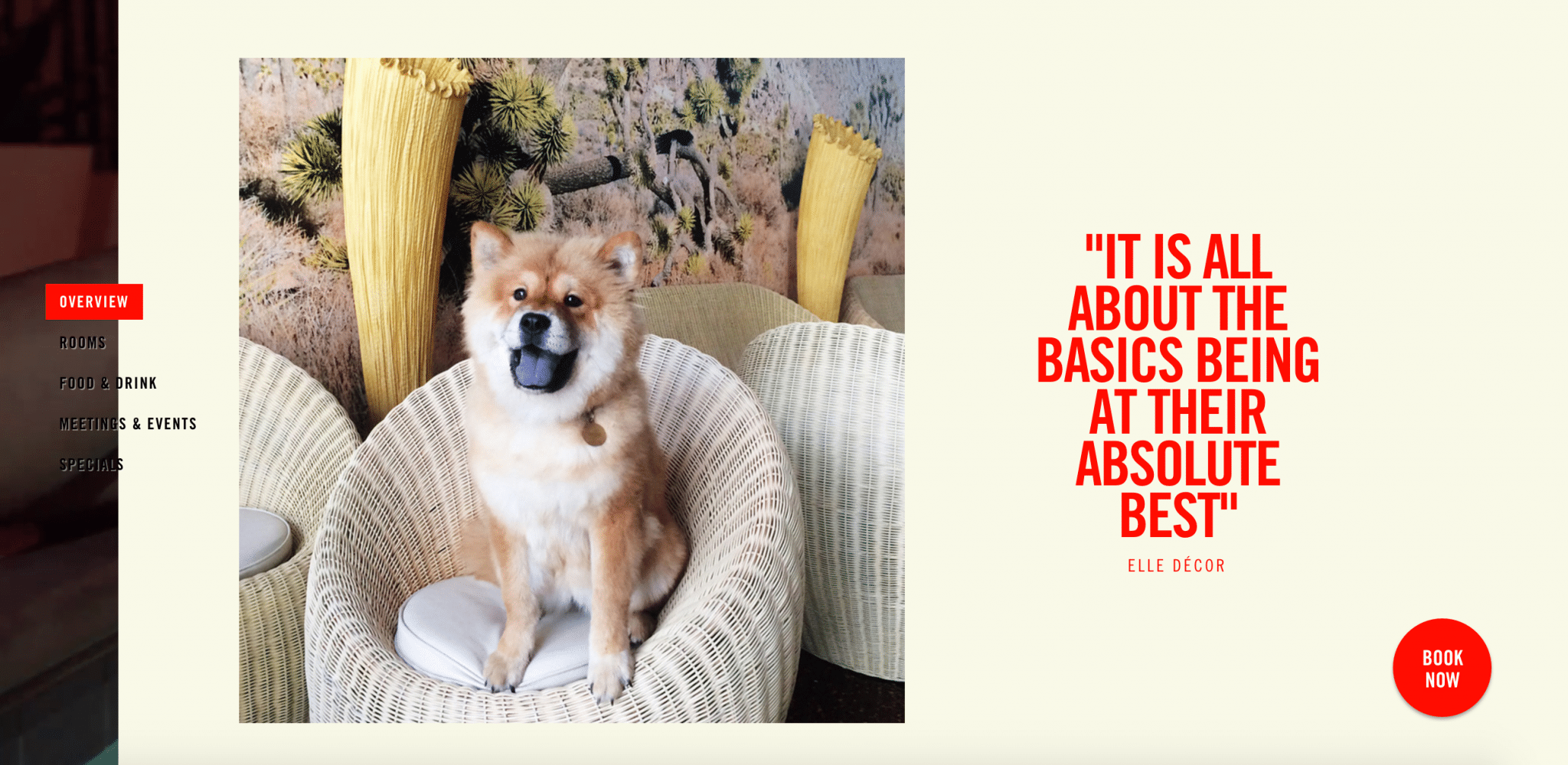
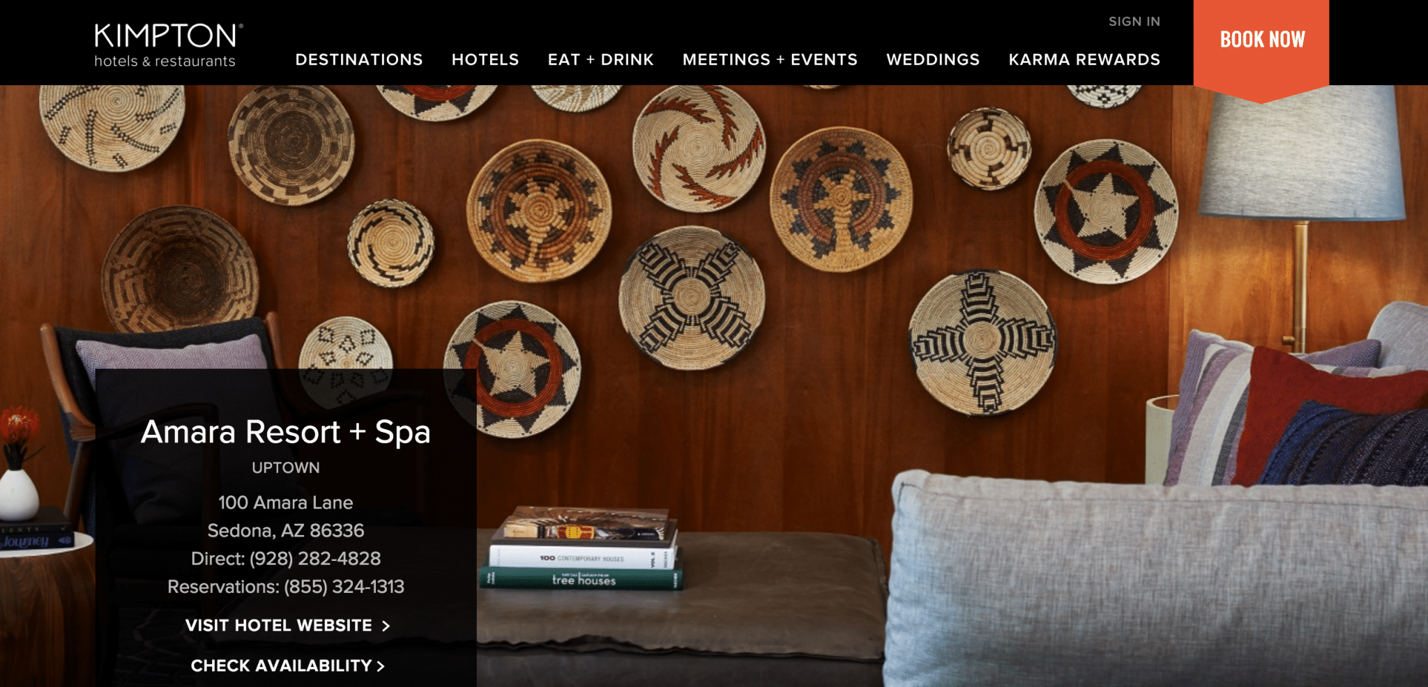
In contrast, Kimpton Hotels offers a great example of a good call to action. By using a simple black and white scheme for their navigation, they are able to use various bright and bold colors for their “Book Now” button in the upper right hand corner.
Mistake #4: Forgetting speeds and load time
According to an infographic by Kissmetrics, the majority of users will only wait at maximum 10 seconds for a web page to load, while just a 1 second delay can lead to a 7 percent drop in conversion rates. Prime offenders for website speed issues include an overuse of video content, heavy parallax animation, unnecessary scripts, and including unoptimized image sizes.
Slow load times are a major contributor to page abandonment, so it’s vital to ensure that your site is optimized to run as quickly as possible. Start by checking your website using tools like Google PageSpeed insights, GTMetrix, and Pingdom.
GTMetrix even has a handy compare tool to allow you to compare performance of different sites. In the below screenshot, we compared the website of a luxury boutique Miami hotel with that of its listing page on Booking.com and Expedia, respectively.

Notice the page load times—at 17.2 seconds, the hotel website (left) is more than twice as slow as its page on Booking.com (middle) and three times slower than its page on Expedia (right). If there is any reason users would be convinced to book with an OTA, that would be one of them.
Design not for design’s sake, but for conversions
Modern design can create truly beautiful websites that have the power to express important brand values through a distinct visual identity.
But artistic expression and visual originality must not hinder functionality and user-friendliness. In the end, these are the crucial elements that drive conversions, and both should be incorporated from the start of the design process.
Maximizing conversion rates also requires “real-world” testing with actual guests and web users (don’t just rely on your web design agency). Continual testing enables design features to be adjusted by constantly measuring the impact that successive changes have.
The end goal, of course, is one of balance. At its best, modern web design is capable of bringing visual beauty and functionality together as one, creating a website that’s optimized for conversion while delivering an unrivalled user-experience.
Visit Travel Tripper to learn more about creating hotel websites that convert better and increase direct bookings.
Have a confidential tip for Skift? Get in touch
Tags: hotels


