Skift Take
By integrating blog content and social media seamlessly into the hotel website, and using longer webpages versus multiple pages, Thompson Hotels is boosting user engagement, time-on-site and -- it hopes -- conversion rates.
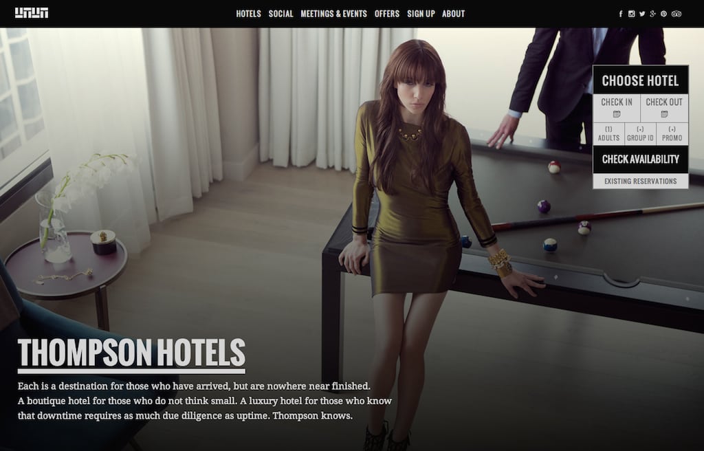
The new Thompson Hotels website provides an interesting case study about how to integrate visual design, brand storytelling, social media and booking functionality, while at the same time streamlining navigation.
Dhiren Khemlani, SVP, head of account management NY at New York-based Noise agency, who oversaw the development of the new portal, says his company was tasked with three directives. Thompson Hotels wanted to: improve SEO by expanding the amount of content and time on site, embed the Room 100 blog content and social platforms more organically throughout the user experience, and offer meeting planners the ability to submit detailed requests for proposal.
For Khemlani and his team, one of their primary end goals was to flatten the layout architecture. He says most hotel websites “direct users down a rabbit hole of clicks” requiring them to constantly navigate up and down too many levels of interior pages. Instead, the new website extends the length of individual pages to deliver more hotel description per page.
The end result is as intelligent as it is pretty. The site was constructed using the .Net framework with WordPress integration for blog content, which is created and published at the corporate level. For social media integration, both corporate and property level staff push out updates which are automatically populated on the website.
Following is our Q&A with Khemlani about his specific strategy for the new website and today’s trends in general about hotel website user behavior.
Skift: What elements of the Thompson Hotels brand were the most important for you to convey with the new site?
Dhiren Khemlani: We’ve been working with Thompson Hotels for over five years now, so we’re well invested in their brand and we understand their values and what they’re trying to project. Generally that stands for modern, inviting and chic.
Skift: What was the most significant design change from the work you’ve done with Thompson in the past?
Khemlani: It was more than just the visual design aesthetic we needed to take into consideration. When we designed the original site five years ago, most users didn’t care to scroll. Most websites, and specifically hotel websites, were designed for an above-the-fold experience. Which is why everything—the navigation, the photography, snippets of copy telling you about each page, and the visuals you were presented with—was above the fold.
Times have changed. People are not adverse to scrolling anymore, especially with the advent of the tablet, and the penetration that has had over the last few years. People are now accustomed to scrolling up and down the page. So that was one constraint we felt we didn’t need to sort of adhere to anymore because the behavior has changed, which freed us up creatively to design this in a different manner.
Skift: How did that shift impact the directives from Thompson?
Khemlani: One of the impetuses for the entire redesign was the SEO. When we designed for above-the-fold five years ago, it constrained us to a small amount of copy that we could include on each page, because we were driving the navigation through a visually-led aesthetic.
In this day and age, SEO is important to drive your search ranking results, so it’s important to be able to change your content on the fly and change it frequently. So the biggest part of this redesign was to open it up and strike that balance between being visually led with great photography and allowing for more copy to enhance search engine rankings.
Skift: What is the end result for the user?
Khemlani: With a lot of other hotel sites, and the old Thompson site, you had a landing page for a particular property that gave you the 10,000-foot level overview of what the property had to offer. But you had to continue to click into Rooms or into Dining or into Nightlife to see what the specific offerings were.
We wanted to surface a lot of the information that is typically buried deeper right there on the landing page. So you get a sense of that hotel right then and there. We obviously provide the ability to go deeper. You can click on any one of the restaurants to find more details. You can click on the respective rooms to get more details about a particular room. But upon landing on that property level page, we wanted to give you a much deeper understanding about that hotel at first glance.
We don’t want users to click forward and click back. That’s the thing. We didn’t want people to have to click two, three, four levels in and then have to click all the way back out to get to more information about that particular property. Keeping them on this one page and sort of isolating the content to each of the individual panels allows for, what we believe, to be a better experience for the user.
Skift: How does the flat architecture affect the Room 100 blog and social media?
Khemlani: For us we feel it’s important these days that users have the ability to experience the brand through all of its touch points. We all know that a corporate website or a property level website is the main entry point for users. This is where they’re going to get the greatest amount of context about a brand, but it’s usually a one-way dialogue.
By incorporating the social media and the blog, the user doesn’t have to leave the site in order to experience the other pieces of brand communications. So they’re getting a better sense about the culture of the brand, and what’s happening with the brand on a daily basis. In the old site, the blog was there but it was relegated to the footer nav, and it wasn’t easily identifiable as a blog.
Skift: How does it work in terms of who manages the blog and social media?
Khemlani: The blog is managed by Thompson corporate through WordPress, and then each new post on the blog gets fed into the site. With the social, similar in regard, we had social on the other site but we linked out to the respective channels. We still wanted to maintain that in the current site, and you’ll see that in the top right corner of the main navigation.
But by also incorporating the social content within the site, you’re getting that experience from the brand without having to leave the site, plus we’re also improving SEO rankings based on social content. So we do it on two different levels. There are the social media posts from the corporate accounts on the homepage. When you’re on the property level pages, you’re getting the individual property social news feeds.
Skift: You’ve also integrated local destination content into the property level pages. You have a lot going on there.
Khemlani: We feel that with the hotel, and Thompson believes this as well, it’s not just the hotel that you’re selling but the neighborhood and the activities around it. And it’s important for users to have an understanding about the neighborhood they’re booking, and what are some of the amenities offered outside the hotel. Neighborhood features have always been a part of the site, they’ve just never been as prominent.
Skift: What were the challenges of bringing all of this content together?
Khemlani: Our biggest challenge for the entire website redesign was the user experience (UX). We went though a number of iterations in terms of what was the right architecture and navigation system to be able to clearly identify all of the main offerings of the corporate brand, and then what are the main offerings of the property level.
For example, when you click into one of the properties, you’ll see the navigation style at the top still remains the same as the main landing page. We wanted that consistency to show that the hotel content is no different than the corporate level content. They’re two and the same. So the challenge for us during the redesign was how do we make sure we can distinguish between corporate and the properties, while making sure the experience doesn’t change. And we feel we did a good job of marrying that by architecting what content moves within each section.
We went back and forth a fair amount with the Thompson brand in terms of what was the right balance, what was too much content versus not enough, and delineating between corporate and property level. Once we had that nailed, the rest of the design and the parallax scroll just sort of came organically to us.
Skift: The parallax scroll, where you have layers of content moving at different speeds on one page, is becoming quite popular these days. What is the value of that?
Khemlani: With parallax design you can use that for aesthetic treatments or for more functional purposes, and ours is a combination of both. For us it adds an element of surprise and intrigue. We wanted to be subtle with it and keep the user in a state of movement as they engaged through the site. So aside from just the panels and the tiles moving in a parallax format, you see within each tile there’s parallax movement as well. The content and pictures are moving in separate layers.
We feel that is a modern and vivid way to present the brand, allowing consumers to experience the brand effortlessly and seamlessly. The fact that people scroll and something happens, it keeps visitors engaged. And when consumers are engaged, they’re more interested in letting you tell them your story about their brand. The parallax helps bring that to life.
Greg Oates covers hotel/tourism development and travel brand media. He has toured over 1,000 hotels in 50+ countries. email / twitter
Have a confidential tip for Skift? Get in touch
Tags: thompson hotels
Photo credit: Homepage at thompsonhotels.com Thompson Hotels