Skift Take
A redesign has to be more than pretty pictures, and TripAdvisor's facelift is geared to emphasize its no-apologies approach to user-generated content.
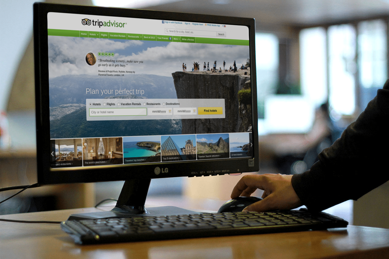
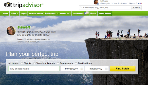
- Notice the green bubbles near the top of the homepage next to a photo of TripAdvisor user FlorencesTravels, and her opinion about the “breathtaking scenery” at Pulpit Rock in Ryfyle, Norway.
- The avatars representing user profiles and profile photos are now circular like TripAdvisor’s “bubbles” rating system. And another tweak is serifed headline fonts to emphasize user opinions such as “Can’t fault it,” a comment about the Distrikt Hotel.
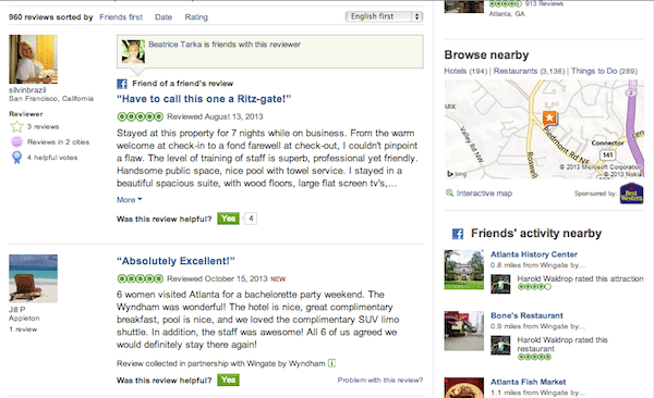
- As you can see from this screenshot, the redesign will be gradual and hasn’t made its way to the hotel pages yet.
Tonight TripAdvisor began rolling out its first site redesign in three years, and despite all the ostensible tumult about the quality of its user reviews, the refresh of the site emphasizes user-generated content, the site’s community of 260 million monthly unique visitors, and its 5-bubble ratings and review system, which it also highlights in the brand’s first national advertising campaign.
Here’s a first look at the new homepage, but the redesign will also gradually make its way to the hotel pages. Global navigation will also be tweaked, says TripAdvisor spokesperson Alison Croyle.
Notice the green bubbles near the top of the homepage next to a photo of TripAdvisor user FlorencesTravels, and her opinion about the “breathtaking scenery” at Pulpit Rock in Ryfyle, Norway.
There will be plenty of inspirational photos to spur travelers to “plan your perfect trip” using TripAdvisor’s recently rolled out hotel metasearch.
Being Green
The redesign brings forward lots more “TripAdvisor green,” Croyle says, and FlorencesTravels’ photo, as well as avatars uploaded when users decline to publish their own profile photos, will now be framed in circles (like the bubbles) instead of the former squares.
The user-generated content atop the homepage will be rotating, and will be refreshed with updated photography, snippets of reviews, and inspirational imagery, Croyle says.
The emphasis on user-generated content highlights the point that CEO Stephen Kaufer made in an interview with Skift earlier today: Namely that TripAdvisor has no intention of backing down from user reviews and “the wisdom of the crowds.”
In the following screenshot, showing the lower half of the homepage, you can also see the circular avatars, and another tweak, serifed headline fonts for user opinions such as “Can’t fault it,” a comment about the Distrikt Hotel. The font is meant to emphasize users’ opinions.
As you can see from another screenshot, the redesign will be gradual and hasn’t made its way to the hotel pages yet.
Notice in the above hotel review page that the profile photos are still square, and the user opinions do not have the serifed headline font treatment yet.
These pages, too, will be part of the redesign as the rollout proceeds.
MORE ABOUT TRIPADVISOR
The Daily Newsletter
Our daily coverage of the global travel industry. Written by editors and analysts from across Skift’s brands.
Have a confidential tip for Skift? Get in touch
Tags: redesign, tripadvisor, ugc
