Skift Take
The mobile experience, both on smartphone and on tablet, is likely to be the website of the future, and airlines will need to strike a balance between helping dreamers dream and selling airline tickets.
-

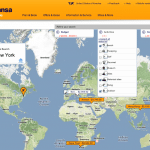
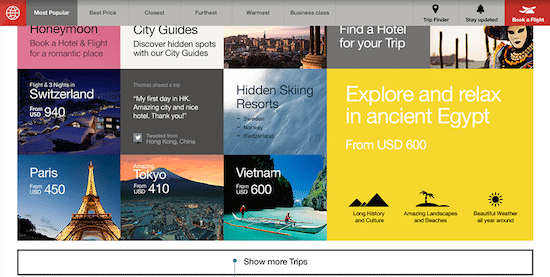
- Lufthansa’s Trip Finder asks travelers to choose a budget, pick some desired activities, and then mull a recommended flight and destination.
-
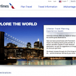
- American Airlines partnered with Frommer’s Travel to spark wanderlust by providing information about featured destinations.
-
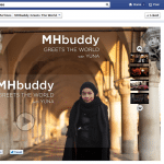
- Malaysia Airlines’ Facebook page inspires the best social impulses through MHbuddy, a way to book a flight and choose a seat mate — and not just a seat.
-
- Apps are likely to be the future airline websites, Duh. You can spin this globe in the Fly Delta iPad app to figure out where to fly.

-
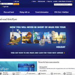
- Singapore Airlines wants travelers to “DREAM” of their next holiday, and a new program enables them to pay for regular flights with a combination of KrisFlyer frequent flyer program miles and cash.
-
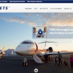
- Now, this is inspiring. Anyone want to loan us some money to buy a fractional share in a NetJets Cessna Citation Sovereign perhaps?
-
- Sometimes an airline’s introductory page can promise visual pleasures, but once you click though the disappointment will be great, as is the case with this choose-a-language page from Taiwan’s Eva Air.
-
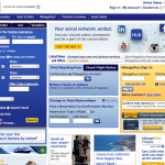
- United Airlines’ boxy, cluttered homepage definitely isn’t a harbinger of the airline website of the future. Although we do have a soft spot in our hearts for “Alex,” the automated United.com guide (top right).
-
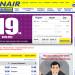
- Ryanair’s website is all about another form of travel inspiration — cheap prices. Could that GBP 19.99 Book Now image be any bigger?
-
- Dear Southwest Airlines Web designers: For a once-maverick, and now more-corporate-oriented airline, you can do way better than this.

-
- This British Airways homepage isn’t bad, especially if the airline could get this flight-search widget and the flight-deal promotion out of the way. But, that’s the crux of the problem: How do you mix travel inspiration with the need to sell some tickets?

-
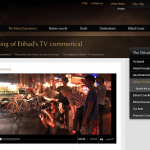
- Ethihad Airways finds an opportunity to post a video on its site with behind-the-scenes footage depicting the making of a TV commercial about the airline’s guest experience.
Travel inspiration can always use another shot of inspiration, and San Francisco-based digital agency Fantasy Interactive has a few ideas it thinks can help airlines move dreamers from inspired lurkers to happy bookers in fewer steps.
The firm created a website and video to share its vision.
Here’s the video:
The progressive disruption that Fi speaks of would lead to airline websites with a clean user interface, filled with rich imagery, a user experience “that beckons the user to explore and discover” their travel options, and by implication, their own lives.
For a look at some of today’s airline websites that are doing things right — and wrong — see the slideshow above.
Fi wants the airline website of the future to inspire travelers and provide a more relaxed discovery method through map-based search, travel guides, and other content-rich features. It all should be visual, and less complicated.
But while inspiring travelers is a laudable goal, flight search and booking is very complicated. Airline websites have to get their hands dirty, and actually focus on selling airline tickets, their chief concern.
Ongoing Experimentation
Several airline websites, such as Lufthansa.com, have experimented with map-based search to inspire travelers who have no set destination in mind. Not a lot of travelers use the tool. And, Hipmunk recently redesigned its hotel search to focus on search by trip type.
The crux of the issue is: How will the airline website of the future — which likely will be in the form of mobile apps or the tablet experience rather than the traditional desktop webiste — blend transactions and inspiration?
Can inspiration really be a driving force?
“In essence you are 100% correct when it comes to the ‘inspire’ part when its shoved into an already traditional website user experience,” says Fi CEO David Martin. “We have had many airline and booking companies contact us with similar stories that there is huge frustration and drop-off among their users.”
“Creating a simple path to selecting and booking from choosing a seat needs to be a simple, speedy and visual journey for those that already know where they are going. Younger demographics prefer an exploratory route which tends to inspire the journey. Our case study is purely scratching the surface and we seem to have struck a nerve with travelers and travel companies alike that major disruption is needed.”
Martin points to airline websites such as VirginAmerica.com and Southwest.com as being “OK-ish,” although he says he knows they are eager to improve them, and he cites EasyJet.com as doing “a good job.”
United.com and BA.com are on his bad list.
“Indeed, BA is like lipstick on a pig,” Martin says. “I have seen them improve it recently, dropping in pretty images, but the overall experience is weak, band-aided, reactionary and poorly executed. I just dont understand how the CEO can stand behind the quality and demand excellence in the choice of aircraft (A380), they first class experience, the meals, but make the actual first connection point with the customer (the site/apps) is so 1986.”
Fi, of course, would like to win the business of airlines looking to take their websites and apps into the future.
Fi touts its skills by citing its redesign of the USAToday.com, while there are some critics of the radical rebrand, Martin defends his firm’s choices with analytics:
“Time on site is up, bounce rates are down and return visits are up,” Martin says. “There was a huge shift to app-based news and the new site has addressed that well.”
The Daily Newsletter
Our daily coverage of the global travel industry. Written by editors and analysts from across Skift’s brands.
Have a confidential tip for Skift? Get in touch
Tags: inspiration