Skift Take
Hipmunk needs to make a big push to become a household name. Easier said than done. The redesign of its hotel pages is an attempt to speed and simplify the user experience, but somehow it seems more complicated than before.
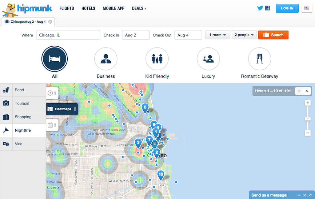
Flight- and hotel-search site Hipmunk redesigned its hotel pages, inserting heat maps to depict hotels by their proximity to neighborhood nightlife, restaurants, and shopping, and also enabling travelers to search for hotels that are skewed toward business, kid friendly, luxury or romantic getaways.
Oh, and don’t worry: As you’ll see from the Hipmunk Then and Now slideshow above, the site’s goofy, buck-toothed, but seemingly lovable hipmunk mascot has survived the site designers’ final cut.
You’ve come a long way, Hipmunk, since your 2010 flights-only debut.
This redesign doesn’t touch or change Hipmunk’s fabled Agony sorting for flights, and fine-tunes hotel search only. As co-founders Adam Goldstein and Steve Huffman discovered in the months after the site’s debut, hotels are where the dinero is.
One of the major changes in the redesign of Hipmunk’s hotel pages is the ability to search by trip type. But so many other sites — Wanderfly, for example, — have tried this, and crashed and burned.
Do travelers really want to start their hotel searches in this way, selecting “all” hotels, business hotels, kid-friendly hotels, luxury hotels or romantic getaways?
And, can you really divide a city’s hotels in this way when there is so much overlap?
For example, if you search Hipmunk for a hotel stay in Chicago, the Hyatt Regency Chicago, the Palmer House Hilton, the Hilton Chicago, and theWit Chicago all appear among the first five choices in both the business and romantic getaway categories.
That’s probably OK if you are looking for a romantic getaway on your business trip, but is there enough differentiation to make this type of search worthwhile?
Hipmunk CEO Adam Goldstein outlines to Skift some of the thinking behind Hipmunk’s hotel redesign:
“We’re always looking at ways to improve our user experience, based on our users’ feedback and our own ideas. The goals with this revision were to make the product faster, easier, and more in-line with the way people think about traveling.
“But even in the short time [since launching the redesign], we’ve seen greater engagement with our new Trip Types feature than any other customization method. Which makes sense: when someone’s traveling, they have a trip in mind, and we help them narrow down their results quickly to the choices that make sense.
“The exact algorithms for each of the Trip Types is a closely-held secret (just like “agony.”) But in general I can tell you that when we suggest romantic hotels, we put more emphasis on properties that have amenities like pools and spas; that are near romantic neighborhoods with cultural and/or historical sites; that are near nice restaurants; etc.
“For romantic hotels, we look across a variety of mid- to high-end hotels, so there are options for everyone. Needless to say, we’ll be tweaking these over time based on users’ feedback and what we observe on the site.”
Hipmunk undoubtedly has tested the trip type-search with users, and it will be interesting to see how it evolves.
Hipmunk’s greatest differentiators are its Agony sort for flights and Ecstacy hotel search (crunching price, stars and location), and it has to ensure that these features don’t get buried within all the other tweaks to the site’s hotel features.
The Daily Newsletter
Our daily coverage of the global travel industry. Written by editors and analysts from across Skift’s brands.
Have a confidential tip for Skift? Get in touch
Photo credit: Hipmunk's heat maps enable users to view areas rife with shopping, nightlife or tourist spots and choose hotels based on the proximity. Hipmunk