Skift Take
Loyal flyers will always be resistant to change, but Avianca’s color-conscious and well-thought-out branding is a smarter execution than American’s redesign that left little room for US Airway’s mark.
Latin American airline Avianca Holdings unveiled its rebranding yesterday; the result of a three-year effort to integrate TACA Airlines and represent a modern Latin American airline.
Avianca Holdings includes the two South American airlines, Galapagos carrier AeroGal, and Avianca Cargo (formerly Tampa Cargo).
The airline’s new look was designed by branding and design firm Lipincott, which also redesigned United’s and Delta’s rebranding.
Color was key to the rebranding and the airline describes the pallet as, “the Avianca red, a dark red which is the essence of TACA Airlines, the orange that represents the union of the companies, and a variety of grays to complement these colors.”
The blog Design Air keenly observes the similarities between Avianca’s symbolic Condor logo and American Airlines’ new logo, which give two airlines the misleading appearance of being sister companies.
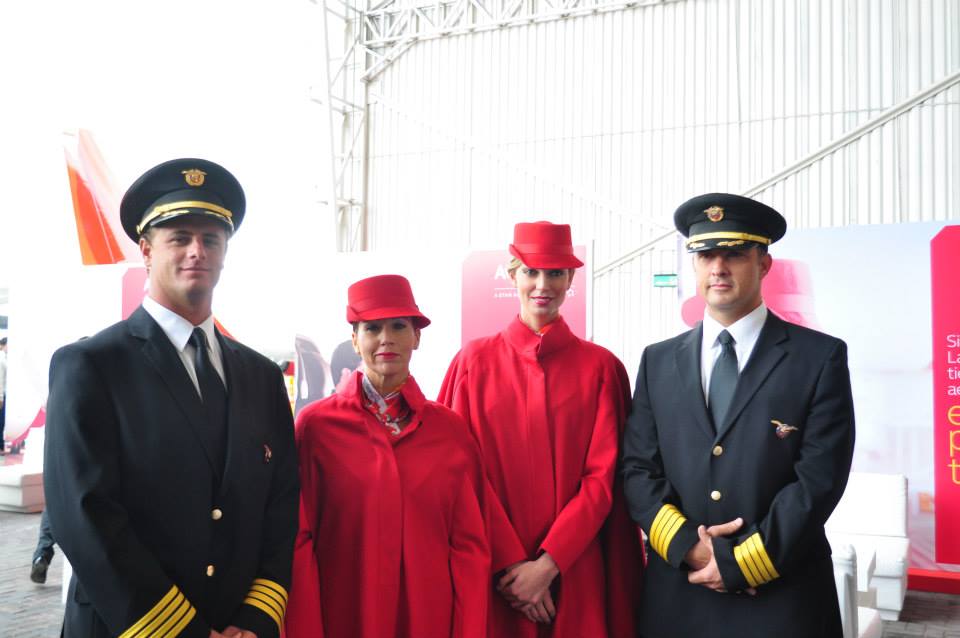
The uniforms designed by renowned Colombian designer Álvaro Reyes will outfit 13,000 staff.
Two new ads released as part of the redesign are embedded below:
The Daily Newsletter
Our daily coverage of the global travel industry. Written by editors and analysts from across Skift’s brands.
Have a confidential tip for Skift? Get in touch
Photo credit: Aviana's female uniforms for each service position showed off at the unveiling event. Avianca Airlines
