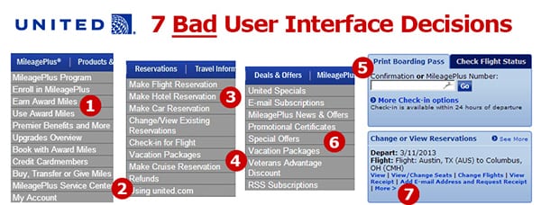
Despite offering one of the consistently worst user experiences of any website in the travel industry, United Airlines continues to promote it. While I’m hardly the first to point out the usability flaws, what IS amazing is that it has been nearly a year later and the site shows no signs of any improvement.
It is one thing offer a poor experience and be working hard to fix it. That anyone could understand. It’s quite another to put a bad experience in front of your customers, make no effort to fix it (after a full year), and create marketing messages to promote it.
Over the past year, I have often traveled on Delta Airlines as well – and the difference between their recently redesigned easy to use site and United’s is like night and day. While United was taking a giant leap backward last year by abandoning their own site to adopt the Continental Airlines website after their merger, Delta has spent the last few years investing in creating a great online experience.
Luckily, there is good news in this story. Looking at United vs. Delta may present the ultimate case study in contrasts for how to successfully implement a great user interface, and how NOT to – in a way which should offer lessons for any industry. So below are some concrete examples of what any brand that aspires to build a great user interface can learn from United’s missteps, and Delta’s strengths.
What United gets wrong …
- Confusing Lingo. At one point, the menu says “Use Award Miles” and a few options later, it says “Book with Award Miles.” And neither option is actually under the “Reservations” tab, where most users would actually expect to find an option for booking a new flight, even if they happen to be using miles.
- No Hierarchy. All the menu options seem to be randomly assorted across all the tabs – with no system of order. For example, “My Account” is buried at the bottom of the MileagePlus section, even though many users who click on that area are most likely trying to navigate to their own account.
- Redundant Options. Under “Reservations,” every type of reservation from flights to hotels to car rentals are each presented in a separate drop down menu. Not only does this make the menu needlessly longer, but it is also the perfect example of United putting its own priorities ahead of its customers. Clearly booking hotels and car rentals bring more commission dollars back to United, but why offer so many confusing options when the vast majority of customers are probably wanting to start by booking a flight?
- Discouraging Browsing. When the average traveler is planning a holiday, it is the ultimate browsing scenario. They want to see the possibilities They want to dream about where they might go and how they might get there. And, of course, they want to get a sense for how much it might cost them and how easy it is to actually get there from where they live. United makes none of this simple and instead forces potential vacationers to even choose right away from whether they want to book a Vacation Package or reserve a Cruise.
- Complicating Simple Tasks. The online Check-in for flights is increasingly one of the most common things that travelers are doing before heading to the airport. United, like many other airlines, offers the functionality to print a boarding pass or download a mobile version that can be scanned at the airport. The check-in feature on the homepage, however, says simply “Print Boarding Pass” – which makes it a confusing option for people who might want to Check-in, but not necessary print their boarding pass. In addition, the Check-in feature frustratingly always requires you to put your confirmation number in – even though you are already logged in.
- Separating Related Information. There are at least four different menu options that allow travelers to see current special offers and deals from United. You can get Vacation offers, special offers, and United specials – which are all delivered on different pages. The result is a scavenger hunt for offers that would make even the biggest coupon collector give up in frustration.
- Not Remembering User Profiles. If you are logged in on the homepage, you can see your upcoming flight – but there is no easy option to check in or requesting an upgrade. Want to check in? This lack of personalization, unfortunately, continues to the check in experience – where despite being logged in you will ALWAYS be asked whether or not you are “13 years or younger.” Why ask for a birth date if you will immediately forget this information when someone is checking in?
What Delta gets right …
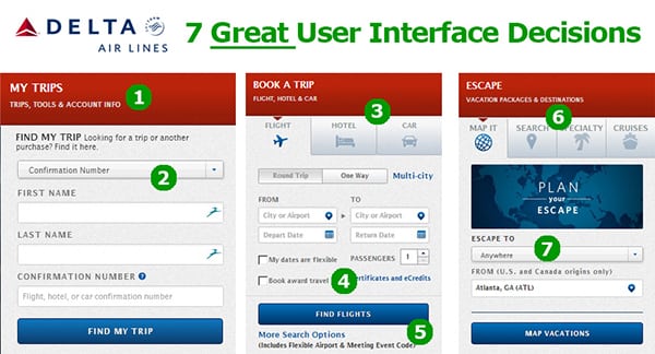
- Smart Aggregation. The most common task of finding or managing a reservation is easy to find, and appropriately labeled under the broad tab of “My Trips.” In addition, when you are logged in, this area becomes customized to show your current mileage earning in a visual chart, as well as your current number of points.
- Dropdown Navigation. While United may not believe the dropdown menu is a great way of presenting multiple options – Delta uses it effectively to let you search for your reservation with multiple parameters.
- Visual Highlights. The reservations area of the site uses visual cues to illustrate what type of booking you are making, and defaults to airline bookings (which as the most likely thing you’d do on Delta’s site). These visual cues provide a reminder for users that they can organize all their travel directly on Delta without creating confusion or getting in the way of your booking a flight.
- Reassure Users. One of the most common things to happen in the travel industry is some sort of delay or overbooking that leads to certificates or discounts for travelers. Rather than going through a booking process only to find you’re in the wrong place, Delta reassures travelers who want to use one of these certificates right away that they are using the right tool for that.
- More What? Rather than using the ubiquitous “Click here for more options” button, Delta gives you a few examples of what “more” really means. This little bit of knowledge helps users figure out if clicking that button may actually lead where they want it to – and aids in the usability overall.
- (and #7) Encourage Dreaming. Every travel site wants to sell vacation packages, but Delta calls their section “Escape” and gives you plenty of ways that you can start to think about the types of trips you might take. Even the drop down menu starts with the default option of “Anywhere.” The end result of this creative use of language is that the traveler is encouraged to dream about (and browse for) vacation destinations. By treating vacation as something more emotional than just a transaction, Delta makes it more likely you will spend time on their site planning your next vacation.
As a consultant who has worked with many web teams, there is an ultimate irony in this post that I should end with.
United already knows about every problem on its site
My guess is that more than one person within the team at United responsible for this site has already made the case to fix every problem I outlined above. And they have either been denied budget or resources by managers within United who don’t “get it.”
So, let me end this post with a simple plea to those managers at United: Your web experts are right. Your site is awful – and your customers know it (and not just the tech savvy ones like me). Immediately invest in your user experience and follow the advice that you have most likely already heard.
And in the meantime, you may want to ask the marketing team to stop promoting the site until it actually offers the experience you are already promising.
Reprinted from Influential Marketing Blog, with permission. Rohit is a marketing expert focused on helping companies bring more humanity back to their businesses. He helped found the world’s largest team of social media strategists at Ogilvy and teaches global marketing at Georgetown University. His first book, Personality Not Included, was a best seller on Amazon and has been translated into 9 languages.
The Daily Newsletter
Our daily coverage of the global travel industry. Written by editors and analysts from across Skift’s brands.
Have a confidential tip for Skift? Get in touch
Tags: delta air lines, united airlines

