Willie Walsh has acknowledged that the industry's flagship climate target may need to move, but a revised timeline will only mean something if it comes with binding commitments, not another round of aspirational pledges.
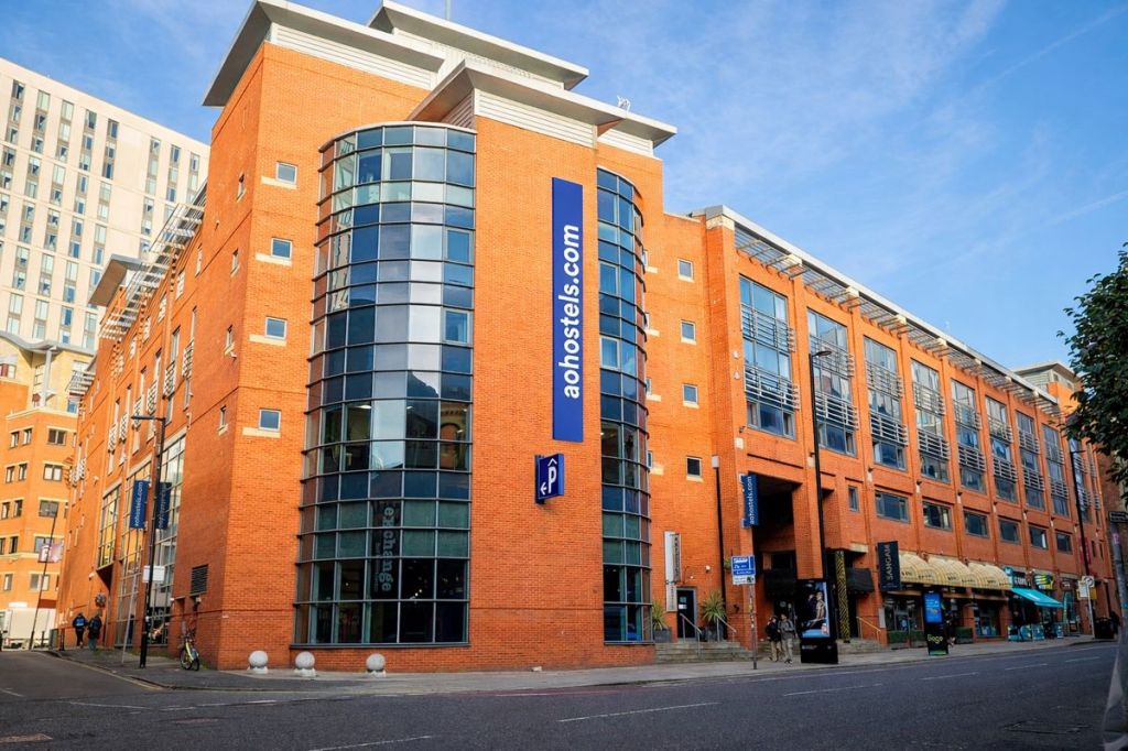
Most hospitality groups are shedding real estate. a&o is picking it up at distressed prices — a contrarian move that works up until the deals, or the lenders, run dry.
Klook has no grand OTA ambitions, at least for now. Its bigger bet is that AI can smooth out the messiness of experiences booking and help it deepen its lead in the category while pulling travelers into adjacent trip spend.
Major hotel groups are betting a domestic tourism boom in India can withstand a broader consumer spending slowdown and stock market slump. Plus, more hotel deal and development news from APAC.
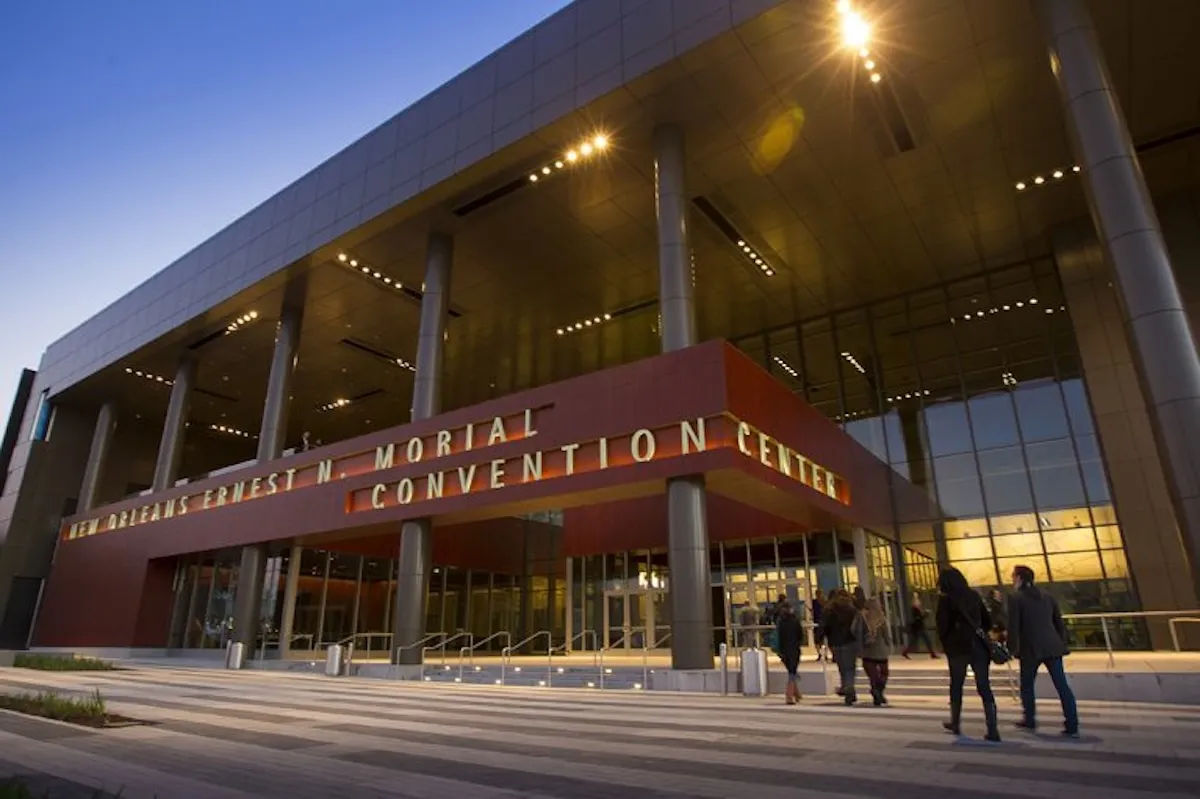
As meetings become increasingly vulnerable to political tensions and activism, planners are forced to decide where to draw the line between free expression and disruption.