As meetings become increasingly vulnerable to political tensions and activism, planners are forced to decide where to draw the line between free expression and disruption.
Given Skyscanner's leading global footprint in flights, it isn't hard to envision an LLM extracting it from Trip.com Group to accelerate building a travel vertical.
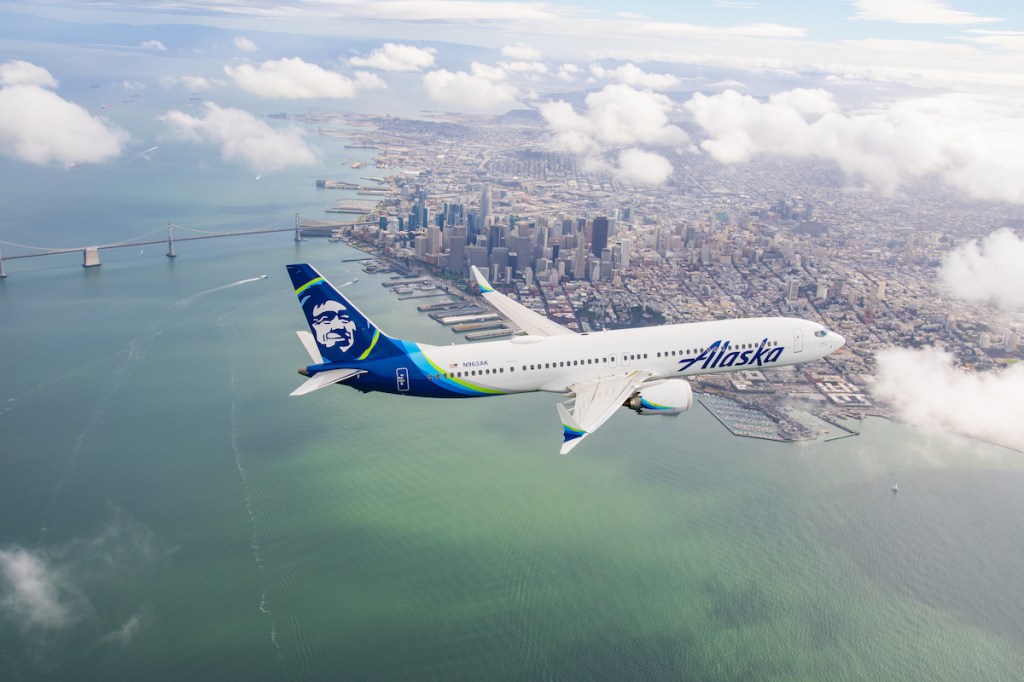
Alaska is doing away with earning points on basic economy seats, but it thinks the installation of Starlink across its fleet will funnel more customer loyalty.
Four years to scale to 550 aircraft and 200 million passengers. Four years to build a widebody business while Air India races down the same long-haul runway. The clock is ticking for IndiGo.
A Ritz-Carlton, Westin, and JW Marriott are among the properties Marriott plans to open in Nepal. Plus, more hotel deal and development news from APAC.